Hi
I am busy with a Streamline app.
I have filters via Streamlit Ag-Grid library, to filter my data and plot a ‘pyramid’ chart using Plotly Histogram function.
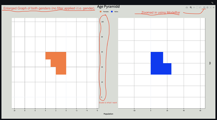
When my data is filtered; in some instances my histogram bins appear strange.
I am unable to determine exactly why it’s happening, and therefore don’t even know where to start of fixing it.
Here is a screenshot of what I am talking about:
Problem:
-
My bins appear weird when I filter on Gender=‘male’ (see screen grabs)
-
My bins represent my Age ranges (example: 20-30, 30-40, … 70-80)
-
I want these bins to remain constant, no matter the data
-
Screengrabs illustrate: bins appear as preferred when display both genders, but when I exclude females, my bins changes (not preferred).
Can anyone tell me why this is happening please, so that I can implement a mechanism to allow data to display as preferred.
Screengrabs: (can also be found here)
Dev Environment details:
Computer: Apple Mac, macOS Big Sur, version 11.6.7
IDE: VSCode Version: 1.69.2
Python: version 3.10.5
Streamlit: version 1.10.0
Plotly: version 5.8.2


