Hi everyone,
I’d like to share plotly-calheatmap, an open-source library that creates interactive calendar heatmaps with Plotly — similar to the contribution graphs on GitHub profiles.
It’s a continuation of plotly-calplot by Bruno Rocha Silva, which is no longer actively maintained.
Key Features
-
Built-in aggregation — pass raw event data with
agg="sum"|"mean"|"count"|"max"instead of pre-aggregating -
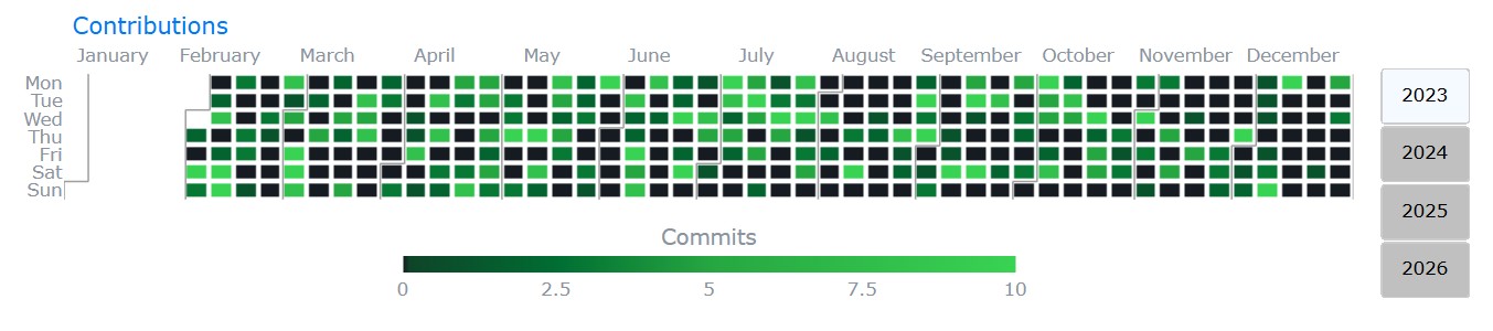
Dataset swap — switch between multiple metrics via dropdown without regenerating the graph
-
Smart colorscales — pass a
colorslist andscale_type("linear","quantile","quantize","diverging","categorical") for automatic interval computation -
Interactive filtering legend — clickable discrete legend items to show/hide categories (
legend_style="legend") -
Logarithmic color scale —
log_scale=Trueapplieslog(1+x)so extreme values don’t wash out the heatmap -
Cell annotations — display values or labels inside each cell
-
Custom week start day —
"monday","sunday", or"saturday" -
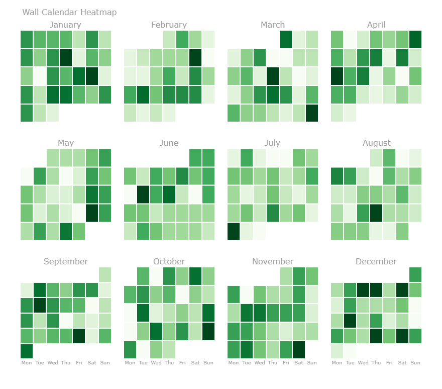
Wall-calendar layout —
layout="calendar"renders a grid of mini-calendars, one per month -
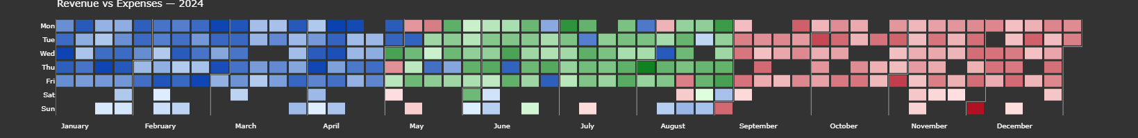
Multi-layer heatmap — overlay multiple DataFrames on one calendar with distinct color gradients per source
-
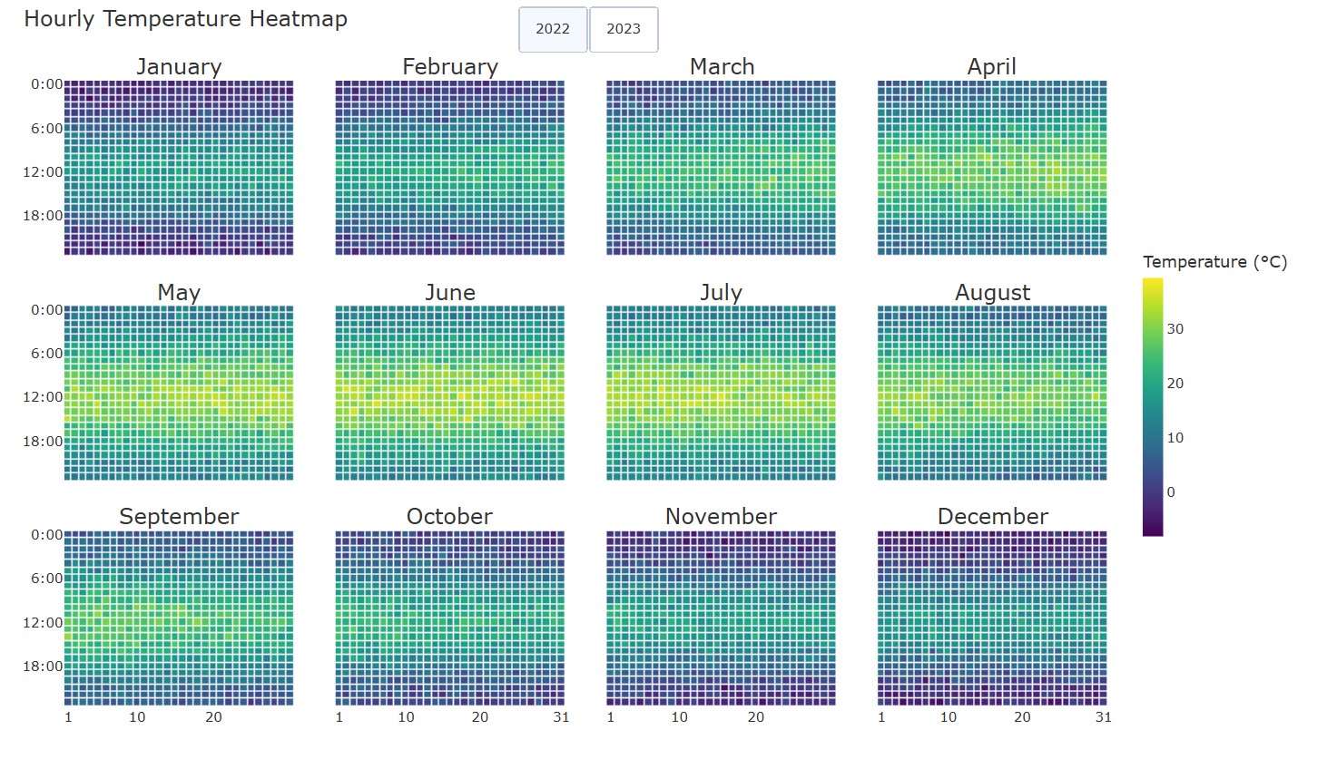
Hourly heatmap —
hourly_calheatmap()for hour × day grids per month -
Vertical orientation, custom time groupings (quarter/bimester/semester), year navigation buttons, localization support
-
Zero-value distinction (
zero_color) and missing-data styling (nan_color) -
Responsive/auto-sizing, customizable hovertemplate with
{placeholder}syntax, month separator lines, and more
Some graphs made in plotly-calheatmap (also available in examples folder of the project):
Install
pip install plotly-calheatmap
Quick Start
from plotly_calheatmap import calheatmap

fig = calheatmap(df, x="date", y="value")
fig.show()
Examples
Dataset swap with navigation:
fig = calheatmap(
    data=df, x="date", y="sales",
    datasets={
        "Sales":    {"y": "sales",    "colorscale": "greens", "showscale": "Sales ($)"},
        "Activity": {"y": "activity", "colorscale": "blues",  "showscale": "Activity (hours)"},
    },
    navigation=True,
)
Multi-layer (e.g. revenue vs expenses on one calendar):
fig = calheatmap(
    layers=[
        {"data": revenue,  "x": "date", "y": "value", "colorscale": "blues", "name": "Revenue"},
        {"data": expenses, "x": "date", "y": "value", "colorscale": "reds",  "name": "Expenses"},
    ],
    overlap_colorscale="greens",
)
Wall-calendar layout:
fig = calheatmap(df, x="date", y="value", layout="calendar", cols=4)
Links
Feedback, issues, and contributions are welcome. Hope you find it useful!