Hi,
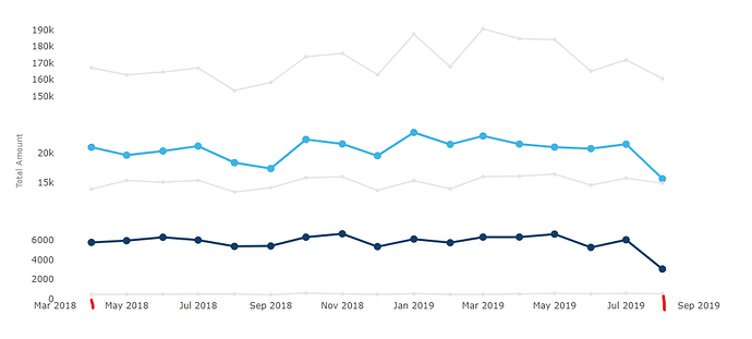
I have this subplots linechart
with values ranging from april 2018 to august 2019.
For some reason axis is generated with additional months on each side.
I’am able to calibrate xaxis properly with tick0 and dtick, but iam quite puzzled with this default behavior.
Can anybody explain, what might be going on?
Thanks
