Plotly 3d chart, x axis range & nticks not shown as specified

As shown in the image below, the range and nticks of the x axis are not shown as specified: i.e. 0<x<2, and nticks=5, whereas the y and z axis are shown correctly.

May I ask what I’ve missed here?

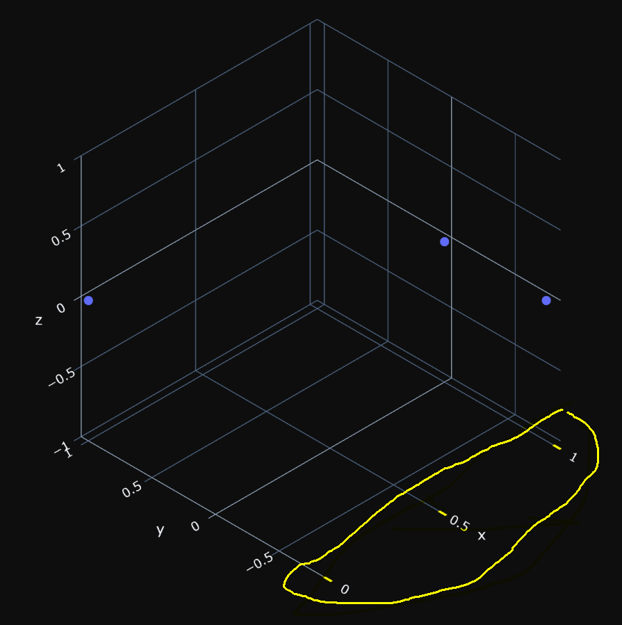
Gist of the notebook is shown here.

Code:

import numpy as np
import pandas as pd
import plotly.express as px

# create a numpy array of the xyz coordinates of 3 pts
A = np.array(
    [[1, -0.8, 0],
     [0, 1, 0],
     [1, 0, 0]]
)

# turn numpy array into pandas dataframe
A_df = pd.DataFrame(A, columns=['x', 'y', 'z'])

# plot the points in 3d scatter plot
fig_3pts = px.scatter_3d(
    A_df,
    x = 'x',
    y = 'y',
    z = 'z',
    template = 'plotly_dark',
)

# camera_topView = dict(
#     up  = dict(x=0,  y=1,  z=0),
#     eye = dict(x=0., y=0., z=2.0),
# )

fig_3pts.update_layout(
    height=800,
    scene=dict(
        aspectmode  ='cube',
        aspectratio = dict(x=1, y=1, z=1),
        xaxis = dict(range=[0, 2],  nticks=5, ticks='outside', tickwidth=5, tickcolor='yellow'),
        yaxis = dict(range=[-1, 1], nticks=5),
        zaxis = dict(range=[-1, 1], nticks=5),
   ),
#    scene_camera=camera_topView,
)

fig_3pts.update_traces(
    marker_size = 5,
)

fig_3pts.update_scenes(
    xaxis_autorange='reversed',
    yaxis_autorange='reversed',
    camera_projection_type='orthographic',
)

fig_3pts.show()
fig_3pts.write_html('./fig_3pts.html')

Let us investigate why you don’t get 5 xaxis ticks.

import plotly.graph_objects as go
help(go.layout.scene.XAxis.nticks)

If your code is in Jupyter notebook, then in the next cell will be displayed:

Help on property:

    Specifies the maximum number of ticks for the particular axis.
    The actual number of ticks will be chosen automatically to be
    less than or equal to `nticks`. Has an effect only if
    `tickmode` is set to "auto".
    
    The 'nticks' property is a integer and may be specified as:
      - An int (or float that will be cast to an int)
        in the interval [0, 9223372036854775807]
    
    Returns
    -------
    int

If you want to control the exact number of ticks, then define:

myticks = [0, 0.25, 0.5, 0.75, 1]
fig_3pts.update_layout(scene_xaxis = dict(range=[0, 2],   ticks='outside', 
                                                      tickwidth=5, tickcolor='yellow',
                                                     tickvals=myticks, ticktext=myticks))
1 Like

Thanks, John.

I’m using plotly.express. However, neither of the two options below were working in my Jupyter notebook, according to your suggestion. I still got the same 3D plot as shown above.

Option 1: put the tick_values inside “scene” update.

tick_values = [0, 0.5, 1, 1.5, 2.0]

fig_3pts.update_layout(
    height=800, 
    scene=dict(
        aspectmode  ='cube', 
        aspectratio = dict(x=1, y=1, z=1), 
        xaxis = dict(
            range=[0, 2],  
            tickvals=tick_values, 
            ticktext=tick_values, 
            ticks='outside', 
            tickwidth=5, 
            tickcolor='yellow'), 
        yaxis = dict(range=[-1, 1], nticks=5), 
        zaxis = dict(range=[-1, 1], nticks=5), 
   ),
)

Option 2: put the tick_values in a separate “sene_xaxis” update.

tick_values = [0, 0.5, 1, 1.5, 2.0]

fig_3pts.update_layout(
    height=800, 
    scene=dict(
        aspectmode  ='cube', 
        aspectratio = dict(x=1, y=1, z=1), 
        # xaxis = dict(
        #     range=[0, 2],  
        #     tickvals=tick_values, 
        #     ticktext=tick_values, 
        #     ticks='outside', 
        #     tickwidth=5, 
        #     tickcolor='yellow'), 
        yaxis = dict(range=[-1, 1], nticks=5), 
        zaxis = dict(range=[-1, 1], nticks=5), 
   ),
)

fig_3pts.update_layout(
    scene_xaxis=dict(
        range=[0, 2],
        ticks='outside',
        tickwidth=5,  
        tickcolor='yellow',
        tickvals=tick_values,
        ticktext=tick_values,
    )
)

Hi @oat,

  1. I’m not John :grinning: :grinning:
  2. Plotly express instantiates behind the scene a go.Figure, hence you are creating indirectly a go trace, and a go.Layout
  3. What Plotly version are you running, because as you can see below my plot is as you required. I have the last version.

In your initial code, I just commented the template to see better the resulted figure, and the layout update is this one:

tick_values= [0, 0.25, 0.5, 0.75, 1]
fig_3pts.update_layout(
    height=600, width=600,
    scene=dict(
        aspectmode  ='cube',
        aspectratio = dict(x=1, y=1, z=1),
        xaxis = dict(range=[0, 2],   ticks='outside', tickwidth=5, tickcolor='yellow',
                    tickvals=tick_values, ticktext=tick_values),
        yaxis = dict(range=[-1, 1], nticks=5),
        zaxis = dict(range=[-1, 1], nticks=5),
   )

Thanks, @empet.

I’m using Plotly v5.5.0, currently.

I have the following observations:

  1. the use of template = 'plotly_dark' doesn’t affect the result here.

  2. I can not force a range of [0, 2] on the x axis for which the range of the data is actually just between 0 and 1 in this example. And this is why when I change tick_values to [0, 0.5, 1, 1.5, 2], only three values, [0, 0.5, 1] are showing on x axis, no matter how I set “nticks”, “tickvals” and “ticktext”. This is true for the y axis here, too, but not for the z axis which can be set to any range for the three zero values in the data.

  3. So, it seems that the “range” for a given axis is bounded to the range of values of data for that axis, unless all data for that axis are zero.

So, my question is: is there a way to force arbitrary range for a given axis in 3d plot in Plotly?

@oat
I neglected your aspectmode="cube" setting. It blocks the user defined range:

help(go.layout.Scene.aspectmode)
Help on property:

    If "cube", this scene's axes are drawn as a cube, regardless of
    the axes' ranges. If "data", this scene's axes are drawn in
    proportion with the axes' ranges. If "manual", this scene's
    axes are drawn in proportion with the input of "aspectratio"
    (the default behavior if "aspectratio" is provided). If "auto",
    this scene's axes are drawn using the results of "data" except
    when one axis is more than four times the size of the two
    others, where in that case the results of "cube" are used.
    
    The 'aspectmode' property is an enumeration that may be specified as:
      - One of the following enumeration values:
            ['auto', 'cube', 'data', 'manual']
    
    Returns
    -------
    Any

Obviously that the template plotly_dark doesn’t influence your settings, but some people have vision deficiency when looking at a black background.