Hello,
I’d like to plot simulation data that was aggregated using Pandas groupby and agg function. The data contains four independent parameters with different values as well as a date. For each combination of the parameters (and date) I calculate the mean and confidence interval.
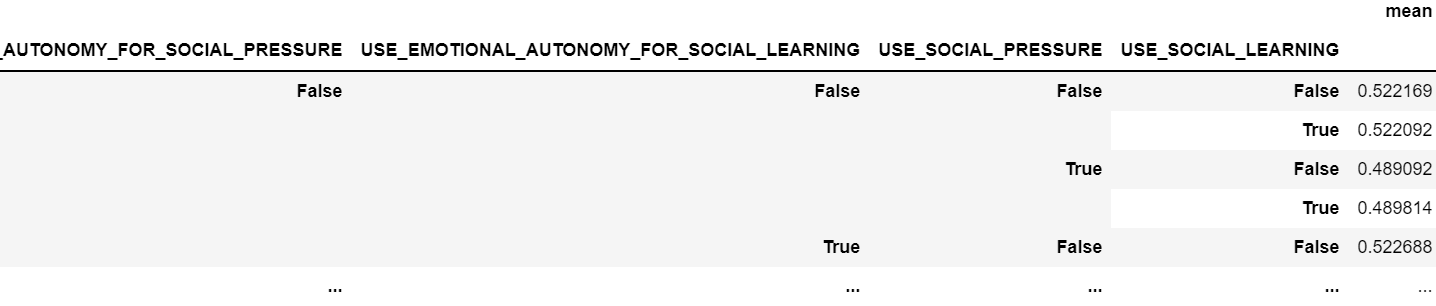
I’d like to plot the data as a line plot considering the different parameter combinations.
For single index dataFrame i use the following code:
myFig = go.Figure([
    go.Scatter(
        name='Mittelwert',
        #x=df['tick'],
        y=df['mean'],
        mode='lines',
        line=dict(color='rgb(31, 119, 255)'),
    ),
     go.Scatter(
        name='CI',
        #x=df['tick'],
        y=df['ci95_hi'],
        mode='lines',
        marker=dict(color="#644"),
        line=dict(width=0),
        showlegend=True
    ),
    go.Scatter(
        name='CI',
        #x=df['tick'],
        y=df['ci95_lo'],
        marker=dict(color="#448"),
        line=dict(width=0),
        mode='lines',
        fillcolor='rgba(130, 68, 68, 0.5)',
        fill='tonexty',
        showlegend=True
    )
])
myFig.update_layout(
    xaxis_title='X axis',
    yaxis_title='Y axis',
    title='Continuous, variable value error bars',
    hovermode="x"
)
How can this be achieved using the given data structure.
Thank you very much in advance I’d really appreciate some help 