Hello,
I have come across an issue while using plotly express with panel by holoviews. When plotting with plotly express there is the option to color the data by another column. If you choose to color by categorical data, the data being plotted is colored with discrete color options according to the categories chosen, as shown below.
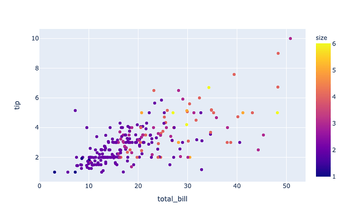
If you choose to color the data by numerical data, the data being plotted is colored with a color bar spanning the range of the numerical data, as shown below.
I would like to look at my data in several different ways so I have created a selector widget that allows me to select how I want my data colored. However, I have noticed that when I make my plotting function dependent on the selector widget the colors for categorical data does not do what its supposed to do.
My first example is of the data being plotted correctly but the function that creates the plot is not dependent on the selector widget. Since it is not dependent I must manually execute the last cell to display my updated plot.
Code for this example:
import plotly.express as px
import panel as pn
pn.extension('plotly')

df = px.data.tips()

color_select = pn.widgets.Select(name='color', options=['smoker','size'], value='smoker')

def our_plot(c):
      return px.scatter(df,x="total_bill", y='tip', color=c)

color_select

pn.Column(our_plot(color_select.value))
My next example shows what happens to the color when you make the plotting function dependent on the selector widget using @pn.depends(color_select.param.value) . The widget and plot are on the same panel so the plot can be automatically updated when I choose a new color. The first time the plot with discrete coloring is displayed it is how it should be. But once I switch to a color scale plot and back to a discrete color plot the first categorical value (in this example ‘No’) is given a continuous color scale while the other category (in this example ‘Yes’) is given a discrete color.
Code for this example:
import plotly.express as px
import panel as pn
pn.extension('plotly')

df = px.data.tips()

color_select = pn.widgets.Select(name='color', options=['smoker','size'], value='smoker')

@pn.depends(color_select.param.value)
def our_plot(c):
    return px.scatter(df,x="total_bill", y='tip', color=c)

pn.Column(color_select, our_plot)
If you execute these two codes separately you will see that the plot is no longer correctly assigning colors to discrete values. I am not sure if this is a plotly or panel issue but things seem to go wrong once I add the @pn.depends() function to the code. If anyone has any ideas as to why this may be happening or have any solutions I would greatly appreciate it. I have also posted this issue on the holoviz discourse page here: Using plotly with panel color issue - Panel - HoloViz Discourse with videos of the examples I described above.
Thank you!

