Hello Community,
I try to redesign a heatmap that I found, in python . Img 1

(wanted_result.png) shows what the result sould look like.
My Aproach would be to first create a Scatter plot with all the points, and then overlay it with a density Heatmap with traspartent color if the count value is 0/None. Sadly I cant figure out a way to create conditional coloring for plotly express density_heatmap. This aproach is shown in Img 2 (px_scatter.png), Img 3(px_density_heatmap.png), and Img 4combined_px_scatter_px_density_heatmap.png).
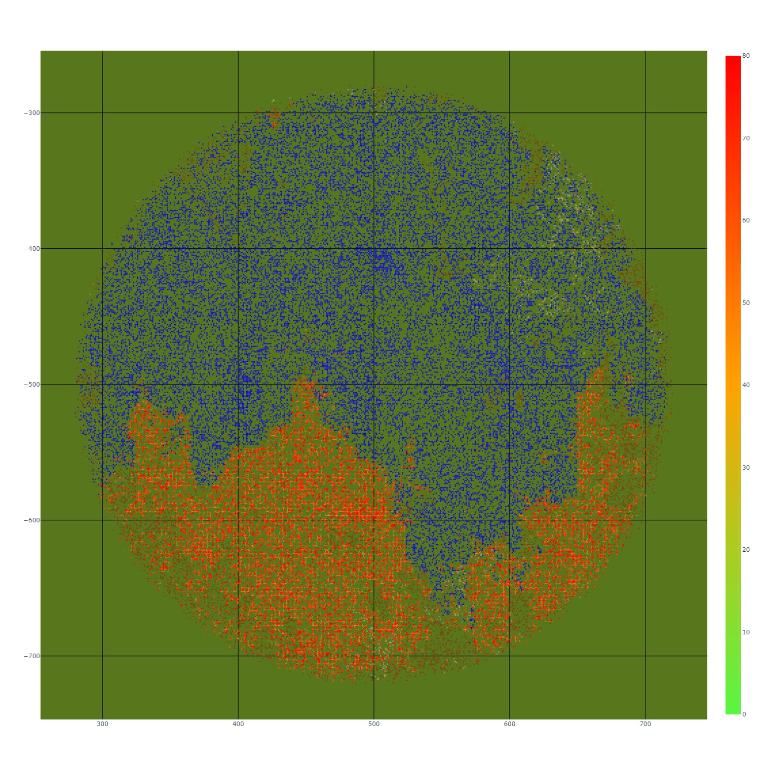
Different aproach of me was to use plotly.graph_objs, where i create a Figure and then add two traces, first is .Heatmap and second is .Scatter. Here my conditional formatting works, but the look of the heatmap is not what I want, since i cannot control the radius of my heat points. I use the dx/dy attributes to select the calculation area but it does not change the size of the shown points. This is how my result looks like: Img 5( go_heatmap.png), Img 6(combine_go_heatmap_go_scatter.png)
I Hope someone can help me out. Thanks