Hi All,
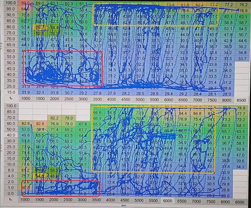
I am looking for a method visualise the Active points in a lookup table. I want to have a table which maps of X and Y input to a output value. Now I want to visualise a time series data of the generated output overlayed over the table to realise which part of the look up table is active at that instant.
Any lead in this regard, will be greatly appreciated.
Thanks and regards,
Nithin
Attachement - Shows a typical representation, I wish to relaise in plotly. The blue dots represents active mapped output from the look up table.