Hi @AIMPED,
I didn’t notice that until you mentioned it good eye. After a bit of testing myself what I presume happens is the figure is generated based on the title position. I’d assume this is a D3.js limitation. As you noted it’s easier to spot if you shift it to a corner.
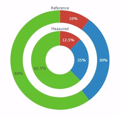
First thing I’ll say here is apparently the titleposition is depreciated (still works for now but who knows when it will break). What should be used is a dict in the title and utilize the position argument inside the dict.
title = dict(text="Reference",
                   position='top center'
),
Now for a fix on the shifting graph after setting one to top center. There might be a better way to solve this but an easy solution is just to change the domain a bit.
It looks like setting y to [0.16,0.8] will be close enough.
data = [
#Inner donut
go.Pie(values=[20,40,100],
labels=['Protein','Carbohydrate', "Lipid"],
domain={'x':[0.3,0.7], 'y':[0.16,0.8]},
hole=0.5,
direction='clockwise',
sort=False,
marker={'colors':['#CB4335','#2E86C1','#64C12E']},
title='Measured'
),
# Individual components (outer donut)
go.Pie(values=[5,15,30],
labels=['Protein','Carbohydrate', "Lipid"],
domain={'x':[0.1,0.9], 'y':[0,1]},
hole=0.75,
direction='clockwise',
sort=False,
marker={'colors':['#CB4335','#2E86C1','#64C12E']},
showlegend=True,
title=dict(text='Reference',
position='top center'
),
)
]
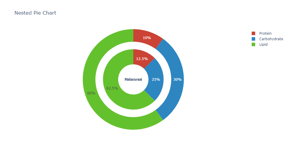
figure=go.Figure(data=data, layout={'title':'Nested Pie Chart'})
figure.show()
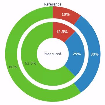
Or alternatively a second option is to set both of the graphs to have the position top center which will shift both the same amount and be even.
data = [
    #Inner donut
    go.Pie(values=[20,40,100],
           labels=['Protein','Carbohydrate', "Lipid"],
           domain={'x':[0.3,0.7], 'y':[0.2,0.8]},
           hole=0.5,
           direction='clockwise',
           sort=False,
           marker={'colors':['#CB4335','#2E86C1','#64C12E']},
           title=dict(text='Measured',
                      position='top center'
                     )
       ),
    # Individual components (outer donut)
    go.Pie(values=[5,15,30],
           labels=['Protein','Carbohydrate', "Lipid"],
           domain={'x':[0.1,0.9], 'y':[0,1]},
           hole=0.75,
           direction='clockwise',
           sort=False,
           marker={'colors':['#CB4335','#2E86C1','#64C12E']},
           showlegend=True,
           title=dict(text='Reference',
                     position='top center'
                     ),
         )
]

figure=go.Figure(data=data, layout={'title':'Nested Pie Chart'})

figure.show()