# Import packages
from dash import Dash, html, dash_table, dcc, callback, Output, Input, State, no_update
import pandas as pd
import plotly.express as px
import micropip
await micropip.install('dash-bootstrap-components')
import dash_bootstrap_components as dbc
await micropip.install('dash_bootstrap_templates')
from dash_bootstrap_templates import load_figure_template
# Incorporate data
df = pd.read_csv('https://raw.githubusercontent.com/plotly/datasets/master/gapminder2007.csv')
# Initialize the app
dbc_css = "https://cdn.jsdelivr.net/gh/AnnMarieW/dash-bootstrap-templates/dbc.min.css"
app = Dash(__name__, external_stylesheets=[dbc.themes.SOLAR, dbc_css])
#app = Dash(__name__, external_stylesheets=[dbc.themes.SOLAR]) # Sytle
load_figure_template("solar")
# App layout
app.layout = html.Div([
html.H1('Do you know the richest countries?', className="dbc"),
html.H4(children='Population, life experiance and standard of living in the world', className="dbc"),
html.Hr(),
html.Div([dash_table.DataTable(data=df.to_dict('records'), page_size=6)], className="dbc"),
# html.Div('Show...'),
html.Br(),
dbc.Row(
[
dbc.Col(html.Div('Show...'), width=2),
dbc.Col(dcc.RadioItems(options=['pop', 'lifeExp', 'gdpPercap'], value='lifeExp', id='radio'), width=2 ),
dbc.Col(dbc.Button('Submit', id='submit'), width=2 )
], justify='start'
),
html.Br(),
dbc.Row(
[
dbc.Col([dbc.Alert(id="alert", children="Please select a property...")], width=10 ),
], justify='center'
),
html.Br(),
#dbc.Col(dcc.RadioItems(options=['pop', 'lifeExp', 'gdpPercap'], value='lifeExp', id='radio') ),
#dbc.Col(dbc.Button('Submit', id='submit') ),
# gdpPercap = standard of living
dcc.Graph(figure={}, id='histogram'),
dbc.Row(
[
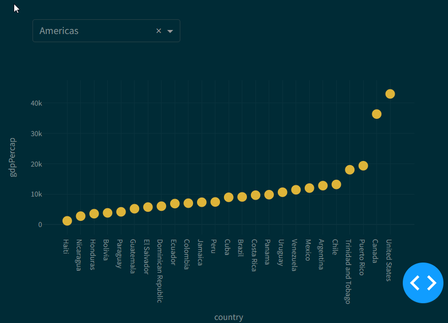
dbc.Col(dcc.Dropdown(id='ContiDropDown', value='Asia', className="dbc"), width={"size": 4, "order": 1, "offset": 1}),
]
),
dcc.Graph(figure={}, id='scatter'),
dcc.Interval(id='interval', interval=3000)
])
# Add controls to build the interaction
@callback(
Output('histogram', 'figure'),
Output('alert', 'children'),
Input('submit', 'n_clicks'),
State('radio', 'value'),
# Input('interval', 'n_intervals') # Tiggers the callback each 3 seconds.
#State() # Gives no callback, only the value comes with it
)
def update_hist(_, col_chosen):
dff = df[df.country.isin(['Albania','Romania','Iran','India','Algeria','Egypt','Australia','Canada','Mexico'])]
dfSort = df.sort_values(by=[col_chosen]) # This not so easy, because it is a summary of each continent
figHist = px.histogram(dfSort, x='continent', y=col_chosen,
histfunc='avg', color='continent',
opacity=0.65, labels={'continent':'list of continents'},
template="solar",
)
#figHist.updates_axes(y='average of population')
#pattern_shape='country',
# expectation of life
if col_chosen=='pop':
alert_text = 'Average Population of the continents'
if col_chosen=='lifeExp':
alert_text = 'Average life experiance of the continents'
if col_chosen=='gdpPercap':
alert_text = 'Average GDP of the continents'
return figHist, alert_text
# Second diagram: scatter
@callback(
Output('ContiDropDown', 'options'),
Input('radio', 'value')
)
def update_dropDown(col_chosen):
if col_chosen=='pop':
return no_update
else:
options = df.continent
return options
# Second diagram: scatter
@callback(
Output('scatter', 'figure'), #allow_duplicate=True), # when use two, same Outputs.
Input('radio', 'value'),
Input('ContiDropDown', 'value'),
prevent_inital_call = True
)
def update_scatter(col_chosen, continent): # histSelected
#ctxOn = dash.callback_context
#if(len(ctxOn.triggered) != 1 ):
#raise PreventUpdate
#print('histSelected: ' + histSelected)
# Country should choose via click on the histogramm
dff = df[df.continent.isin([continent])]
dffSort = dff.sort_values(by=[col_chosen])
#dff = df[df.country.isin(['Albania','Romania','Iran','India','Algeria','Egypt','Australia','Canada','Mexico'])]
figScat = px.scatter(dffSort, x='country', y=col_chosen,) # , range_x =[10000,40000])
figScat.update_traces(marker_size=15, showlegend=False)
# showlegend=False #fig.update_traces()
return figScat
# Run the app
if __name__ == '__main__':
app.run(debug=True)


It is not completly finished,
may I can do this on one day next week.