Hello Everyone,
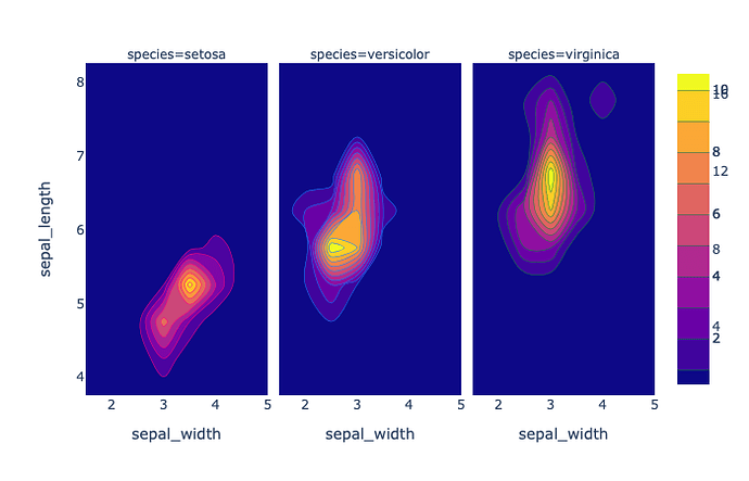
Making a facetted density_contour plot with option contours_coloring=‘fill’ creates, what it looks like to me, several color bars that are superimposed. Here is a figure that shows this:
Based on the numbering, there are at least two color bars superimposed. Is there a way to either draw the color bar next to each figure or synchronise the color scale and draw only one?
For completeness, is the code to reproduce this:
import plotly.express as px
Iris = px.data.iris()
fig = px.density_contour(Iris, x=‘sepal_width’, y=‘sepal_length’, facet_col=‘species’)
fig.update_traces(contours_coloring=‘fill’,showlegend=False)
fig.show()
I printed the Figure object to see if there is an option I can use but nothing stood out. However, I am new to Plotly Express so I am still learning how to use the library.
Thanks in advance for your help,

