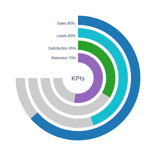
This implementation demonstrates how to build a Multilevel Circular Progress Bar. The visualization displays multiple key indicators at once using concentric rings. Each ring represents the current progress toward its goal with clear colors and labels, making it easy to understand and compare important metrics in a compact and visually appealing way. I hope you find this implementation very useful.


import plotly.graph_objects as go
import math

def pad_text(text, length):
    return " " * (length - len(text)) + text


kpis = [
    {'name': 'Sales', 'value': 85, 'color': '#d2b48c'},
    {'name': 'Leads', 'value': 60, 'color': '#c19a6b'},
    {'name': 'Satisfaction', 'value': 45, 'color': '#8b4513'},
    {'name': 'Retention', 'value': 70, 'color': '#5c4033'}
]

fig = go.Figure()

max_arc = 270
rotation_start = 0
direction = 'clockwise'
outer_radius = 0.40
thickness = 0.06
gap = 0.02
bg_gray = 'rgba(0,0,0,0.2)'
invisible_color = 'rgba(0,0,0,0)'

needed = len(kpis) * (thickness + gap) - gap
if needed > outer_radius:
    raise ValueError("Not enough radial space.")

texts = [f"{kpi['name']} {kpi['value']}%" for kpi in kpis]
max_len = max(len(t) for t in texts)

for i, kpi in enumerate(kpis):
    r_outer = outer_radius - i * (thickness + gap)
    r_inner = r_outer - thickness
    hole_frac = r_inner / r_outer

    progress_deg = kpi['value'] * max_arc / 100.0
    remaining_deg = max_arc - progress_deg
    invisible_deg = 360 - max_arc
    values = [progress_deg, remaining_deg, invisible_deg]

    domain_box = {
        'x': [0.5 - r_outer, 0.5 + r_outer],
        'y': [0.5 - r_outer, 0.5 + r_outer]
    }

    fig.add_trace(go.Pie(
        values=values,
        labels=['', '', ''],
        hole=hole_frac,
        marker_colors=[kpi['color'], bg_gray, invisible_color],
        direction=direction,
        rotation=rotation_start,
        sort=False,
        textinfo='none',
        hoverinfo='skip',
        showlegend=False,
        domain=domain_box
    ))


    theta_rad = math.radians(90)
    ann_radius = (r_inner + r_outer) / 2
    ann_y = 0.5 + ann_radius * math.sin(theta_rad)

    padded_text = pad_text(texts[i], max_len)

    fig.add_annotation(
        x=0.4,
        y=ann_y,
        xref='paper',
        yref='paper',
        text=padded_text,
        showarrow=False,
        align='left',
        font=dict(size=12,)
    )


fig.add_annotation(
    x=0.5, y=0.5,
    xref='paper', yref='paper',
    text="KPIs",
    showarrow=False,
    font=dict(size=20),
    align="center"
)

fig.update_layout(
    height=500, width=500,
    margin=dict(t=0, b=0, l=0, r=0),
    template="plotly_dark"
)

fig.show()