Using the MATLAB function meshc(X,Y,Z), we can also create a 3-D mesh surface plot with a contour plot underneath. So with this functionality MATLAB offers us the ability to create surprisingly interesting charts. With this post I want to show you the equivalent versions that we can create using fig2plotly. I assure you it will be worth it! 
To achieve this with fig2plotly , we again need to resort to the optional 'TreatAs' parameter, setting it to 'meshc' . Let’s see how this would be with an example
[X,Y] = meshgrid(1:0.5:10,1:20);
Z = sin(X) + cos(Y);

sc = meshc(X,Y,Z);
sc(1).EdgeColor = 'yellow';

f = fig2plotly(gcf, 'offline', false,  'TreatAs', 'meshc');
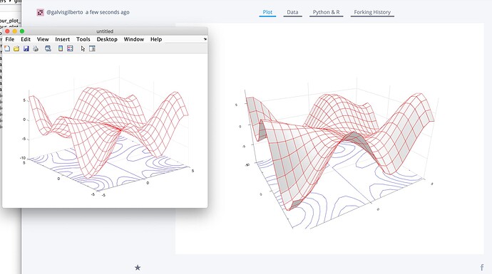
After we run the MATLAB code above, the results we would get looks like this
In the previous figure we can see the chart generated by MATLAB (on the left), which is very interesting. However, the version created by Plotly in Chart-Studio (right) is a sweetie. Don’t you think so? 
If you want to experience this on your own at Plotly Chart-Studio, please follow this link. I am inviting you to what you are doing. You will not regret! 
In this repository folder you can find more examples using MATLAB’s meshc functionality. Please feel free to recreate those examples with fig2plotly using what is explained in this post 
Attached below more results that I obtained from my side 


