Making a custom grid view; working but slow

Hi, I am looking for help improving the speed of this chart type.
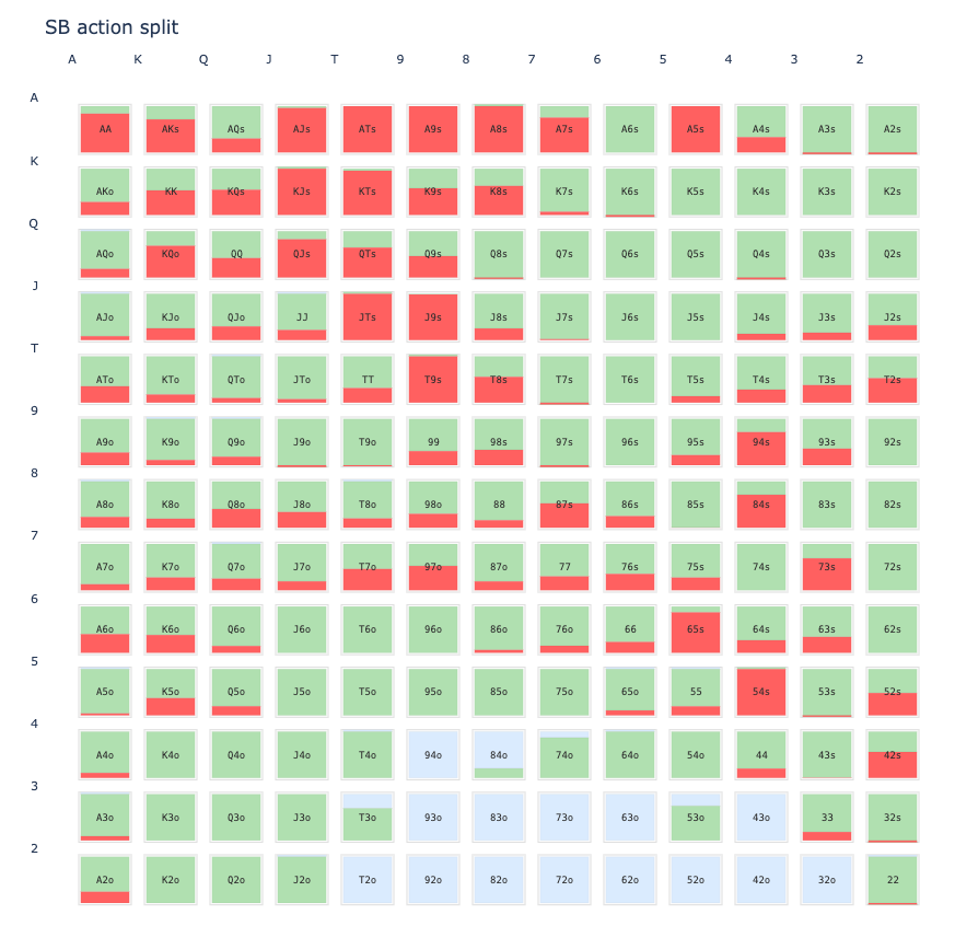
Here is my best attempt at a standalone example:

```

import numpy as np
import plotly.graph_objects as go

# 13 ranks in poker order
ranks = list("AKQJT98765432")

# generate a random 3-way action split for each hand: F + C + R = 1
rng = np.random.default_rng(42)
F = np.zeros((13, 13), dtype=float)
C = np.zeros((13, 13), dtype=float)
R = np.zeros((13, 13), dtype=float)

for i in range(13):
    for j in range(13):
        probs = rng.dirichlet(np.array([1.5, 1.5, 1.5]))
        F[i, j], C[i, j], R[i, j] = probs

# make the matrix symmetric so it behaves like a range matrix
for i in range(13):
    for j in range(i, 13):
        F[j, i] = F[i, j]
        C[j, i] = C[i, j]
        R[j, i] = R[i, j]

# Colors roughly matching the app: blue=fold, green=call, red=raise
COLORS = {
    "F": "#b7d7ef",
    "C": "#9ad7a6",
    "R": "#f08e8e",
}

fig = go.Figure()

cell_w = 1.0
cell_h = 1.0

for i in range(13):
    for j in range(13):
        x0 = j
        x1 = j + cell_w
        y0 = i
        y1 = i + cell_h

        # stack in the same visual order as the app: R at the bottom, C middle, F top
        r_h = R[i, j]
        c_h = C[i, j]
        f_h = F[i, j]

        # bottom slice: raise
        y_bottom = y0
        y_top = y0 + r_h * cell_h
        fig.add_shape(
            type="rect",
            x0=x0,
            x1=x1,
            y0=y_bottom,
            y1=y_top,
            fillcolor=COLORS["R"],
            line=dict(color="rgba(0,0,0,0)", width=0),
            opacity=0.95,
        )

        # middle slice: call
        y_bottom = y0 + r_h * cell_h
        y_top = y0 + (r_h + c_h) * cell_h
        fig.add_shape(
            type="rect",
            x0=x0,
            x1=x1,
            y0=y_bottom,
            y1=y_top,
            fillcolor=COLORS["C"],
            line=dict(color="rgba(0,0,0,0)", width=0),
            opacity=0.95,
        )

        # top slice: fold
        y_bottom = y0 + (r_h + c_h) * cell_h
        y_top = y0 + cell_h
        fig.add_shape(
            type="rect",
            x0=x0,
            x1=x1,
            y0=y_bottom,
            y1=y_top,
            fillcolor=COLORS["F"],
            line=dict(color="rgba(0,0,0,0)", width=0),
            opacity=0.95,
        )

# use a simple matrix layout to mimic the screenshot
fig.update_xaxes(
    range=[0, 13],
    tickmode="array",
    tickvals=np.arange(13) + 0.5,
    ticktext=ranks,
    showgrid=False,
    zeroline=False,
    side="top",
)

fig.update_yaxes(
    range=[13, 0],
    tickmode="array",
    tickvals=np.arange(13) + 0.5,
    ticktext=ranks,
    showgrid=False,
    zeroline=False,
    autorange=False,
)

fig.update_layout(
    title="SB action split",
    width=1200,
    height=1200,
    margin=dict(l=40, r=40, t=60, b=40),
    template="plotly_white",
    showlegend=False,
    paper_bgcolor="white",
    plot_bgcolor="white",
)

fig.show()

Hi @Kevin_Lalli and welcome to the Plotly community :slightly_smiling_face:

Yes, that is slow - it’s the layout.shapes that’s the most expensive part.

Subplots would be faster:


import numpy as np
import plotly.graph_objects as go
from plotly.subplots import make_subplots

ranks = list("AKQJT98765432")

COLORS = {
    "F": "#b7d7ef",
    "C": "#9ad7a6",
    "R": "#f08e8e",
}

rng = np.random.default_rng(42)

F = np.zeros((13, 13))
C = np.zeros((13, 13))
R = np.zeros((13, 13))

for i in range(13):
    for j in range(13):
        F[i, j], C[i, j], R[i, j] = rng.dirichlet([1.5, 1.5, 1.5])

# Make the range symmetric
for i in range(13):
    for j in range(i, 13):
        F[j, i] = F[i, j]
        C[j, i] = C[i, j]
        R[j, i] = R[i, j]


def hand_name(i, j):
    if i == j:
        return f"{ranks[i]}{ranks[j]}"
    if i < j:
        return f"{ranks[i]}{ranks[j]}s"
    return f"{ranks[j]}{ranks[i]}o"


fig = make_subplots(
    rows=13,
    cols=13,
    horizontal_spacing=0.015,
    vertical_spacing=0.015,
)

for i in range(13):
    for j in range(13):
        row = i + 1
        col = j + 1
        hand = hand_name(i, j)

        # One stacked vertical bar for this hand
        fig.add_trace(
            go.Bar(
                x=[""],
                y=[F[i, j]],
                name="Fold",
                marker_color=COLORS["F"],
                hovertemplate=(
                    f"<b>{hand}</b><br>"
                    f"Fold: {F[i, j]:.1%}<extra></extra>"
                ),
                showlegend=(i == 0 and j == 0),
            ),
            row=row,
            col=col,
        )

        fig.add_trace(
            go.Bar(
                x=[""],
                y=[C[i, j]],
                name="Call",
                marker_color=COLORS["C"],
                hovertemplate=(
                    f"<b>{hand}</b><br>"
                    f"Call: {C[i, j]:.1%}<extra></extra>"
                ),
                showlegend=(i == 0 and j == 0),
            ),
            row=row,
            col=col,
        )

        fig.add_trace(
            go.Bar(
                x=[""],
                y=[R[i, j]],
                name="Raise",
                marker_color=COLORS["R"],
                hovertemplate=(
                    f"<b>{hand}</b><br>"
                    f"Raise: {R[i, j]:.1%}<extra></extra>"
                ),
                showlegend=(i == 0 and j == 0),
            ),
            row=row,
            col=col,
        )

        # Hand label in the center of each subplot
        fig.add_annotation(
            x=0,
            y=0.5,
            xref=f"x{i * 13 + j + 1}",
            yref=f"y{i * 13 + j + 1}",
            text=f"<b>{hand}</b>",
            showarrow=False,
            font=dict(size=10),
        )


fig.update_layout(
    barmode="stack",
    width=900,
    height=900,
    margin=dict(l=55, r=20, t=50, b=45),
    title="SB action split",
    template="plotly_white",
    legend=dict(
        orientation="h",
        yanchor="bottom",
        y=1.02,
        xanchor="right",
        x=1,
    ),
)

# All subplots use the same 0-1 vertical scale.
fig.update_yaxes(
    range=[0, 1],
    showticklabels=False,
    showgrid=False,
    zeroline=False,
)

fig.update_xaxes(
    showticklabels=False,
    showgrid=False,
    zeroline=False,
)

# Add the poker rank labels around the matrix.
for i, rank in enumerate(ranks):
    # Left axis
    fig.add_annotation(
        x=-0.035,
        y=1 - (i + 0.5) / 13,
        xref="paper",
        yref="paper",
        text=rank,
        showarrow=False,
        xanchor="right",
        font=dict(size=12),
    )

    # Top axis
    fig.add_annotation(
        x=(i + 0.5) / 13,
        y=1.015,
        xref="paper",
        yref="paper",
        text=rank,
        showarrow=False,
        yanchor="bottom",
        font=dict(size=12),
    )

fig.show()

Belated thanks for this! I have been on a vibe-coding binge, haven’t touched plotly/ dash in a couple of years, and this will move things along nicely.