Hello,
I have the following code which produces a dotted red line using the graph objects scatter method from x values “fifty” to “thirty”. I have a comment above with “This is where I need help”.
def graph_two_v_two(filter_year: str, filter_month: str, width: int, height: int, budget_plan: str):
        # Load budget plans
    with open("budget_plans.yml", "r") as budp:
        budget_plans = yaml.safe_load(budp)

    tran_table_filter = ((tran_table['Tag']!='Internal Transfer')
                         & (tran_table['Date']>=f'{filter_year}-{filter_month}-01')
                         & (tran_table['Amount']<int(0)))
    new_tran_table = tran_table[tran_table_filter]
    new_tran_table['Category'] = new_tran_table.apply(lambda row: make_category_tag_dict(budget_plans[budget_plan], row), axis=1)
    new_tran_table['Max Spend'] = new_tran_table.apply(lambda row: category_max_spend(budget_plans[budget_plan], row), axis=1)
    expense_table_vendors = new_tran_table.groupby(['Category', 'Tag'], as_index=False).Amount.sum()
    expense_graph = px.bar(expense_table_vendors, x='Category', y='Amount', color='Tag',
                    hover_data=['Tag'],
                    width=width, height=height)
    # This is where I need help!!!
    expense_graph.add_traces(
        go.Scatter(
            x=('fifty', 'thirty'),
            y=(-2500, -2500),
            mode="lines",
            line_dash="dot",
            line_color="red",
            showlegend=False
    )
)
    expense_graph.show()
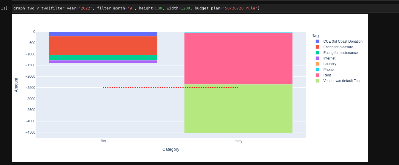
graph produce -
What I would like is to have that dotted red line be different for each x value. However, if I wanted this line to only be drawn on a single x value, it becomes a dot that you can only see while hovering. Example here -
def graph_two_v_two(filter_year: str, filter_month: str, width: int, height: int, budget_plan: str):
        # Load budget plans
    with open("budget_plans.yml", "r") as budp:
        budget_plans = yaml.safe_load(budp)

    tran_table_filter = ((tran_table['Tag']!='Internal Transfer')
                         & (tran_table['Date']>=f'{filter_year}-{filter_month}-01')
                         & (tran_table['Amount']<int(0)))
    new_tran_table = tran_table[tran_table_filter]
    new_tran_table['Category'] = new_tran_table.apply(lambda row: make_category_tag_dict(budget_plans[budget_plan], row), axis=1)
    new_tran_table['Max Spend'] = new_tran_table.apply(lambda row: category_max_spend(budget_plans[budget_plan], row), axis=1)
    expense_table_vendors = new_tran_table.groupby(['Category', 'Tag'], as_index=False).Amount.sum()
    expense_graph = px.bar(expense_table_vendors, x='Category', y='Amount', color='Tag',
                    hover_data=['Tag'],
                    width=width, height=height)
    # This is where I need help!!!
    expense_graph.add_traces(
        go.Scatter(
            x=('fifty', 'thirty'),
            y=(-2500, -2500),
            mode="lines",
            line_dash="dot",
            line_color="red",
            showlegend=False
    )
)
    expense_graph.show()

I’m trying to make a toy budget app to learn. So the X problem here is that I’m calculating the monthly max spend of an annual income for a given category based on a percentage per category, and then applying a red dotted line at that value with basic hover information like how much more you can spend before going over budget in that category, etc. So in the end, I was going to have a for loop draw a line on the y axis for each x value based on that calculated max spend. go.scatter seems to be best for this, but if there is a better way to do this, or if someone has a better way to express a limit like what I’m trying to do, I’m definitely open to feedback.
Thank you!

