Hi,
I’m having trouble to generate a plotly.express.timeline in Python with a provided argument for the text parameter. This is a sample code snippet that I’m currently trying to get working:
from datetime import datetime, timedelta
import pandas as pd
import plotly.express as px
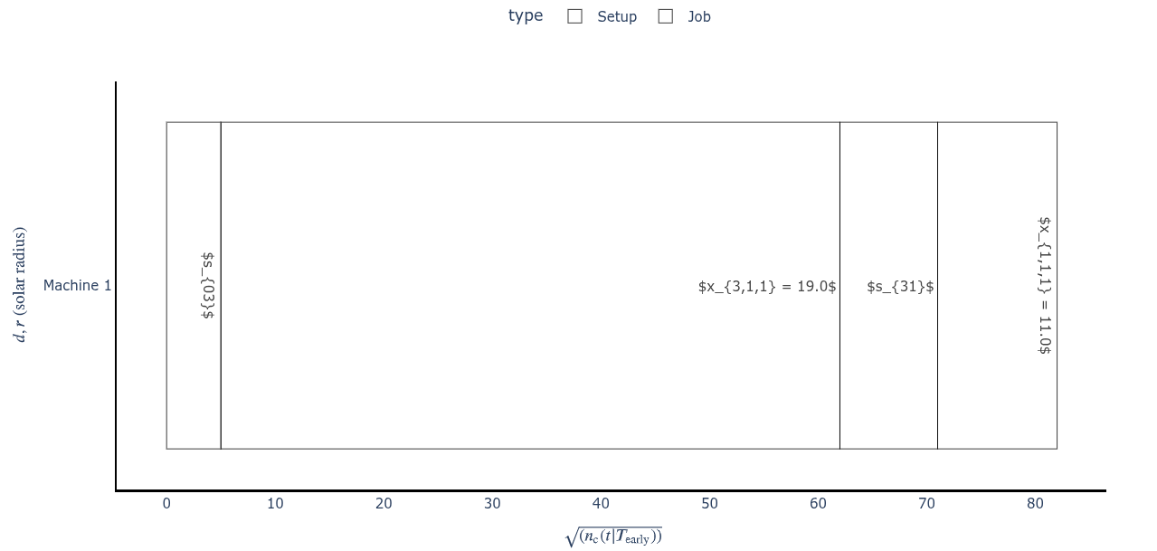
df = pd.DataFrame({
'name': ['$s_{03}$', '$x_{3,1,1} = 19.0$', '$s_{31}$', '$x_{1,1,1} = 11.0$'],
'start': [0.0, 5.0, 62.0, 71.0],
'stop': [5.0, 62.0, 71.0, 82.0],
'type': ['Setup', 'Job', 'Setup', 'Job'],
'machine':[1, 1, 1, 1],
'time': [1, 1, 1, 1],
})
now = datetime(year=1970, month=1, day=1)
df['start'] = [now + timedelta(seconds=t) for t in df['start']]
df['stop'] = [now + timedelta(seconds=t) for t in df['stop']]
df['machine'] = [f'Machine {h}' for h in df['machine']]
fig = px.timeline(df, x_start="start", x_end="stop", y="machine", color='type', text='name')
fig.update_yaxes(autorange="reversed")
fig.update_layout(
plot_bgcolor='rgba(0, 0, 0, 0)',
paper_bgcolor='rgba(0, 0, 0, 0)',
xaxis=dict(tickformat = '%s'),
yaxis_title = r'',
legend=dict(
yanchor="top",
y=1.2,
xanchor="center",
orientation="h",
x=0.5
))
fig.update_xaxes(showline=True, linewidth=2, linecolor='black')
fig.update_yaxes(showline=True, linewidth=2, linecolor='black')
fig.update_traces(textposition='inside')
fig.update_layout(uniformtext_minsize=8, uniformtext_mode='hide')
for n in fig.data:
n["marker"]['line']["color"]='#000000'
n['marker']['color']='rgba(0, 0, 0, 0)'
fig.show()
However, the figure generated looks like this — the LaTeX syntax is not rendered:

I also tried the workaround suggested here. While that solution allows LaTeX rendering for the example provided in the discussion, it doesn’t work for my code.
import plotly
from IPython.display import display, HTML

plotly.offline.init_notebook_mode()
display(HTML(
    '<script type="text/javascript" async src="https://cdnjs.cloudflare.com/ajax/libs/mathjax/2.7.1/MathJax.js?config=TeX-MML-AM_SVG"></script>'
))
I’ve tested this code both in the VS Code integrated terminal and in JupyterLab using Firefox and Chrome, all running on Ubuntu 24.04.3 LTS, but the behavior is the same in all cases.