Hi there,
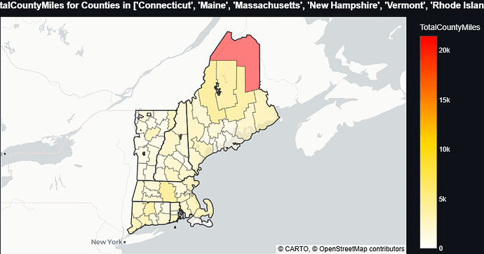
I have been working with some plotly choropleth maps in javascript, and was trying to get US state and county boundaries in different colors by superimposing two choropleth maps.
I am making one transparent map of the states except the lines, with the counties on top of that:
    // The choropleth trace data
    let traces = [
        // The State data that I want just for the outlines
        {
            type: 'choropleth',
            geojson: stateGeojson,
            locationmode: 'geojson-id',
            locations: stateGeoid,
            z: statesData,
            text: stateGeoid,
            colorscale: [[0, 'rgba(0,0,0,0)'],[1, 'rgba(0,0,0,0)']],
            showscale: false,
            marker: {
                line: {
                    color: 'rgba(0, 0, 0, 1)',
                    width: 0.7
                },
                opacity: 1
            },
            geo: 'geo'
        },
        // actual county data to plot
        {
            type: 'choropleth',
            geojson: countyGeojson,
            locationmode: 'geojson-id',
            locations: unpackData(rows, 'GEO_ID'),
            z: rawData,
            hovertemplate: '<b> %{text}: </b>' +
                           '%{customdata}' +
                           '<extra></extra>',
            text: unpackData(rows, 'Admin2'),
            colorscale: 'Jet',
            marker: {
                line: {
                    color: 'rgba(100, 100, 100, 0.5)',
                    width: 0.3
                },
                opacity: 0.8,
            },
            geo: 'geo'
        },
    ];

    // The layout data - disables most to try and avoid confounding factors
    let layout = {
      title: 'example of attempt to layer choropleth'
      geo: {
          scope: 'usa',
          showsubunits: false,
          showland: false,
          landcolor: 'rgb(10, 10, 10)',
          showlakes: false,
          showcoastlines: false,
          lakecolor: 'rgb(255, 255, 255)',
          visible: false,
      }
  }
The result kinda works, but since I have to make the data map have some opacity, I trade off not being able to see the state lines well with muted data:

I also tried putting the state trace in front, but that blocked hovering on the counties, which is more important than getting the state outlines.
So if anyone know a way to make this work (any way, certainly not attached to this approach), or if I am chasing something that is not feasible beyond what I have, let me know.
Thanks!

