Hi @rohit3463,
Yeah, I’m not sure what that layout.colorbar property is doing there, but that’s not valid in recent versions of plotly.py. I opened an issue at https://github.com/plotly/documentation/issues/1250.
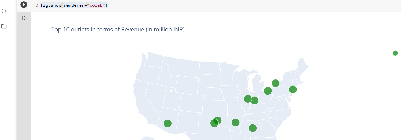
When I remove the colorbar property the plot seems to be working for me. I also converted it to offline mode
from plotly.offline import iplot, init_notebook_mode
import pandas as pd
init_notebook_mode()

df = pd.read_csv('https://raw.githubusercontent.com/plotly/datasets/master/2011_february_us_airport_traffic.csv')
df.head()

df['text'] = df['airport'] + '' + df['city'] + ', ' + df['state'] + '' + 'Arrivals: ' + df['cnt'].astype(str)

scl = [ [0,"rgb(5, 10, 172)"],[0.35,"rgb(40, 60, 190)"],[0.5,"rgb(70, 100, 245)"],\
    [0.6,"rgb(90, 120, 245)"],[0.7,"rgb(106, 137, 247)"],[1,"rgb(220, 220, 220)"] ]

data = [ dict(
        type = 'scattergeo',
        locationmode = 'USA-states',
        lon = df['long'],
        lat = df['lat'],
        text = df['text'],
        mode = 'markers',
        marker = dict(
            size = 8,
            opacity = 0.8,
            reversescale = True,
            autocolorscale = False,
            symbol = 'square',
            line = dict(
                width=1,
                color='rgba(102, 102, 102)'
            ),
            colorscale = scl,
            cmin = 0,
            color = df['cnt'],
            cmax = df['cnt'].max(),
            colorbar=dict(
                title="Incoming flightsFebruary 2011"
            )
        ))]

layout = dict(
        title = 'Most trafficked US airports<br>(Hover for airport names)',
        geo = dict(
            scope='usa',
            projection=dict( type='albers usa' ),
            showland = True,
            landcolor = "rgb(250, 250, 250)",
            subunitcolor = "rgb(217, 217, 217)",
            countrycolor = "rgb(217, 217, 217)",
            countrywidth = 0.5,
            subunitwidth = 0.5
        ),
    )

fig = dict( data=data, layout=layout )
iplot(fig)
Do you still get an empty plot even with this offline version?
-Jon