Hello Everyone:
I have a Dash Ag Grid table on which I have a callback defined based on “cellValueChanged” property. It works fine for normal columns but is not getting triggered with a column where I have custom cellRendered defined for having a dropdown in each cell.
I don’t know React; and I referred to this link and some minor tweaking to get the below renderer:
dagcomponentfuncs.Dropdown = function (props) {
const { setData, api, node, column } = props;
function selectionHandler(event) {
    // update data in the grid
    const newValue = event.target.value;
    const colId = column.colId;
    node.setDataValue(colId, newValue);

    // update cellRendererData prop so it can be used to trigger a callback
    setData(newValue);

    // Close the dropdown after selection (if this is desired behavior)
    api.stopEditing(false);
}

// Create the dropdown options using values and labels
const options = props.colDef.cellRendererParams.values.map((value, index) => {
    const label = props.colDef.cellRendererParams.labels[index];
    return React.createElement(
        'option',
        { value: value, key: value },
        label
    );
});

// The current value of the dropdown should match the current cell value
const currentValue = props.value;

return React.createElement(
    'div',
    { style: { width: '100%', height: '100%' } },
    React.createElement(
        'select',
        {
            value: currentValue, // Controlled component: the value is set by the cell's value
            onChange: selectionHandler,
            style: { width: '100%', height: '100%' }
        },
        options
    )
);
};
And I am setting these properties in the column definition for this column:
col_meta[“cellEditor”] = “Dropdown”
col_meta[“cellRenderer”] = “Dropdown”
col_meta[“cellRendererParams”] = {
“labels”: list_of_labels,
“values”: list_of_values,
}
Does anyone see any obvious mistake here? Is there any other way to have dropdowns in each cell and have callback triggered on them?
Thanks a lot!
I have some examples of using a dmc.Select in AG Grid cells here. This component will be a lot easier to configure.
Hello @AnnMarieW , sorry for a late reply, but I tried this out yesterday, and works great. I am sticking with your solution.
One thing though that I was trying to accomplish based on your code was to have the notion of “value” and “label” for this custom component, however was not able to do so. So for now, I am showing UI-friendly values on the UI and manually converting them back to back-end values, something which is implicitly provided by dmc Select if used directly in a Dash App.
Hi @manish1022iiti
It’s possible to have the labels and values different. Check out the City column in the example called dmc.Select with grouping
Also, since you found a way to handle it without that feature, you could simplify things by using the built-in select cell editor:
Ahh, should have scrolled further down. Added unnecessary complexity in my code.
Thanks for sharing this. Will definitely incorporate this whenever I get to this next.
Another thing I was wondering is if there is a way to make it obvious that a particular cell/column has dropdowns without actually clicking on the cell. Any way to show the dropdown icon without clicking on the cell?
Thank you.
Ah figured it, I used another render in the col def of my Dash Ag Grid table, below renderer for showing Pencil Icon:
dagcomponentfuncs.PencilIconRenderer = function(params) {
var icon = React.createElement(‘i’, {
className: “fa fa-pencil”,
‘aria-hidden’: “true”
});
var container = React.createElement(‘span’, {}, icon, ’ ', params.value);
return container;
};
Oh, that’s a good idea! Yes, you can add a cellrenderer to show a small dropdown icon. You can see some examples with some other component examples. I’ll add that example next week too 
That sounds awesome @AnnMarieW. Thank you.
You could also just use a cellRenderer as the drop-down, and turn off the cell editor if you want to.
The downside is you need to use set the value of the cell using the api in a slightly different way.
You also wouldn’t be able to go into the editing the same way. So, from a UX perspective it’s a little confusing.
@manish1022iiti
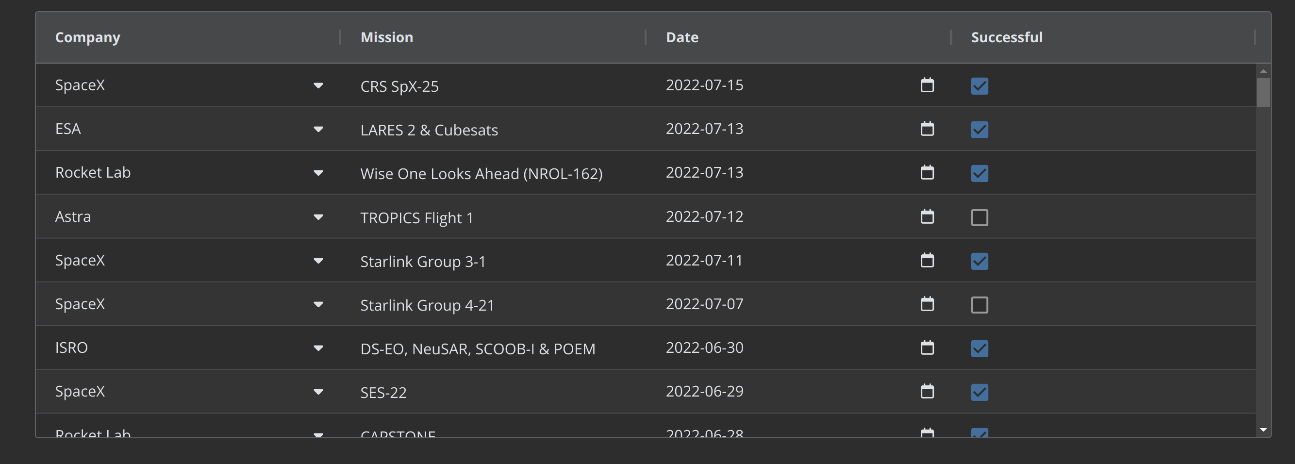
Here is an example of using a cell renderer to add a right aligned icon to indicate a cell is editable. This demo uses the Provided Cell Editors, but it can be used with custom cell editors (like the dmc.Select) component as well.
The same cell render component cellEditorIcon is used to add icons to both the Company column and the Date column. You can specify the icon using the “icon” prop in the cellRendererParams
import dash_ag_grid as dag
from dash import Dash, html
import pandas as pd


app = Dash(__name__, external_stylesheets=["https://use.fontawesome.com/releases/v5.15.4/css/all.css"])

df = pd.read_csv("https://raw.githubusercontent.com/plotly/datasets/master/ag-grid/space-mission-data.csv")

columnDefs = [
    {
        "field": "company",
        "cellRenderer": "cellEditorIcon",
        "cellRendererParams": {
            "icon": "fas fa-caret-down",
        },
        "cellEditor": "agSelectCellEditor",
        "cellEditorParams": {
            "values": df["company"].unique(),
        }
    },
    {"field": "mission"},
    {
        "field": "date",
        "cellRenderer": "cellEditorIcon",
        "cellRendererParams": {
            "icon": "far fa-calendar",
        },
    },
    {"field": "successful"}
]

app.layout = html.Div(
    [
        dag.AgGrid(
            rowData=df.to_dict("records"),
            columnDefs=columnDefs,
            defaultColDef={"flex":1, "editable":True},
            dashGridOptions = {"singleClickEdit": True}

        ),
    ],
)


"""
Put the following in the dashAgGridComponentFunctions.js file in the assets folder

-----------

var dagcomponentfuncs = window.dashAgGridComponentFunctions = window.dashAgGridComponentFunctions || {};


// adds a right aligned icon to a cell
dagcomponentfuncs.cellEditorIcon = function (props) {
  return React.createElement(
    'span',
    {
      style: {
        width: '100%',
        height: '100%',
        display: 'flex',
        alignItems: 'center',
      },
    },
    props.value,
    React.createElement('i', {
      className: props.icon,
      style: { marginLeft: 'auto' },
    })
  );
}


"""


if __name__ == "__main__":
    app.run(debug=True)
You can find a live version of this example, along with other custom component examples here:
Ah I see, yeah, makes sense! thanks.
This looks great @AnnMarieW Definitely going to use this! Thank you.
I will note, that with the version of 2.16.1 from dash, you can now trigger your own cellValueChanged event via set_props on the dash_clientside, you just need to know the id and the props that you are setting.
This would allow for a cellRenderer to interact just like a regular cellEditor. This does require using an id in the grid, which could be passed as a cellRendererParams. 
Hello @jinnyzor a bit too late to this thread, and not sure if I understand this fully correctly, but I get the idea that with the said Dash version, we will be able to use “cellRenderer” on clientside to achieve the benefits of a cellEditor too without explicitly defining a “cellEditor”. Is my understanding correct on this? If any example, that would be great.
Thank you.
Hello @AnnMarieW
So I am back to this problem, this time with a slight enhancement that I am trying to achieve.
Now, I want to have a “different” set of dropdown values in each cell of the column. For example, for a column named “Food”, one cell might have options “[veg salad; tofu]” and the other cell might have “[chicken salad, salmon]” for two different people with different food preferences (Assume that this information person-to-food-preferences is available to us and we now to need to display it in the dropdowns in various cells).
Hi @manish1022iiti
Yes that’s possible - there is an example in the docs where the dropdown in the cell of one column (the city) is based on the value of another column (the country)
Hello @AnnMarieW Thanks for sharing this. This is helpful. Do you know how I can maybe pass an additional parameter to the cellEditorParams function that provides the map b/w country-to-cities. Imagine 100 countries and several cities in each of those; I can not hardcode the mapping b/w these countries and cities inside the java script function used by the cellEditorParams, is there a way to do it eloquently?
Thank you.
Hi @manish1022iiti
Great question!
You can pass a dict from the app to the JavaScript function. It makes the JS function even simpler! Might need update the docs to use this example
Here’s an example based on the one in the docs:
Put this in the dashAgGridFunctions.js file in the assets folder:
var dagfuncs = (window.dashAgGridFunctions = window.dashAgGridFunctions || {});

dagfuncs.dynamicOptions = function (params, options) {
    return {values: options[params.data.country]}
};
import dash_ag_grid as dag
from dash import Dash, html

app = Dash(__name__)

options = {
    "United States": ["Boston", "Seattle", "Chicago"],
    "Canada": ["Vancouver", "Montreal", "Toronto"]
}

columnDefs = [
    {"field": "country"},
    {
        "headerName": "Select Editor",
        "field": "city",
        "editable": True,
        "cellEditor": "agSelectCellEditor",
        "cellEditorParams": {"function": f"dynamicOptions(params, {options})"},
    },

]

rowData = [
    {"country": "United States", "city": "Boston"},
    {"country": "Canada", "city": "Montreal"},
    {"country": "Canada", "city": "Vancouver"},
]

app.layout = html.Div(
    [
        dag.AgGrid(
            id="cell-editors-dynamic",
            columnDefs=columnDefs,
            rowData=rowData,
            columnSize="sizeToFit",
            dashGridOptions={"animateRows": False},
        ),
    ]
)

if __name__ == "__main__":
    app.run(debug=True)
@AnnMarieW Thanks for getting back. This worked for me, thanks a ton!
@AnnMarieW It’s so interesting and exciting to see how Dash has support for doing such nuanced UI things directly or via leveraging ReactJS. I have been using Dash for a few months and now see myself often running into use cases where I might benefit from creating custom components/options as we have been discussing in this thread. I think I should take up a React course to further utilize Dash, haha!