I want to create a two bar charts layered over one another with categorical variables at y axis and numeric variables on different x axis. How can i do that?
Step one.
Create different traces for each subset , the following trace example will be used as the reference for xaxis2
example
add_trace(

						# create y axis line parallel to xx'
						# The line follows the positions of actual snps, so that each snp can be found easily on the grid

						type = 'scattergl', #
						mode = 'lines',
						name = 'significance limit',

						# specific color for markers
						line = list(color = "rgb(255,10,0)"),

						y = Log_P_CUTOFF,  # use the user selected cutoff limit as the y intercept

						x = ~unique(XXX$XXX),  # take in account all CHR positions

						xaxis = 'x2',  # use this as the way to use this trace for the second x axis

						hoverinfo = 'none'

						)%>%
Step two:
create a layout for each xaxis, setting the position that you want the xaxis to be positioned on the plot
layout(

						title = paste(title_for_plottly_online), # get title from user settings

							xaxis = list(

										title = 'xxxxx',
										side = "top",
										showgrid = TRUE,
										tickvals = xxxx , #look it up
										ticktext = ~xxxxx, #sets tick text, gets it from CHR ID
										ticks = "outside",
										tick0 = 0,
										tickwidth = 1,
										tickfont = list(color = "blue"),
										tickcolor = toRGB("blue")
									  ),

					 	 	xaxis2 = list(
						 				#xaxis ticks at chromosomes
						 				overlaying = "x", #important! as the xaxis1 should be the main one
						 				side = "bottom",
						 				title = 'xxx',
						 			#	range = c(xmin,xmax),
						 			#	zeroline = TRUE,
						 			#	#autotick = FALSE,
						 				tickmode = "array",
						 				tickmode = "auto",
						 				nticks = xxxx , # sets number of ticks. Has effect when tickmode = "auto"

						 				tickcolor = toRGB("red"),
						 				tickfont = list(color = "red")
						 			  ),
Step three: check if you are missing any ) or (…
I was able to plot with 2 x axis but my issue is I m getting 2 “line 0” for Y axis. Below is the r plotly script. please advise as to how to merge both “line 0” into one.
f1 <- list(
family = "Arial, sans-serif",
size = 18,
color = "grey"
)
f2 <- list(
family = "Old Standard TT, serif",
size = 14,
color = "#4477AA"
)
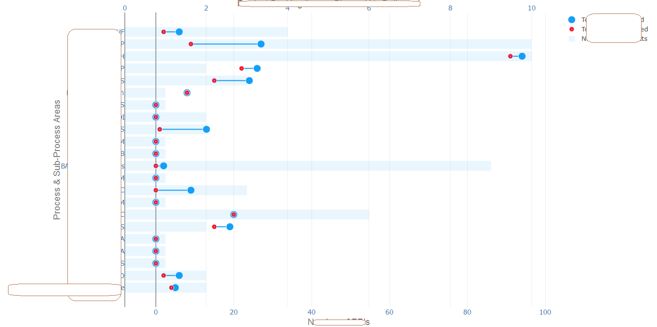
ax <- list(
title = "Number of PBIs",
titlefont = f1,
anchor = "y",
side = "bottom",
showticklabels = TRUE,
tickangle = 0,
tickfont = f2
)
ax2 <- list(
title = " ",
overlaying = "x",
anchor = "y",
side = "top",
titlefont = f1,
showticklabels = TRUE,
tickangle = 0,
tickfont = f2
)
ay <- list(
title = "Process & Sub-Process Areas",
titlefont = f1,
showticklabels = TRUE,
tickangle = 0,
tickfont = f2
)
plot_ly(data = scrum %>%
group_by(Master.Project) %>%
summarise(Total_PBIs_Planned=sum(PBIs.Planned.in.Sprint, na.rm = TRUE),
Total_PBIs_Delivered = sum(Actual.PBI.Delivery,na.rm = TRUE)) %>% inner_join(scrum %>% count(Master.Project)),
color = I("#149EF7")) %>%
add_segments(x = ~Total_PBIs_Planned, xend = ~Total_PBIs_Delivered,
y = ~Master.Project, yend = ~Master.Project, showlegend = FALSE) %>%
add_trace(x = ~Total_PBIs_Planned, y = ~Master.Project,
name = "Total_PBIs_Planned", type = 'scatter',mode = "markers",
marker = list(color = "#149EF7", size = 15,
line = list(color = '#FFFFFF', width = 1))) %>%
add_trace(x = ~Total_PBIs_Delivered, y = ~Master.Project,
name = "Total_PBIs_Delivered",type = 'scatter',mode = "markers",
marker = list(symbol ="circle-dot",color = "#F71430", size = 10,
line = list(color = '#FFFFFF', width = 1))) %>%
add_trace(x = ~n, y = ~Master.Project, xaxis = "x2",
name = "No._of_Sub_projects",type = 'bar',
marker = list(color = "#149EF7"),
opacity = 0.1,
hoverinfo = 'text',
text = ~paste(
Master.Project,
'<br> Total Sub Projects: ',n,
'<br> PBIs Planned: ',Total_PBIs_Planned,
'<br> PBIs Delivered: ',Total_PBIs_Delivered
)
) %>%
layout(
title = "Product Backlog Items - Planned Vs Delivered", titlefont = f1,
xaxis = ax, xaxis2 = ax2,
yaxis = ay,
margin = list(l = 250)
)