There is a tutorial of making dumbbell plots in plotly R but not python.
Being a Python user, I’m just wondering if how can it be made in Py.
There is a tutorial of making dumbbell plots in plotly R but not python.
Being a Python user, I’m just wondering if how can it be made in Py.
Hi @verypsb,
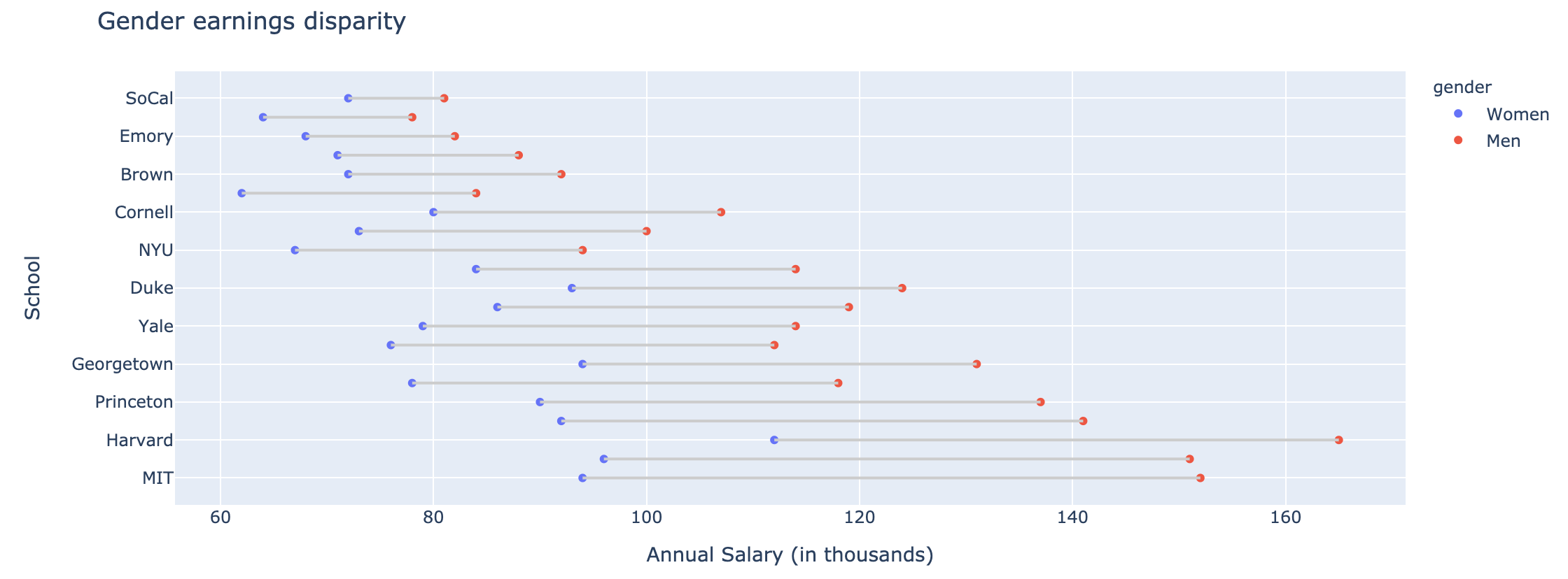
here is one way to do it (with the example from the plotly R docs) 
import pandas as pd
import plotly.express as px

df = pd.read_csv("https://raw.githubusercontent.com/plotly/datasets/master/school_earnings.csv")

fig = px.scatter(df, x=['Women','Men'], y='School', labels={'variable':'gender'})
fig.update_layout(title_text = "Gender earnings disparity",
    xaxis_title = "Annual Salary (in thousands)",
    margin_l = 65)
for i in range(df.shape[0]):
    fig.add_shape(
        type='line',
        x0=df['Women'].iloc[i], y0=df['School'].iloc[i],
        x1=df['Men'].iloc[i], y1=df['School'].iloc[i],
        line_color="#cccccc"
    )
fig.show()
hope this helps, Alex-
Thanks so much, @Alexboiboi. I didn’t realize the new plotly that supports add_Line, add_shapes, etc was released.
Does the documentation update to add tutorials about add customized lines?