How to include a colorscale for color of line graphs

Hi,
Hope you are well. I wanted to recreate a vector plot like the one below using Plotly:


I have written code (below), that plots the vectors as desired, however, I wanted to assign a colour scale to the colours of the lines. The colours of the lines would be equal to df[β€œcos2”]. I am unsure of how to proceed and include this. Any help would be much appreciated.
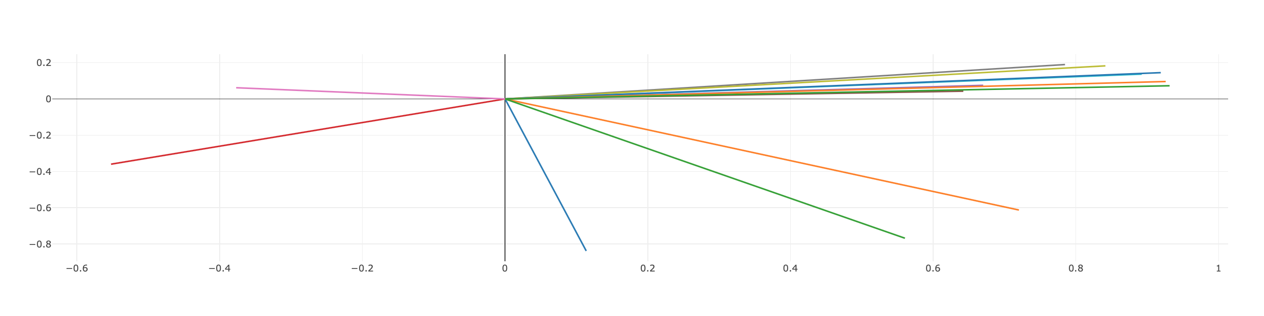
The output of current code:

import pandas as pd
import plotly.graph_objs as go
import dash
import dash_core_components as dcc
import dash_html_components as html
from dash.dependencies import Input, Output, State
import flask

server = flask.Flask(__name__)
app = dash.Dash(__name__, server=server)

file_path = "/Users/mythilisutharson/documents/cam_work/explorer_data/AAML_Oxygen_Data_cos2.csv"
df = pd.read_csv(file_path)

fig = go.Figure()
fig1 = go.Figure()

app.layout = html.Div([
    html.Div([
                    html.Div([dcc.Graph(id='cos2-plot', figure=fig)
                              ], style={},
                             ),
html.Div(
                        [html.Label(["Remove outliers (if any) in analysis:", dcc.RadioItems(
                            id='outlier-value-cos2',
                            options=[{'label': 'Yes', 'value': 'Yes'},
                                     {'label': 'No', 'value': 'No'}],
                            value='No')
                                     ])
                         ], style={'display': 'inline-block',
                                   'width': '49%'}),

])
])

@app.callback(Output('cos2-plot', 'figure'),
              [
                  Input('outlier-value-cos2', 'value'),
              ])
def update_cos2_plot(outlier):
    if outlier == 'Yes':
        data = df
    counter = 0
    lists = [[] for i in range(len(df['line_group'].unique()))]
    for i in df['line_group'].unique():
        dataf_all = df[df['line_group'] == i]
        trace1_all = go.Scatter(x=dataf_all['PC1'], y=dataf_all['PC2'], mode='lines+text',
                                name=i,
                                textposition='bottom right', textfont=dict(size=12)
                                )
        lists[counter] = trace1_all
        counter = counter + 1
    return {'data': lists,
            'layout': go.Layout(showlegend=False)}


if __name__ == '__main__':
    app.run_server()

Data used for code:

Hi msuths1,

Plotly does not provide the colorscale attribute for lines of a scatter trace, of mode='lines'.
Even heatmap, contour and surface don’t return the color code in a colorscale corresponding to a z-value.

For your vectors you can use a custom function that returns the color for each particular value in an interval.
To call such a function you have first to choose from plotly.colors https://github.com/plotly/plotly.py/tree/master/packages/python/plotly/_plotly_utils/colors
a list of colors, pl_colors, for a colorscale:

from plotly.colors import * 

pl_colors = cmocean.deep  # define the deep colorsale

The custom function:

from ast import literal_eval
import numpy as np
def get_color_for_val(val, vmin, vmax, pl_colors):
    
    if pl_colors[0][:3] != 'rgb':
        raise ValueError('This function works only with Plotly  rgb-colorscales')
    if vmin >= vmax:
        raise ValueError('vmin should be < vmax')
    
    scale = [k/(len(pl_colors)-1) for k in range(len(pl_colors))] 
   
   
    colors_01 = np.array([literal_eval(color[3:]) for color in pl_colors])/255.  #color codes in [0,1]
   
    v= (val - vmin) / (vmax - vmin) # val is mapped to v in [0,1]
    #find two consecutive values in plotly_scale such that   v is in  the corresponding interval
    idx = 1
   
    while(v > scale[idx]): 
        idx += 1
    vv = (v - scale[idx-1]) / (scale[idx] -scale[idx-1] )
    
    #get   [0,1]-valued color code representing the rgb color corresponding to val
    val_color01 = colors_01[idx-1] + vv * (colors_01[idx ] - colors_01[idx-1])
    val_color_0255 = (255*val_color01+0.5).astype(int)
    return f'rgb{str(tuple(val_color_0255))}'

Example:

get_color_for_val(2.3, 1, 5, pl_colors) 

returns 'rgb(62, 81, 157)'

In your case vmin, vmax are the min, respectively the max value in the column cos2.

Unfortunately you cannot plot a naturally associated colorbar. To get it displayed you should define a dummy Scatter trace, mode='markers', with two markers, of size= 0, and marker['color']=[vmin, vmax].

Hi @empet,
Thank you for your detailed explanation. I have tried incorporating the custom function that you have mentioned but an error comes up.

import pandas as pd
import plotly.graph_objs as go
import dash
import dash_core_components as dcc
import dash_html_components as html
from dash.dependencies import Input, Output, State
import flask
from plotly.colors import *
from ast import literal_eval
import numpy as np

server = flask.Flask(__name__)
app = dash.Dash(__name__, server=server)

file_path = "/Users/mythilisutharson/documents/cam_work/explorer_data/AAML_Oxygen_Data_cos2.csv"
df = pd.read_csv(file_path)

fig = go.Figure()
fig1 = go.Figure()

app.layout = html.Div([
    html.Div([
                    html.Div([dcc.Graph(id='cos2-plot', figure=fig)
                              ], style={},
                             ),
html.Div(
                        [html.Label(["Remove outliers (if any) in analysis:", dcc.RadioItems(
                            id='outlier-value-cos2',
                            options=[{'label': 'Yes', 'value': 'Yes'},
                                     {'label': 'No', 'value': 'No'}],
                            value='No')
                                     ])
                         ], style={'display': 'inline-block',
                                   'width': '49%'}),

])
])


pl_colors = cmocean.deep
def get_color_for_val(val, vmin, vmax, pl_colors):
    if pl_colors[0][:3] != 'rgb':
        raise ValueError('This function works only with Plotly  rgb-colorscales')
    if vmin >= vmax:
        raise ValueError('vmin should be < vmax')

    scale = [round(k / (len(pl_colors)), 3) for k in range(len(pl_colors) + 1)]

    colors_01 = np.array([literal_eval(color[3:]) for color in pl_colors]) / 255  # color codes in [0,1]

    v = (val - vmin) / (vmax - vmin)  # val is mapped to v in [0,1]
    # find two consecutive values in plotly_scale such that   v is in  the corresponding interval
    idx = 0

    while (v > scale[idx + 1]):
        idx += 1

    vv = (v - scale[idx]) / (scale[idx + 1] - scale[idx])

    # get   [0,1]-valued color code representing the rgb color corresponding to val
    val_color01 = colors_01[idx] + vv * (colors_01[idx + 1] - colors_01[idx])
    val_color_0255 = (255 * val_color01 + 0.5).astype(int)
    return f'rgb{str(tuple(val_color_0255))}'


@app.callback(Output('cos2-plot', 'figure'),
              [
                  Input('outlier-value-cos2', 'value'),
              ])
def update_cos2_plot(outlier):
    if outlier == 'Yes':
        data = df
    counter = 0
    lists = [[] for i in range(len(df['line_group'].unique()))]
    for i in df['line_group'].unique():
        dataf_all = df[df['line_group'] == i]
        trace1_all = go.Scatter(x=dataf_all['PC1'], y=dataf_all['PC2'], mode='lines+text',
                                name=i,
                                line=dict(color=get_color_for_val(dataf_all["cos2"], df["cos2"].min(), df["cos2"].max(), pl_colors)),
                                textposition='bottom right', textfont=dict(size=12)
                                )
        lists[counter] = trace1_all
        counter = counter + 1
    
    return {'data': lists,
            'layout': go.Layout(showlegend=False)}


if __name__ == '__main__':
    app.run_server()

For the line

    while (v > scale[idx + 1]):

I get the error:
β€œThe truth value of a Series is ambiguous. Use a.empty, a.bool(), a.item(), a.any() or a.all().”
I am unsure of how to fix this.
Thank you!

@msuths1
That error appears because you passed to the function get_color_for_val the whole column cos2.
It works only for individual values.
Namely, for each val in cos2 you get a color code for a line ( vector). Define a scatter trace, mode=' lines' for each vector, and set as line['color'] the computed color. Unlike the marker['color'], the line[β€˜color’] cannot be a list o colors.

Hi @empet,
Thank you! I have now got it working.

1 Like