Hi there,
I’m new to plotly, coming from ggplot2, so trying my first steps in this territory. I shall note that I’ve published my question already at Stack Overflow, but haven’t gotten any useful tips yet. Thus, I’m posting it here too.
I have plotted a pie chart using the following code, but I cannot set the pie itself to be aligned at the horizontal center. This is particularly annoying because the title is easy to set using xanchor = "center".
library(dplyr)
library(plotly)

data_for_plot <-
  mtcars %>%
  count(cyl)

> data_for_plot

##    cyl  n
## 1   4 11
## 2   6  7
## 3   8 14


plot_ly(data_for_plot, labels = ~cyl, values = ~n, type = 'pie', hole = 0.05 ,textposition = 'outside',textinfo = 'percent') %>%
  layout(title = list(text = "my nice title is here", xanchor = "center"),
         showlegend = F,
         xaxis = list(showgrid = FALSE, zeroline = FALSE, showticklabels = TRUE),
         yaxis = list(showgrid = FALSE, zeroline = FALSE, showticklabels = TRUE)) %>%
  layout(paper_bgcolor = "pink")
This gives the following output:
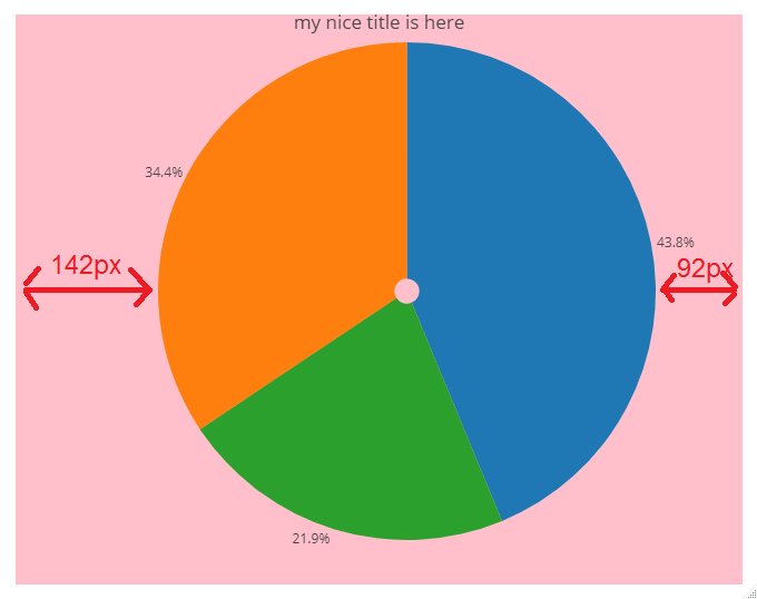
Is there a way to align the pie at the horizontal center? I’ve tried many attributes within layout(), but so far couldn’t find a solution.
Thanks!