How to get plotly to use the set locale

Hi there,

Iā€™m an absolute beginner when it comes to plotly and Iā€™m stuck - I hope someone can help me.

I canā€™t for the life of me get plotly to respect the locale I set. Everything is always in English (including number formats).

Iā€™m using locale.setlocale(locale.LC_ALL, '') to set the locale, but plotly doesnā€™t seem to care. (I know it works in general, as printing the current weekday comes out in my local language. Just all my plots are still in English.)
I know about this: https://github.com/d3/d3-time-format/blob/master/README.md#locale_format
But all the specifiers that should produce something local (like %a) just come out as English in the chart.

So the question is: how can I get plotly to use the locally appropriate language and number formats?

Please help me, I feel like an idiot, getting stuck at something so basic!
Thanks for your help.

Hi @FLudwig,

This is an example that works:

import pandas as pd
import numpy as np
import plotly.graph_objs as go
from datetime import datetime
import locale


#Get information on the actual locale setting:

print(locale.getlocale())
('en_US', 'UTF-8')


#Set locale for another country:

locale.setlocale(locale.LC_TIME, 'de_DE') # this sets the date time formats to Germany; there are many other options for currency, numbers etc. 
#for any other locale settings see: https://docs.python.org/3/library/locale.html

d = {'date': [datetime(2020, k, 15).strftime('%d  %B, %Y') for k in range(2,7)],
      'A': np.random.rand(5)}
df=pd.DataFrame(d)
print(df)

fig = go.Figure(go.Scatter(x=df['date'], y=df['A']))
fig.show()

Youā€™ll see that the dataframe is displayed like this:

                date         A
0  15  Februar, 2020  0.541385
1     15  MƤrz, 2020  0.889526
2    15  April, 2020  0.453590
3      15  Mai, 2020  0.635907
4     15  Juni, 2020  0.368840

Hence, just replace ā€˜de_DEā€™ with your locale.

Hi empet,

thank you so much for your response. Unfortunately I still donā€™t understand it. Thatā€™s pretty much what I doā€¦

In the beginning of my code, I do the following to make sure I got the right locale:

print(datetime.datetime.today().strftime('%A'))

locale.setlocale(locale.LC_ALL, '')

print(datetime.datetime.today().strftime('%A'))

This gives me the weekday first in english and then in my language, so I know I got that part right. Then I import my data from excel to get my dataframe (time series). Then I use the following to format the x-axis depending on the zoom level:

tickformatstops=[
           ...
            dict(dtickrange=[3600000, 86400000], value="%a %d. %b %H:%M"),
            dict(dtickrange=["M1", "M12"], value="%b '%y"),
            dict(dtickrange=["M12", None], value="%Y")

Which should use the setting in locale to display stuff like the day of the week or the month, but itā€™s always English. For example, according to the documentation, %a should give me the ā€œWeekday as localeā€™s abbreviated nameā€.

Does this make sense to you? Maybe you can find my mistake in this?

@FLudwig

I changed to another locale and it works. In your example above you didnā€™t set explictly which locale are you setting.

With the same imports and dataframe definition like in my first example I get the right locale for France:

locale.setlocale(locale.LC_ALL, 'fr_FR')#Unlike your locale setting I specified `fr_FR`. You have  just a blank!!!!

Dataframe:


date	A
0	15 fƩvrier, 2020	0.204496
1	15 mars, 2020	0.274823
2	15 avril, 2020	0.580947
3	15 mai, 2020	0.427788
4	15 juin, 2020	0.249633
print(datetime.today().strftime('%A'))
lundi
print(datetime(2020, 8, 10).strftime('%A %d  %B, %Y'))
lundi 10  aoƻt, 2020

For Switzerland, you can set:

`fr_CH`, `de_CH`, `it_CH`
locale.setlocale(locale.LC_ALL,'it_CH')
print(datetime.today().strftime('%A'))

lunedƬ

Plotly adopted d3.js locale.format https://github.com/d3/d3-time-format/blob/master/README.md#locale_format.

Hi empet,

leaving the locale blank sets it to the default of the computer youā€™re using, which is what I want to do, so I can send it to someone in another country and they see it in their language.

Setting the locale is not the problem. As I said, it does work in the python output (using ā€˜printā€™). The problem is that the plotly graph is always in English, no matter what locale I set.

@FLudwig

I think that setting locale.setlocale(locale.LC_ALL, '') is not sufficiently informative for Plotly, because you did not set a speciffic locale.

For me Plotly 4.9.0 works as expected, by setting explicitly some locale:


I still donā€™t get it. It must have something to do with the pandas dataframe.

I used your code and ran it - it works as intended on my computer (leaving the locale blank works as intended as well). Now if I use your code with the locale set to de_DE, but use my dataframe, which I imported from a csv (I also tried it with an xlsx), everything is English again. All I changed in your code is using the following to get the data, and everyting is English:

df = pd.read_excel("file")

It looks like pandas is the problem, not plotly. When I create a dataframe by importing data, everything switches back to English, no matter what locale is set.
I couldnā€™t figure out, how to fix that yet, but Iā€™ll let you know if I find something.

@FLudwig

Could you, please, upload somewhere a dataframe similar to that you are reading, but only with a few rows?

Hi empet,

I uploaded an Excel-file here:

@FLudwig

Your df[ā€˜Datumā€™] contains timestamps. I converted them to datetime as follows:

locale.setlocale(locale.LC_ALL,'de_DE')
#datet = [tstamp.to_pydatetime().strftime('%B %d, %Y, %r') for  tstamp in df['Datum']] 
datet = [tstamp.strftime('%B %d, %Y, %r') for  tstamp in df['Datum']] 
fig=go.Figure(go.Scatter(x=datet, y=df['W']))
fig.update_xaxes(tickangle=-45)

and got this plot:

EDIT: No pydatetime() conversion is needed in the datet definition.

Hi empet,

Iā€™m really sorry, but I donā€™t understand. If I get this right, you produce a new ā€œcolumnā€ in which you convert the date to a string. Why do you need to do that?

When I read the excel file, pandas seems to understand that the first column is a date just fine. I can for example use df = df.set_index('Datum') to make the date-column the index, or df = df.resample('H', on='Datum').sum() to get hourly data. So Pandas must understand which number is the year, which is the hour, and so on.

Datum                                                                      
2018-01-01 00:00:00       63.812                 23.528        42.1  304.80
2018-01-01 01:00:00       89.528                 31.232        56.7  412.08
2018-01-01 02:00:00       85.776                 30.608        56.4  402.00

So Pandas understands the date in the excel file and plotly understands the date in the pandas dataframe. Why canā€™t I get them to use a different language for the data that is already there? And why can you get them to use a different language if you produce some new data, which is basically a copy of the data both pandas and plotly already understand?

I can imagine this getting frustrating for you, empet. Sorry, that Iā€™m so slow on the uptake. A lot of this just doesnā€™t make any sense to me. Thank you for sticking with this for so long!

1 Like

@FLudwig
Yes, pandas understands that it is a timestamp (have you seen my later edit?), but Plotly(?) cannot display that timestamp according to a particular locale. I think itā€™s the time that generates this issue.

OK, I give up. It still doesnā€™t make any sense to me, but Iā€™ll just accept, that it doesnā€™t work like I thought it should.

Thanks for all your help, empet!

@empet Can you help me in this thread? Locale not working

Hi!

Sorry to revive an old topic, but Iā€™ve been searching around the web for hours and could not find an appropriate solution.

First of all, the standard way to set the locale in Python is

import locale
locale.setlocale(locale.LC_ALL, "pt_BR.UTF-8")

This works for anything in the Python standard library, like the datetime module and others, as long as the locale you are trying to set is installed on your system. I have even written an article about it which further explains the details.

With Plotly, inside Jupyter Notebook / Jupyter Lab however, itā€™s not so simple. Apparently, you need to pass the locale to the configuration options, such as this .show(config={"locale": "de"}). But that doesnā€™t work on its own. You need also to include the localization script in the html. I found instructions on how to do that in Dash, but not in Jupyter Notebook.

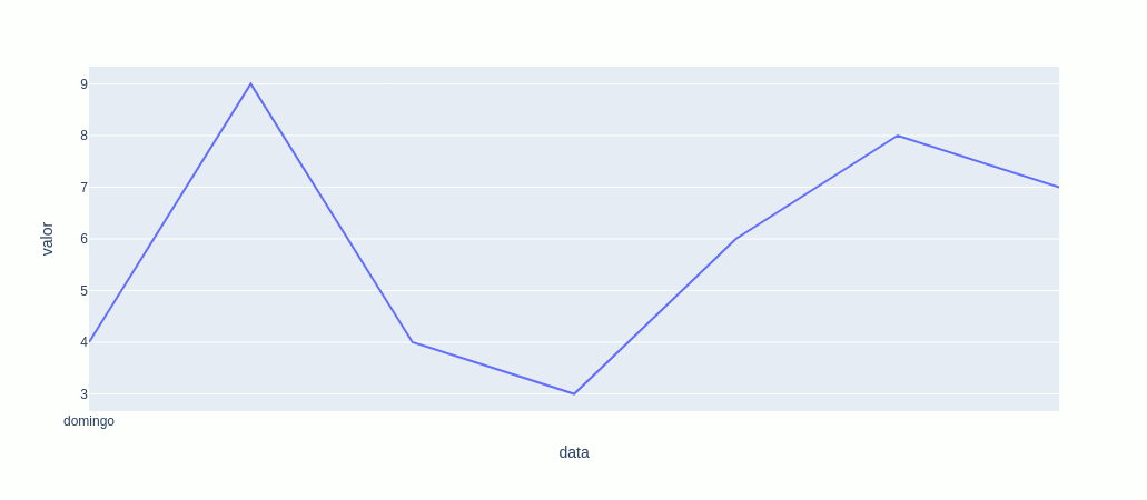
For instance, the following code will create a chart with the weekdays in English, despite setting the locale differently:

from random import choice
from datetime import date
import plotly.express as px

(
    px.line(
        {
            'data': [date(2021,6,20 + days) for days in range(7)],
            'valor': [choice(range(10)) for val in range(7)]
        },
        x='data',
        y='valor'
    )
    .update_xaxes(tickformat='%A')
    .show(config={'locale': 'pt-BR'})
)

@empetā€™s solution in the messages above involves converting the dates to strings in Python outside Plotly. Something like this:

(
    px.line(
        {
            'data': [date(2021,6,20 + days).strftime('%A') for days in range(7)],
            'valor': [choice(range(10)) for val in range(7)]
        },
        x='data',
        y='valor'
    )
    #.update_xaxes(tickformat='%A')
    #.show(config={'locale': 'pt-BR'})
)

It may seem to ā€œworkā€ if your needs are very simple. However, if you try for instance to make any adjustments to the ticks, the fact that you are using strings instead of dates will make that impossible and break things. See this example that should display every other day on the x-axis:

(
    px.line(
        {
            'data': [date(2021,6,20 + days).strftime('%A') for days in range(7)],
            'valor': [choice(range(10)) for val in range(7)]
        },
        x='data',
        y='valor'
    )
    .update_xaxes(dtick=86400000*2, tickformat='%A')
    #.show(config={'locale': 'pt-BR'})
)

Because weā€™re using strings instead of real dates, Plotly canā€™t figure out the proper interval.

The proper way to do this should be by passing dates to Plotly and letting it format the dates using locale internally. This might work in HTML, but inside Jupyter Notebook the locale script is not loaded and we get it in English instead:

(
    px.line(
        {
            'data': [date(2021,6,20 + days) for days in range(7)],
            'valor': [choice(range(10)) for val in range(7)]
        },
        x='data',
        y='valor'
    )
    .update_xaxes(dtick=86400000*2, tickformat='%A')
    .show(config={'locale': 'pt-BR'})
)

Where 86400000 is the number of milliseconds in a day, as in the example in the docs. We see every other day (Monday, Wednesday, Friday) as expected there, however, the locale is not applied at all.

How can we make Plotly really apply the locale by its own, when using Jupyter Notebook / Jupyter Lab, instead of ā€œcheatingā€ and converting the dates to strings before passing them on to Plotly?

1 Like

At the moment, Plotly.py is unable to use Plotly.jsā€™ localization features. As you mention above, the known workarounds today are to use strings and categorical axes rather than date axes.

2 Likes

Thanks for the clarification. Iā€™ll use the workarounds for now, then. I hope it becomes possible in the future to use Plotly.jsā€™s localization features inside Plotly.py and Jupyter.

2 Likes

Hi @herrmann Hermann, did you find a solution? Iā€™d like to get locale format for ā€œauto textā€ values.

Unfortunately, no. I used the mentioned workaround at the time and have not touched it since.

The mentioned workaround didnā€™t do what I expected. It seems to work for formatting axis labels, but not auto text values.

Percentage should use comma instead of dot and tooltip text should be ā€œSoma deā€.