I have a plotly chart that tracks the live sentiment for various keywords.
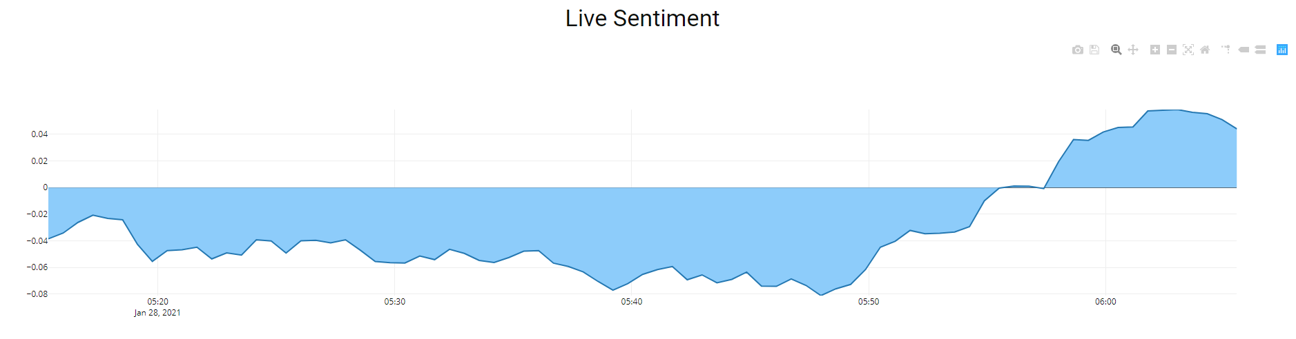
I want the graph to show green when the sentiment is positive and red when it is negative.
app = dash.Dash(__name__)
app.layout = html.Div(
[   html.Div(className='container-fluid', children=[html.H2('Live Market Sentiment', style={'color':"#0C0F0A", 'text-align': 'center'}),
                                                    html.H5('Search Ticker/Stock:', style={'color':app_colors['text']}),
                                              dcc.Dropdown(id='sentiment_term', options = [{'label':s,'value':s} for s in data_dict.keys()],value =['Google-GOOGL'], multi = False),
                                              ],
             style={'width':'98%','margin-left':10,'margin-right':10,'max-width':50000})


@app.callback(Output('live-graph', 'figure'),
          [Input(component_id='sentiment_term', component_property='value')],
          events=[Event('graph-update', 'interval')])
def update_graph_scatter(sentiment_term):

var1 = str(data_dict[sentiment_term][0])
var2 = str(data_dict[sentiment_term][1])

try:
    if sentiment_term:
        df1 = pd.read_sql("SELECT sentiment.* FROM sentiment_fts fts LEFT JOIN sentiment ON fts.rowid = sentiment.id WHERE fts.sentiment_fts MATCH ? ORDER BY fts.rowid DESC LIMIT 1000", conn, params=(var1+'*',))
        df2 = pd.read_sql("SELECT sentiment.* FROM sentiment_fts fts LEFT JOIN sentiment ON fts.rowid = sentiment.id WHERE fts.sentiment_fts MATCH ? ORDER BY fts.rowid DESC LIMIT 1000", conn, params=(var2+'*',))
        df = df1.append(df2)
    else:
        df = pd.read_sql("SELECT * FROM sentiment ORDER BY id DESC, unix DESC LIMIT 1000", conn)
    df.sort_values('unix', inplace=True)
    df['date'] = pd.to_datetime(df['unix'], unit='ms')
    df.set_index('date', inplace=True)
    init_length = len(df)
    df['sentiment_smoothed'] = df['sentiment'].rolling(int(len(df)/5)).mean()
    df = df_resample_sizes(df)
    X = df.index
    Y = df.sentiment_smoothed.values
    Y2 = df.volume.values
    #df_count = pd.read_sql("SELECT * FROM sentiment ORDER BY id DESC LIMIT 1", conn)
    #analyzer_count =df_count.id.max()
    #print(analyzer_count)

    data = plotly.graph_objs.Scatter(
            x=X,
            y=Y,
            name='Sentiment',
            mode= 'lines',
            yaxis='y2',
            fill="tozeroy",
            fillcolor = "#8bcbfc"
            )


    return {'data': [data],'layout' : go.Layout(xaxis=dict(range=[min(X),max(X)]),
                                                      yaxis2=dict(range=[min(Y),max(Y)], side='left', overlaying='y',title='sentiment'),
                                                      title='Live sentiment for: "{}"'.format(sentiment_term),
                                                      font={'color':app_colors['text']},
                                                      plot_bgcolor = app_colors['background'],
                                                      paper_bgcolor = app_colors['background'],
                                                      showlegend=False)}

except Exception as e:
    with open('errors.txt','a') as f:
        f.write(str(e))
        f.write('\n')
I tried adding if conditions to the charts but it does not seem to help. please help!
Thanks