Hi folks.
I have read this article:
And I tried to understand the documentation but I still struggle to create this simple chart. Let’s see if someone knows how to do it.
I have a Pandas dataframe with several columns (col1,col2,…), in each of these columns I have numbers, and I have the date in the index. I don’t understand how to use a time index whose type is DateTime ns so I created a column specifically for the Dates, it is not the best solution but it is something that may work. (This is not the main question so let’s forget this)
import plotly.express as px
import pandas as pd

a = [1,2]
b = [3,5]
c = [2018,2019]

df = pd.DataFrame ({"col1": a, "col2": b, "Dates": c})
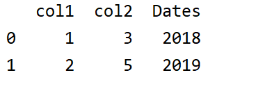
As you can see, we have a simple data structure.
What I want is having the names of the columns shown in the x axis (“col1”, “col2”), and in the y axis I want:
1.- In the first screen, corresponding to Date 2018 the values of the col1 and col2 shown as a bar, the origin of the bar is 0 (always) and the lenght of the bar is the number in the first row of the two columns (in this case it should be 1 and 3).
- After clicking on the “Play button” I want the bars to change its length to the next row. So now the data shown will be:
x labels: Doesn’t change, they are still col1 and col2.
y labels: Doesn’t change, they are simply a range of values.
bar: Origin is again 0, but lenght has changed to 2 and 5.
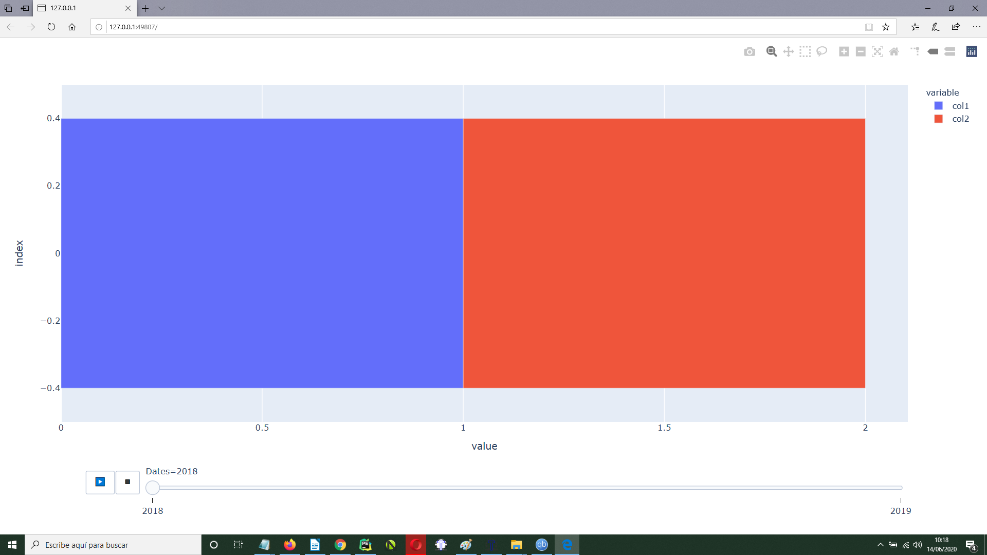
I tried these code:
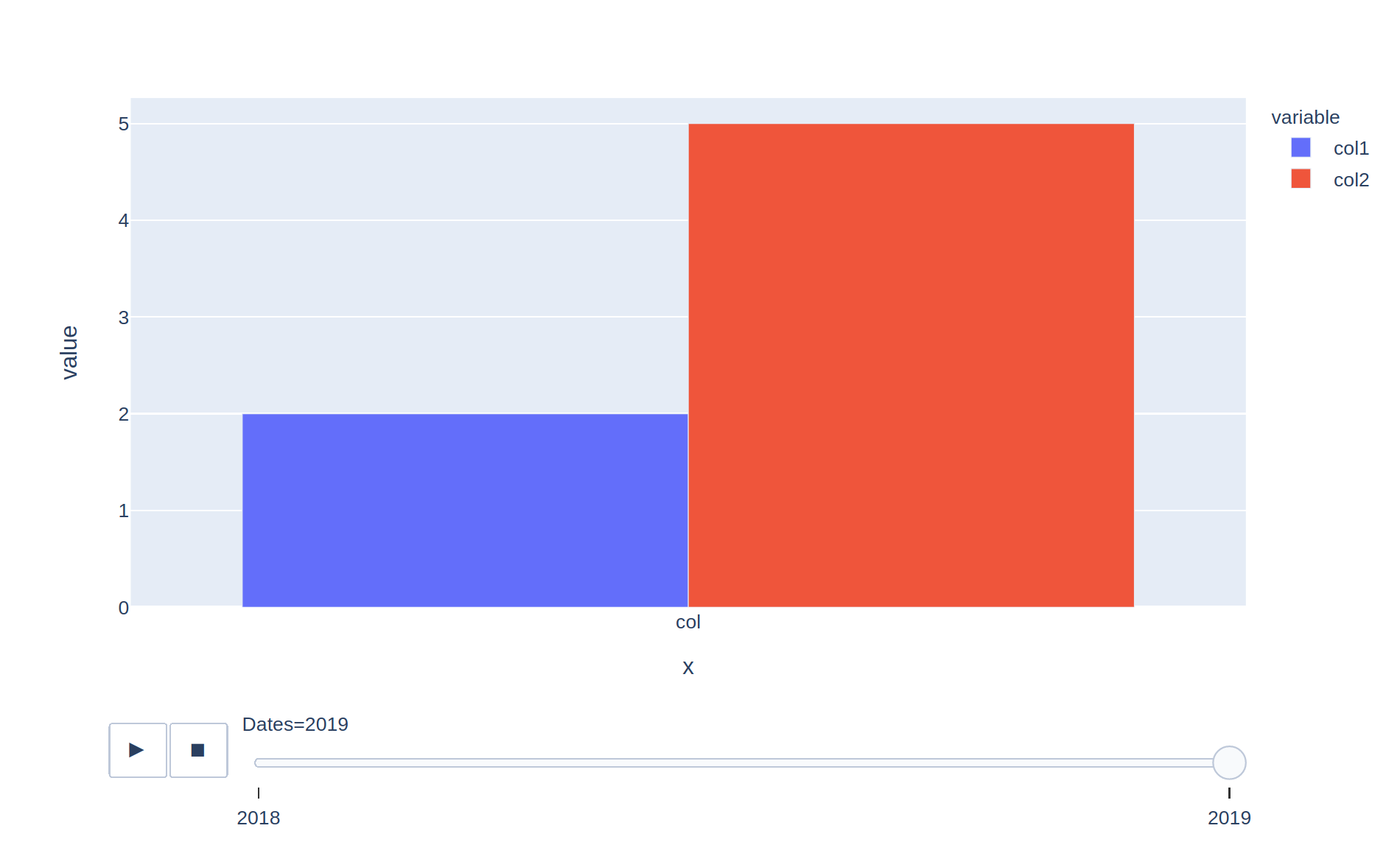
fig = px.bar(df, x = ["col1", "col2"], animation_frame=df.Dates)
But this is what I see:
As you can see:
- The slider below is correct, it starts at 2018 and ends at 2019, that is fine.
- But the origin of the bars on the y axis is not 0, is -0.4.
- When you click on the play button they simply dissapear because they don’t start from 0 at every different timestamp.
- In the x axis I don’t see the names of the columns.
This is basically what I want:
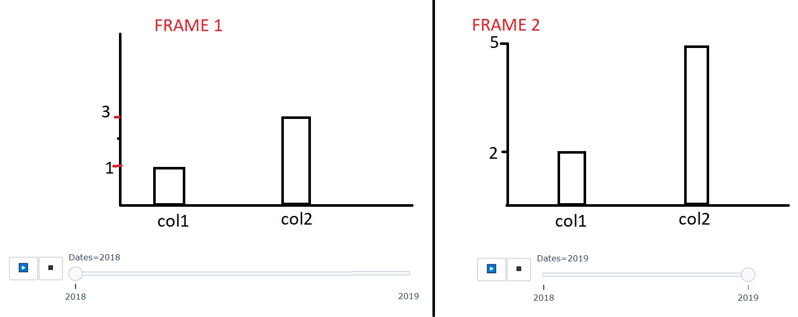
Is it possible to create this chart?
Thanks