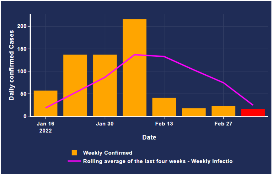
How to put a red box and a label in the legend with a label prediction since for now it only showed the weekly confirmed
THIS IS THE CODE
weekly_infection = db.selecting_infection()
weekly_infection["dateinfection"] = pd.to_datetime(weekly_infection["dateinfection"])

weekly_infection.set_index("dateinfection", inplace=True)

raw_data_infection = weekly_infection["infection"].resample("W").sum()

raw_data_weekly_infection = raw_data_infection.reset_index()

raw_data_weekly_infection = raw_data_weekly_infection.rename(

    columns={"dateinfection": "Date", "infection":"Infection"}

)

covid_data_1 = raw_data_weekly_infection

date_new_list = datetime_list("Infection", covid_data_1)

temporary_dictionary = {"Date": date_new_list}

dates_df = pd.DataFrame(temporary_dictionary)

new_df = covid_data_1.merge(dates_df, how="right", on="Date")

new_df["Date"] = new_df["Date"].apply(

    lambda x: pd.to_datetime(str(x).split(" ")[0])

)


training_percentage = 0.50

validation_percentage = 0.25

length_dataframe = len(new_df)

training_data_percentage = round(int(length_dataframe * training_percentage))

validation_data_percentage = round(int(length_dataframe * validation_percentage))

validation_size = training_data_percentage + validation_data_percentage

training_df = new_df[0:training_data_percentage]

validation_df = new_df[training_data_percentage:validation_size]

testing_df = new_df[validation_size:]

length_testing = len(testing_df)

training_array = np.array(training_df["Infection"])

validation_array = np.array(validation_df["Infection"])

testing_array = np.array(testing_df["Infection"])

training_array = training_array.reshape(training_data_percentage, 1)

validation_array = validation_array.reshape(validation_data_percentage, 1)

testing_array = testing_array.reshape(length_testing, 1)

history = [element for element in training_array]

predictions = list()

bias = 2.0036779999999936

for index in range(len(testing_array)):

    arima_model_ = SARIMAX(

        history,

        order=(1, 0, 0),

        seasonal_order=(0, 0, 0, 0),

        enforce_stationarity=False,

        enforce_invertibility=False,

    )

    fitted_arima_ = arima_model_.fit(trend="nc", disp=0)

    predicted_value = fitted_arima_.forecast()[0]

    predictions.append(predicted_value + bias)

    history.append(testing_array[index])

latest_date = testing_df["Date"].iloc[-1]

ending_date_parse = str(latest_date).split(" ")[0]

testing_start_date = testing_df["Date"].iloc[0]

start_date_parse = str(testing_start_date).split(" ")[0]

testing_date_list = (

    pd.date_range(start=start_date_parse, end=ending_date_parse, freq="W-SUN")

    .to_pydatetime()

    .tolist()

)

testing_list = testing_array

temporary_dictionary = {"Date": testing_date_list}

testing_set = pd.DataFrame(temporary_dictionary)

testing_set["Infection"] = testing_list

testing_set.set_index("Date", inplace=True)

testing_set = testing_set.reset_index()

training_df = pd.concat([training_df, testing_set])

training_infection = (

    training_df.groupby(["Date"])[["Infection"]].sum().reset_index()

)

training_infection.set_index("Date", inplace=True)

model = SARIMAX(

    training_infection["Infection"].astype(float),

    order=(1, 0, 0),

    seasonal_order=(0, 0, 0, 0),

)

model_fit = model.fit()

pred_date = [

    training_infection.index[-1] + DateOffset(weeks=x) for x in range(1, 2)

]

pred_date = pd.DataFrame(index=pred_date[0:], columns=training_infection.columns)

pred_date = pred_date.reset_index()

pred_date = pred_date.rename(columns={"index": "Date"})

training_infection = training_infection.reset_index()

training_infection = pd.concat([training_infection, pred_date])

start_index = len(training_infection["Infection"]) - 1

end_index = len(training_infection["Infection"]) - 1

prediction = model_fit.predict(start=start_index, end=end_index)

prediction = prediction.reset_index()

prediction = prediction.rename(columns={0: "Infection"})

infection_num = int(prediction["Infection"].iloc[-1:][0])

training_infection["Infection"].iloc[-1:] = infection_num

training_infection.set_index("Date", inplace=True)

prediction_infection = training_infection.iloc[-1:]

prediction_infection = prediction_infection.reset_index()

covid_data_1 = pd.concat([covid_data_1, prediction_infection])

covid_data_1["Rolling Average"] = covid_data_1["Infection"].rolling(window=4).mean()

weekly_date = covid_data_1["Date"].tail(8)

number_infected = covid_data_1["Infection"].tail(8)

rolling_average = covid_data_1["Rolling Average"].tail(8)

frame = {

    "Barangay": zones_barangay,

    "Date": weekly_date,

    "Infection": number_infected,

    "Rolling Average": rolling_average,

}

results = pd.DataFrame(frame)

colors = [

    "orange",

    "orange",

    "orange",

    "orange",

    "orange",

    "orange",

    "orange",

    "red",

]

return {

    "data": [

        go.Bar(

            x=weekly_date,

            y=number_infected,

            name="Weekly Confirmed",

            marker=dict(color=colors),

            hoverinfo="text",

            hovertext="<b>Date</b>: "

            + results[results["Barangay"] == zones_barangay]["Date"].astype(str)

            + "<br>"

            + "<b>Weekly Confirmed</b>: "

            + results[results["Barangay"] == zones_barangay]["Infection"].astype(

                str

            ),

        ),

        go.Scatter(

            x=results[results["Barangay"] == zones_barangay]["Date"],

            y=results[results["Barangay"] == zones_barangay]["Rolling Average"],

            mode="lines",

            name="Rolling average of the last four weeks - Weekly Infection Cases",

            line=dict(width=3, color="#FF00FF"),

            hoverinfo="text",

            hovertext="<b>Date</b>: "

            + results[results["Barangay"] == zones_barangay]["Date"].astype(str)

            + "<br>"

            + "<b>Rolling Ave. (last 4 weeks)</b>: "

            + results[results["Barangay"] == zones_barangay][

                "Rolling Average"

            ].astype(str)

            + "<br>"

            # marker=dict(

            #     color='green'),

        ),

    ],

    "layout": go.Layout(

        plot_bgcolor="#1f2c56",

        paper_bgcolor="#1f2c56",

        title={

            "text": "Confirmed Cases In : " + "Barangay Carmen",

            "y": 0.93,

            "x": 0.5,

            "xanchor": "center",

            "yanchor": "top",

        },

        titlefont={"color": "white", "size": 20},

        hovermode="x",

        margin=dict(r=0),

        xaxis=dict(

            title="<b>Date</b>",

            color="white",

            showline=True,

            showgrid=True,

            showticklabels=True,

            linecolor="white",

            linewidth=2,

            ticks="outside",

            tickfont=dict(family="Arial", size=12, color="white"),

        ),

        yaxis=dict(

            title="<b>Daily confirmed Cases</b>",

            color="white",

            showline=True,

            showgrid=True,

            showticklabels=True,

            linecolor="white",

            linewidth=2,

            ticks="outside",

            tickfont=dict(family="Arial", size=12, color="white"),

        ),

        legend={

            "orientation": "v",

            "bgcolor": "#1f2c56",

            "xanchor": "center",

            "x": 0.5,

            "y": -0.5,

        },

        font=dict(family="sans-serif", size=12, color="white"),

    ),

}Do you want to be able to toggle the red bar as visible/invisible, or just have the legend entry there as a display?
Probably the simplest approach is to create two bar traces, one for the orange bars and the other with the red bar, and use barmode="overlay". Plotly draw one legend item per trace, therefore you would need two traces to accomplish what you want.
can you make an simple example on what you stated above because i am not really familliar on using traces
i just want a legend entry as a display