der24
December 2, 2024, 7:24pm
1
I’m trying to plot a 3D cylindrical pipe using Plotly in Python, and I want to exclude a section of the pipe based on angle. I’m using np.nan to mask the values in the array, but I’m facing issues with the shape distortion.
Below is the code I am using
if mask_cylinder:
    mask = theta_grid > np.deg2rad(25) # exclude beyond 25 degrees
    x = np.where(mask, np.nan, x)
    y = np.where(mask, np.nan, y)
    z = np.where(mask, np.nan, z_grid)
else:
    z = z_grid

fig = go.Figure()

fig.add_trace(
    go.Surface(
        x=x,
        y=y,
        z=z,
        colorscale="Viridis",
        showscale=True,
    )
)

fig.update_layout(
    title="3D Pipe",
    scene=dict(
        xaxis_title="X Axis",
        yaxis_title="Y Axis",
        zaxis_title="Z Axis",
        xaxis=dict(visible=True),
        yaxis=dict(visible=True),
        zaxis=dict(visible=True),
    ),
)

fig.show()
You could achieve it using transparency i.e. plotting first 25 degrees with full opacity and next 335 degrees with full transparency. That does preserve the original cylindrical geometry but is computationally expensive especially if the resolution is higher
Is there a better way to exclude certain regions while preserving the integrity of the cylindrical geometry?
AIMPED
December 2, 2024, 10:23pm
2
Hey @der24 welcome to the forums.
Could you post a reproducible example? I’m not sure I understood what you are trying to do.
der24
December 2, 2024, 11:40pm
3
der24:
if mask_cylinder:
    mask = theta_grid > np.deg2rad(25) # exclude beyond 25 degrees
    x = np.where(mask, np.nan, x)
    y = np.where(mask, np.nan, y)
    z = np.where(mask, np.nan, z_grid)
else:
    z = z_grid

fig = go.Figure()

fig.add_trace(
    go.Surface(
        x=x,
        y=y,
        z=z,
        colorscale="Viridis",
        showscale=True,
    )
)

fig.update_layout(
    title="3D Pipe",
    scene=dict(
        xaxis_title="X Axis",
        yaxis_title="Y Axis",
        zaxis_title="Z Axis",
        xaxis=dict(visible=True),
        yaxis=dict(visible=True),
        zaxis=dict(visible=True),
    ),
)

fig.show()
@AIMPED here is how it should look like.
import plotly.graph_objects as go
import numpy as np


theta = np.linspace(0, 2 * np.pi, 100)
z = np.linspace(0, 10, 100)
theta_grid, z_grid = np.meshgrid(theta, z)


r = 1


x = r * np.cos(theta_grid)
y = r * np.sin(theta_grid)


mask_opaque = theta_grid <= np.deg2rad(25)
x_opaque = np.where(mask_opaque, x, np.nan)
y_opaque = np.where(mask_opaque, y, np.nan)
z_opaque = np.where(mask_opaque, z_grid, np.nan)


mask_transparent = theta_grid > np.deg2rad(25)
x_transparent = np.where(mask_transparent, x, np.nan)
y_transparent = np.where(mask_transparent, y, np.nan)
z_transparent = np.where(mask_transparent, z_grid, np.nan)


fig = go.Figure()


fig.add_trace(
    go.Surface(
        x=x_opaque,
        y=y_opaque,
        z=z_opaque,
        colorscale="Viridis",
        showscale=True,
        opacity=1,
    )
)


fig.add_trace(
    go.Surface(
        x=x_transparent,
        y=y_transparent,
        z=z_transparent,
        colorscale="Viridis",
        showscale=False,
        opacity=0.1,
    )
)

fig.update_layout(
    title="3D Pipe ",
    scene=dict(
        xaxis_title="X Axis",
        yaxis_title="Y Axis",
        zaxis_title="Z Axis",
        xaxis=dict(visible=True),
        yaxis=dict(visible=True),
        zaxis=dict(visible=True),
    ),
)

fig.show()
AIMPED
December 3, 2024, 7:11am
4
@der24 I think you might refer to the aspectmode parameter.
import plotly.graph_objects as go
import numpy as np


theta = np.linspace(0, 2 * np.pi, 100)
z = np.linspace(0, 10, 100)
theta_grid, z_grid = np.meshgrid(theta, z)


r = 1

x = r * np.cos(theta_grid)
y = r * np.sin(theta_grid)

x_circle = r * np.cos(theta)
y_circle = r * np.sin(theta)

mask_opaque = theta_grid <= np.deg2rad(25)
x_opaque = np.where(mask_opaque, x, np.nan)
y_opaque = np.where(mask_opaque, y, np.nan)
z_opaque = np.where(mask_opaque, z_grid, np.nan)


fig = go.Figure()


fig.add_trace(
    go.Surface(
        x=x_opaque,
        y=y_opaque,
        z=z_opaque,
        colorscale="Viridis",
        showscale=True,
        opacity=1,
    )
)


fig.update_layout(
    title="3D Pipe ",
    scene=dict(
        xaxis_title="X Axis",
        yaxis_title="Y Axis",
        zaxis_title="Z Axis",
        xaxis=dict(visible=True),
        yaxis=dict(visible=True),
        zaxis=dict(visible=True),
        aspectmode='data'
    ),
    height=800,
)

# maybe helps with visualization
fig.add_traces(
    [
        go.Scatter3d(
            x=x_circle,
            y=y_circle,
            z=np.ones_like(x_circle) * position,
            mode="lines",
            line_color="black",
            showlegend=False
        )
    for position in [z.min(), z.max()]
    ]
)

fig.show()
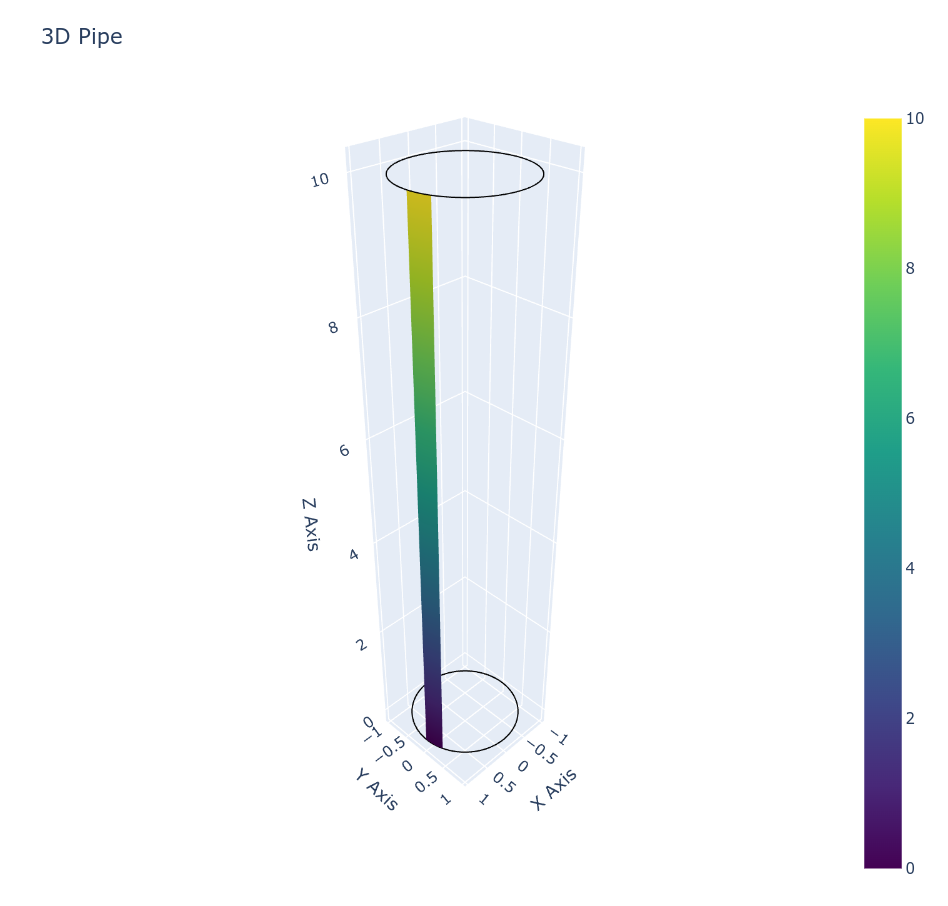
der24
December 9, 2024, 6:10pm
6
Finally figured it out, it was an issue with axes limits.
import plotly.graph_objects as go
import numpy as np

mask_cylinder = False

theta = np.linspace(0, 2 * np.pi, 100)
z = np.linspace(0, 10, 100)
theta_grid, z_grid = np.meshgrid(theta, z)

r = 1

x = r * np.cos(theta_grid)
y = r * np.sin(theta_grid)


xlim = (x.min(), x.max())
ylim = (y.min(), y.max())
zlim = (z.min(), z.max())


# padding to avoid plot artifacts
def pad_limits(min_val, max_val, padding_factor=0.05):
    range_val = max_val - min_val
    padding = range_val * padding_factor
    return min_val - padding, max_val + padding


xlim = pad_limits(x.min(), x.max())
ylim = pad_limits(y.min(), y.max())
zlim = pad_limits(z.min(), z.max())

if mask_cylinder:
    mask = theta_grid > np.deg2rad(25)  # exclude beyond 25 degrees
    x = np.where(mask, np.nan, x)
    y = np.where(mask, np.nan, y)
    z = np.where(mask, np.nan, z_grid)
else:
    z = z_grid

fig = go.Figure()

fig.add_trace(
    go.Surface(
        x=x,
        y=y,
        z=z,
        colorscale="Viridis",
        showscale=True,
    )
)

fig.update_layout(
    title="3D Pipe",
    scene=dict(
        xaxis_title="X Axis",
        yaxis_title="Y Axis",
        zaxis_title="Z Axis",
        xaxis=dict(visible=True, range=xlim),
        yaxis=dict(visible=True, range=ylim),
        zaxis=dict(visible=True, range=zlim),
    ),
)

fig.show()