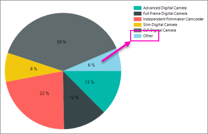
I want to achieve something like the image shown below in plotly if possible:

Hi @jigyanshu,
To do this, you could build out your own functionality to aggregate columns meeting certain values. Here’s an example:
import pandas as pd
import plotly.graph_objects as go

labels = ['Oxygen', 'Hydrogen', 'Carbon_Dioxide', 'Nitrogen', 'Small 1', 'Small 2', 'Small 3', 'Small 4']
values = [4500, 2500, 1053, 500, 13, 144, 242, 332]

df = pd.DataFrame([values], columns=labels)

# define the condition for the 'other' column
other_condition = df < 500

# get the column names we're aggregating
other_cols = df[other_condition].dropna(axis=1).columns

# create aggregated column
df['Other'] = df[other_condition].sum(axis=1)

# drop the columns that were aggregated
df = df.drop(other_cols, axis=1)

fig = go.Figure(data=[go.Pie(labels=df.columns, values=df.iloc[0, :])])
fig.show()
1 Like
Thank you so much, this helped ![]()
1 Like
