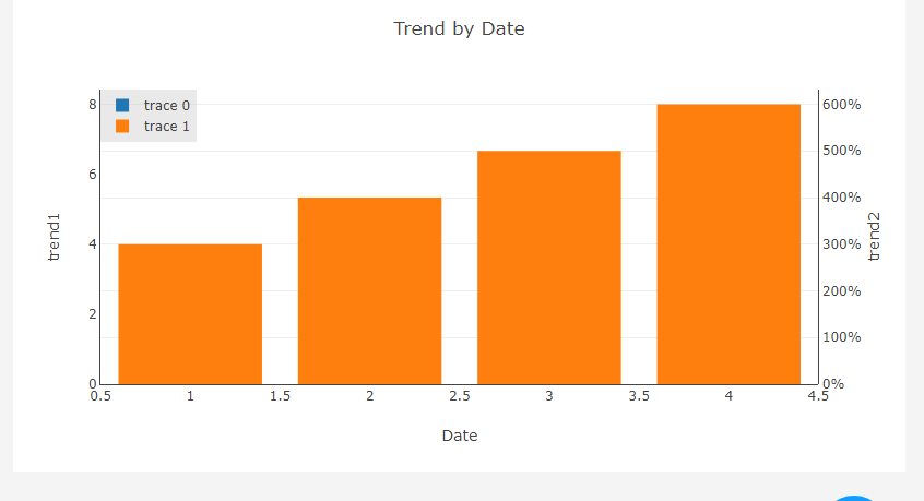
I have to create graph like this

I have to create graph like this
Check out the plotly docs: https://plot.ly/python/multiple-axes/
Or if you’re using dcc.Graph here’s a fragment of mycode, edit it to get the style of graph you wwant:
dcc.Graph(
        id=data_name,
        figure={'data': traces,
                'layout': {
                    'title': f'Trend by Date',
                    'showlegend': True,
                    'legend': {'x': 0,
                               'y': 1,
                               'traceorder': 'normal',
                               'bgcolor': 'rgba(200, 200, 200, 0.4)'
                               },
                    'xaxis': {'title': 'Date',
                              'showline': True},
                    'yaxis': {'title': 'trend1',
                              'showline': True},
                    'yaxis2': {'title': 'trend2',
                               'tickformat': tick_format2,
                               'side': 'right'}
                    },
                },
)I did not get what i need. I am new to plotly can you please help me
here is the code:
N = 500
random_x = np.linspace(0, 1, N)
random_y = np.random.randn(N)
trace0 = go.Bar(
x = [1,2,3,4],
y = [2,4,6,8]
)
trace1 = go.Bar(
x = [1,2,3,4],
y = [3,4,5,6],
yaxis=‘y2’
)
    datas = [trace0,trace1]


    html.Div(
                dcc.Graph(
                    id="my-bar",
                    figure={'data': datas,
                            'layout': {
                                'title': f'Trend by Date',
                                'showlegend': True,
                                'legend': {'x': 0,
                                           'y': 1,

                                           'traceorder': 'normal',
                                           'bgcolor': 'rgba(200, 200, 200, 0.4)'
                                           },
                                'xaxis': {'title': 'Date',
                                          'showline': True},
                                'yaxis': {'title': 'trend1',
                                            'side': 'left',
                                          'showline': True},
                                'yaxis2': {'title': 'trend2',
                                           'tickformat': '%d %B (%a)<br>%Y',
                                           'side': 'right',
                                           'showline': True}
                            },
                            },
                )
            ),
Try this example program in plotly documentation