How to add rounded rectangle sharp under text

Hi,

I used go.box with annotation on the top of plot. Is there any way to add rounded rectangle sharp under the annotation text with color.

fig.add_trace(go.Box(
    y=y, 
    x=(x, x1), 
    boxpoints='all', 
    jitter=0.5, 
    whiskerwidth=0.2, 
    marker_size=3, 
    pointpos=0, 
    fillcolor='white', 
    line_width=1.5
))    
fig.add_annotation(
        text=str(mean),
        xref="x domain", x=X_P,
        yref="y domain", y=1.09,
        showarrow=False,
        font=dict(family="Courier New, monospace", size=12),
        xanchor="center"  
    )

Hi,

I think, with Plotly’s go.Box and add_annotation, you cannot create an annotation with a rounded background and a pointer arrow below it, because Plotly’s shapes do not support border radius and annotation arrows are not styled as tooltips.
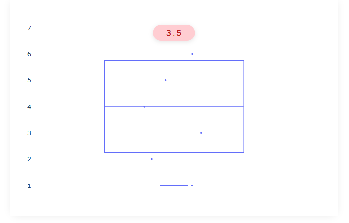
In Dash, you can use HTML and CSS to fully customize the annotation’s appearance, including rounded corners and a custom arrow, making it ideal for this kind of visual effect.

In my example:

import dash
from dash import dcc, html
import plotly.graph_objects as go

app = dash.Dash(__name__)

# Example data
y = [1, 2, 3, 4, 5, 6, 7]
x = [1] * len(y)
mean = 3.5

fig = go.Figure()
fig.add_trace(go.Box(
    y=y,
    x=x,
    boxpoints='all',
    jitter=0.5,
    whiskerwidth=0.2,
    marker_size=3,
    pointpos=0,
    fillcolor='white',
    line_width=1.5
))
fig.update_layout(
    margin=dict(l=40, r=40, t=40, b=40),
    plot_bgcolor='white',
    paper_bgcolor='white',
    showlegend=False,
    xaxis=dict(showticklabels=False)
)

app.layout = html.Div([
    html.Div([
        # This is the rounded annotation overlay
        html.Div(
            str(mean),
            style={
                "position": "absolute",
                "left": "50%",
                "top": "50px",  # adjust as needed
                "transform": "translateX(-50%)",
                "background": "#ffcdd2",
                "color": "#b71c1c",
                "borderRadius": "30px", #radius
                "padding": "6px 24px",
                "fontFamily": "Courier New, monospace",
                "fontSize": "16px",
                "fontWeight": "bold",
                "boxShadow": "0 2px 8px rgba(0,0,0,0.10)",
                "zIndex": "10",
                "textAlign": "center"
            }
        ),
        dcc.Graph(
            id="box-plot",
            figure=fig,
            style={"height": "400px", "background": "white"}
        ),
    ], style={
        "position": "relative",
        "width": "600px",
        "margin": "40px auto",
        "background": "white",
        "borderRadius": "18px",
        "boxShadow": "0 2px 12px rgba(0,0,0,0.06)"
    }),
], style={
    "background": "white",
    "minHeight": "100vh"
})

if __name__ == "__main__":
    app.run(debug=True)

You can define a rectangle with rounded corners as a shape of type “path”, rounding the corners by quadratic Bezier curves.

Each corner is rounded by a quadratic Bezier curve having the corner as a central control point,
while the first and the last control points are located on the adjacent rectangle sides, at the distance h.

import plotly.graph_objs as go
def rounded(x0, y0, x1, y1, h):    
    rounded_bottom_left = f' M {x0+h}, {y0} Q {x0}, {y0} {x0}, {y0+h}'#
    rounded_top_left = f' L {x0}, {y1-h} Q {x0}, {y1} {x0+h}, {y1}'
    rounded_top_right = f' L {x1-h}, {y1} Q {x1}, {y1} {x1}, {y1-h}'
    rounded_bottom_right = f' L {x1}, {y0+h} Q {x1}, {y0} {x1-h}, {y0}Z'
    path = rounded_bottom_left + rounded_top_left+\
         rounded_top_right+rounded_bottom_right
    return path

x0=3
y0=1
x1=6
y1=2
h=0.25
fillcolor='rgba(128, 0, 128, 0.7)'

roundedrect = dict(type='path',
                   path=rounded(x0,y0,x1, y1, h),
                   fillcolor=fillcolor,
                   layer='above', 
                   line=dict(color=fillcolor, width=0.5))

fig=go.Figure()
fig.update_layout(width=400, height=350, 
                  xaxis_range=[x0-0.5, x1+0.5], yaxis_range=[y0-0.5, y1+0.5], 
                  xaxis_visible=False, yaxis_visible=False,                          
                  plot_bgcolor="white",
                  shapes=[roundedrect])
fig.show()