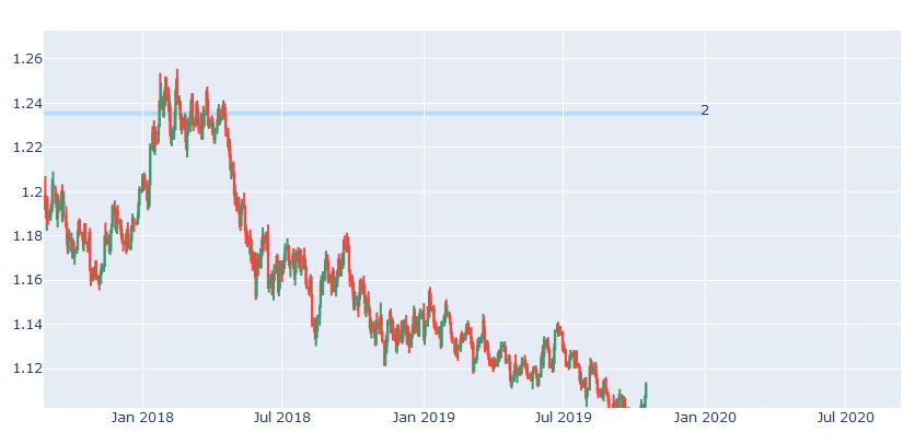
I use plotly package to show dynamix finance chart at python. However I didn’t manage to put my all key points lines on one chart with for loop. Here is my code:
    fig.update_layout(
        for i in range(0,len(data)):
            shapes=[
                go.layout.Shape(
                type="rect",
                x0=data['Date'][i],
                y0=data['Max_alt'][i],
                x1='2019-12-31',
                y1=data['Max_ust'][i],
                fillcolor="LightSkyBlue",
                opacity=0.5,
                layer="below",
                line_width=0)])
    fig.show()
