periodicity=df.periodicity.unique()
app = dash.Dash(__name__)
percentage = FormatTemplate.percentage(3)
app.layout = html.Div([ html.H1(
                                children='Early Alarm Dashboard',
                                 style={
                                        'textAlign': 'center',
                                         'color':'#111111'
                                        }
                                ),

html.Div([ html.Label('Select Periodicity'),
          dcc.Dropdown(
            id="filter_dropdown",
            options=[{'label':i,'value':i} for i in df.periodicity.unique()],
            placeholder="Select periodicity",
            #multi=True,
            value=periodicity[2]
        )]),
                     #style={'width':'50%','float':'left','display':'inline-block'}

html.Div(id="final_table")
])

@app.callback(Output("final_table",'children'),
              [Input("filter_dropdown","value")])

def update(Select_periodicity):
    df_filtered = df[df['periodicity']==Select_periodicity].dropna(how='all',axis=1).round(1)
    #df_filtered=df_filtered.assign(**df_filtered.select_dtypes('number')/100)
    #year
    if Select_periodicity == 'Annual':
        df_Transpose=df_filtered.drop(['Date','quarter','periodicity','Month'],axis=1)
        df_Transpose=df_Transpose.set_index('Year').T
        df_Transpose.reset_index(inplace=True)
        df_Transpose.rename(columns={'index':'Indicators'},inplace=True)
        style_data_conditional=cond_year
        columns=[{'name':i,'id': i,'type':'numeric',} for i in df_Transpose.columns] #,'format':percentage
        #quarter
    elif Select_periodicity == 'Quarter':
        df_Transpose=df_filtered.drop(['Date','Year','periodicity','Month'],axis=1)
        df_Transpose=df_Transpose.set_index('quarter').T
        df_Transpose.reset_index(inplace=True)
        df_Transpose.rename(columns={'index':'Indicators'},inplace=True)
        style_data_conditional=cond_quarter
        columns=[{'name':i,'id': i,'type':'numeric',} for i in df_Transpose.columns]#
        #Month
    elif Select_periodicity == 'Monthly':
        df_Transpose=df_filtered.drop(['Date','Year','periodicity','quarter'],axis=1)
        df_Transpose=df_Transpose.set_index('Month').T
        df_Transpose.reset_index(inplace=True)
        df_Transpose.rename(columns={'index':'Indicators'},inplace=True)
        style_data_conditional=cond_month
        columns=[{'name':i,'id': i,'type':'numeric',} for i in df_Transpose.columns]#'format':percentage

    return [dash_table.DataTable(
                id='table',
                columns=columns,
                data= df_Transpose.to_dict("records"),
                page_action='native',
                #fixed_rows={'headers':True,'data':0},
                fixed_columns={'headers':True,'data':1},
                export_format='xlsx',
                #export_headers='display',

style_cell={'textAlign': 'center',},

style_header={'textAlign': 'center',
      'backgroundColor': 'black',#'rgb(210, 210, 210)',
       'color': 'white',
      'fontWeight': 'bold',
    'whiteSpace': 'normal',
     # 'width': '100%', 'maxWidth': '100%',
      #          'minWidth': '100%', 'height':'100%'
     },

style_table={'height':'auto',
            'minWidth': '100%',
          #'width':'auto',
           # 'maxWidth':'auto',
           # 'overflow': 'hidden'
          #'overflowY': 'scroll',
        #'overflowX': 'scroll'
             },

                style_data_conditional=style_data_conditional
                )]#style_data_conditional=style_data_conditional

if __name__ == "__main__":
    #app.run_server(debug=False)
    app.run_server(host="163.121.17.205",port="8050")
Hello @Moaaz,
The easiest way would to probably use a DataTable as a list with the same conditional formatting on the cells, with descriptions instead of the numbers.
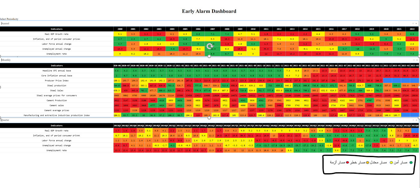
I need the color as a circle behind it a description of color meaning
Please give an example via an image, of what you are trying to do.