Hi! This is a repost from a different group so I apologize if you’re seeing this again.
My graph is doing something strange. The hover data works for some of the points, but not all of them. Here are a couple images explaining.
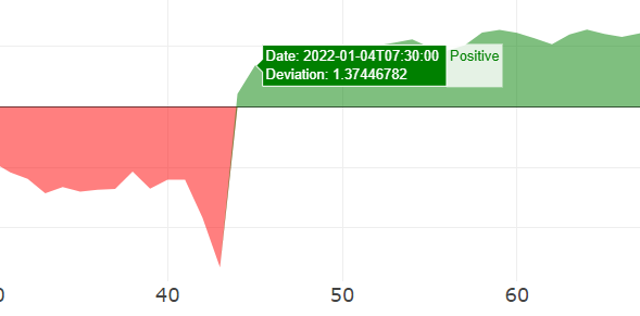

As you can see, the hover info is working for the positive, but not for the negative. Also sometimes in the negative it shows green like in the picture but sometimes it shows red (which is preferred), but still no info.
Here is my code for the graph:
    df = pd.DataFrame(data['df'])
    df['MeasureDate'] = pd.to_datetime(df['MeasureDate'], infer_datetime_format=True)
    df['Sign'] = np.where(df['DeviationValue'] > 0, 'Positive', 'Negative')
    fig = px.area(df,
                  y='DeviationValue',
                  title=f"Graph of {data['engine']} going back one year from {data['date']}",
                  color='Sign',
                  color_discrete_map={
                    'Positive': 'green',
                    'Negative': 'red'
                  },
                  labels={
                    "DeviationValue": 'Deviation',
                    'index': ''
                  },
                  custom_data=['MeasureDate', 'DeviationValue']
                )
    fig.update_traces(showlegend=False, hovertemplate='Date: %{customdata[0]} <br>Deviation: %{customdata[1]}')
I did determine that it’s because of the color. When I have the color commented out, it works just fine. But I would like to keep the color map like I have and have the hover work with it.
Bumping to see if anyone has any ideas. Thanks!
Hello @bpolasek,
Do you have any data or a full MRE so that we dont need to fumble through trying to emulate with the limited info? 
data = {
    'MeasureDate': ['2022-01-01', '2022-01-02', '2022-01-03', '2022-01-04', '2022-01-05', '2022-01-06', '2022-01-07', '2022-01-08', '2022-01-09', '2022-01-10'],
    'DeviationValue': [1, 1, 2, -0.5, -0.8, 1.1, 1.2, -0.1, 0, -0.2]
}

    df = pd.DataFrame(data)
    df['MeasureDate'] = pd.to_datetime(df['MeasureDate'], infer_datetime_format=True)
    df['Sign'] = np.where(df['DeviationValue'] > 0, 'Positive', 'Negative')
    fig = px.area(df,
                  y='DeviationValue',
                  color='Sign',
                  color_discrete_map={
                    'Positive': 'green',
                    'Negative': 'red'
                  },
                  labels={
                    "DeviationValue": 'Deviation',
                    'index': ''
                  },
                  custom_data=['MeasureDate', 'DeviationValue']
                )
    fig.update_traces(showlegend=False, hovertemplate='Date: %{customdata[0]} <br>Deviation: %{customdata[1]}')
    fig.for_each_yaxis(lambda ya: ya.update(showticklabels=True))
    for i in range(len(fig['data'])):
        fig['data'][i]['line']['width'] = 0

    fig.show()
Here is the code with a small dataset!
Hello @bpolasek,
It’s not so much your the graphs as your data, I added hovermode='x unified' to it, and this is what I see:
import plotly.express as px
import pandas as pd
import numpy as np

data = {
    'MeasureDate': ['2022-01-01', '2022-01-02', '2022-01-03', '2022-01-04', '2022-01-05', '2022-01-06', '2022-01-07', '2022-01-08', '2022-01-09', '2022-01-10'],
    'DeviationValue': [1, 1, 2, -0.5, -0.8, 1.1, 1.2, -0.1, 0, -0.2]
}

df = pd.DataFrame(data)
df['MeasureDate'] = pd.to_datetime(df['MeasureDate'], infer_datetime_format=True)
df['Sign'] = np.where(df['DeviationValue'] > 0, 'Positive', 'Negative')
fig = px.area(df,
              y='DeviationValue',
              color='Sign',
              color_discrete_map={
                'Positive': 'green',
                'Negative': 'red'
              },
              labels={
                "DeviationValue": 'Deviation',
                'index': ''
              },
              custom_data=['MeasureDate', 'DeviationValue'],
            )
fig.update_traces(showlegend=False, hovertemplate='Date: %{customdata[0]} <br>Deviation: %{customdata[1]}')
fig.update_layout(hovermode="x unified")
fig.for_each_yaxis(lambda ya: ya.update(showticklabels=True))
for i in range(len(fig['data'])):
    fig['data'][i]['line']['width'] = 0

fig.show()
What do you mean it’s the data? Sorry just trying to understand. Thanks!
Ugh, nevermind, it seems to be a glitch with area plots, in that they assume data it as every section.
Gotcha. Darn. It makes me feel better that it’s not me doing something wrong! lol
