Highlight one or more points in distplot

Hi,

I have an array of daily average temperatures. I am plotting my data using the create_distplot() function.

Is there a way to highlight the latest entry of the array i.e. the most recent value? What I mean by highlight is the to have a colored marker e.g.a red “X” in the bar below the histogram and color the respective box of the histogram.

Thanks!

best for #api:python

1 Like

@mr.t

It’s not straightforward to update the distplot such that to highlight the last recorded temperature.
I created this Jupyter notebook https://plot.ly/~empet/14938 to explain the steps to perform such an update.

1 Like

Awesome, thanks!

Can I somehow add a red vertical line on top of the histogram to better visualize the bar that it belongs to?

You can add one more trace for that red vertical line, but unfortunately we don’t know its height.

onemore_trace=dict(type='scatter',
                   x=[d['temp'][-1], d['temp'][-1]],
                   y=[0, height],
                   mode='lines',
                   line=dict(color='red', width=1.5),
                   xaxis='x',
                   yaxis='y')
2 Likes

for visualization purposes the height can be found as shown below:

height = fw.data[1].y.max() * 1.1
onemore_trace=dict(type='scatter',
                   x=[d['temp'][-1], d['temp'][-1]],
                   y=[0, height],
                   mode='lines',
                   line=dict(color='red', width=1.5),
                   xaxis='x',
                   yaxis='y')

x 1.1 to make it stand out :wink:

1 Like

Hi. I have a similar questions addressed in this post but seems like the link is not working. Can you please upload the code again?

@parvizalizada I updated that old code to work with 5.11.0:

import numpy as np
from  plotly import figure_factory as FF
import plotly.graph_objects as go

d = {'day' : [f'{mm}-{dd}-2017' for mm in [6, 7, 8] for dd in range(1, 32)], #suppose that june has 31 days, too :)
  'temp' : np.random.normal(80, 6.5, size=93)}

fig = FF.create_distplot(hist_data=[d['temp']],  group_labels=['distplot'])

Our fig contains three traces: a histogram, a scatter plot with mode=‘lines’ (the estimated pdf), and the rugplot
as a scatter trace, mode=‘markers’. Let us check their order in the list fig.data:

for k in range(3):
    print(fig.data[k].type)
print (fig.data[-1].mode)

To mark by a red ‘x’ the last recorded temperature, we extract the temperature for august 31, and define a new trace with the same attributes as the trace fig.data[-1]. Inspect this last trace:

print(fig.data[-1])
fig.add_scatter(x=[d['temp'][-1]],
                y=['distplot'],
                mode='markers',
                marker=dict(color='red', symbol='x'),
                xaxis= 'x',
                yaxis='y2')
#improve the plot aesthetics:
fig.update_traces(selector=dict(type="histogram"), marker_line_color="black", marker_line_width=1.5)
fig.update_layout(width=700, height=500)

I hope that it still helps.

1 Like

@empet, thank you very much! This is what I wanted. Just two more questions. Is it possible to rotate histogram, e.g., -90 degrees or 90 degrees? I want to draw a population pyramid with age distribution. I will have two distribution plots on the same canvas, one for males and another for females.

My second question is if it is possible to also highlight the bin of the point highlighted with red x mark.

I’m trying to create a graph similar to the one in the picture below. Not exactly the same but this is to give you idea of my final goal for the graph.

@mr.t
No, distplot cannot be displayed with histogram bars horizontally oriented. Only independent histogram/bar charts can be created with horizontal bars.
Here is some kind of pyramid:

import numpy as np
import pandas as pd
import plotly.graph_objects as go
df = pd.read_csv("Europe-Brain-Drain-Gain.csv")
dfs=df.sort_values(by='Brain Drain', axis=0, ascending=True)
fig=go.Figure()
fig.add_bar(
    x=dfs['Brain Drain'],
    y=dfs['Country'],
    base=-1.0*(dfs['Brain Drain'].values), ####ATTN!
    name='Brain Drain',
    orientation='h',
    marker=dict(
        color='rgb(204, 0, 0)',
        line_width=0.25),
   opacity=0.8
)

fig.add_bar(
    x=dfs['Brain Gain'],
    y=dfs['Country'],
    base=0, #ATTN!
    name='Brain Gain',
    orientation='h',
    marker=dict(
        color='rgb(106, 168, 79)',
        line_width=0.25),
   opacity=0.8
)
fig.update_layout(title_text="Europe's Brain Drain and  Brain Gain between 2003 to 2014",
                  title_x=0.5, width=500, height=600,  barmode='overlay')

Attention to how to set base in each go.Bar, such that to display “the negative” to left and “positive” to right!!!

2 Likes

@empet
Thank you. I had a similar graph but I was trying to find a way to make rotated distribution plots. If it is not possible I will do histograms instead.

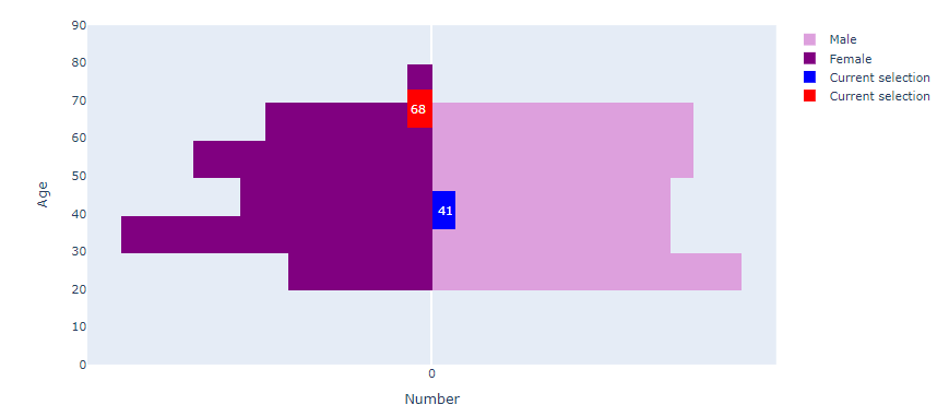
Is it possible to add data points to these bar graphs? To be precise, I have the following code:

# Creating instance of the figure
fig = go.Figure()

# Adding Male data to the figure
fig.add_trace(go.Histogram(y= df[(df['country']=='Norway') & (df['gender']=='M')]['age'],
                           marker=dict(color='plum'),
                           name = 'Male', orientation = 'h',
                           hoverinfo='skip'))

# Adding Female data to the figure
fig.add_trace(go.Histogram(y = df[(df['country']=='Norway') & (df['gender']=='F')]['age'],
                           x=-1 * np.ones(1000),
                           marker=dict(color='purple'),
                           histfunc="sum",
                           name = 'Female', orientation = 'h',
                           hoverinfo='skip',
                           
                          ))

fig.add_trace(go.Histogram(y=df[(df['country']=='Norway') & (df['gender']=='M')]['age'].sample(1,random_state=123),
                           orientation='h',marker_color="blue",
                           name='Current selection',
                           texttemplate=str(df[(df['country']=='Norway') & (df['gender']=='M')]['age'].sample(1,random_state=123).values[0]),
                           textfont_size=12
                          ))

fig.add_trace(go.Histogram(y=df[(df['country']=='Norway') & (df['gender']=='F')]['age'].sample(1,random_state=321),
                           x=-1 * np.ones(1000),
                           histfunc="sum",
                           orientation='h',marker_color="red",
                           name='Current selection',
                           texttemplate=str(df[(df['country']=='Norway') & (df['gender']=='F')]['age'].sample(1,random_state=321).values[0]),
                           textfont_size=12
                          ))

# Updating the layout for our graph
fig.update_layout(barmode='overlay',
                   yaxis=go.layout.YAxis(range=[0, 90], title='Age'),
                   xaxis=go.layout.XAxis(
                       tickvals=[-150, -100, -50, 0, 50, 100, 150],
                       ticktext=[150, 100, 50, 0, 50, 100, 150],
                       title='Number'))

fig.show()

This code is based on the following example: https://plotly.com/python/v3/population-pyramid-charts/

The graph output looks like this:

I want to show data points next to each histogram (similar to marginal=“rug” in px.histogram() ) and highlight ‘Current selection’ points in those data points. So, instead of those ugly looking highlighted bars that I have now, I want to show points.

You can replicate my data by running this code:

customers = [{'country':'Norway','age': random.randint(20,70),
              'income': random.randint(50000,200000),'latitude': random.uniform(59,71),
              'longitude': random.uniform(4,33), 'gender': np.random.choice(["M", "F"]),
             'partner': np.random.choice(["Bank1", "Bank2", "bank3","Bank4"]),
             'product': np.random.choice(["Product1", "Product2", "Product3"])} for i in range(100)] + \
            [{'country':'Sweden','age': random.randint(20,70),
              'income': random.randint(50000,200000),'latitude': random.uniform(55,69),
              'longitude': random.uniform(11,24), 'gender': np.random.choice(["M", "F"]),
             'partner': np.random.choice(["Bank1", "Bank2", "bank3","Bank4","Bank5","Bank6"]),
             'product': np.random.choice(["Product1", "Product2", "Product3"])} for i in range(150)] + \
            [{'country':'Denmark','age': random.randint(20,70),
              'income': random.randint(50000,200000),'latitude': random.uniform(54,58),
              'longitude': random.uniform(7,15), 'gender': np.random.choice(["M", "F"]),
             'partner': np.random.choice(["Bank1","Bank2"]),
             'product': np.random.choice(["Product1", "Product2"])} for i in range(60)] + \
            [{'country':'Finland','age': random.randint(20,70),
              'income': random.randint(50000,200000),'latitude': random.uniform(59,70),
              'longitude': random.uniform(20,32), 'gender': np.random.choice(["M", "F"]),
             'partner': np.random.choice(["Bank1", "Bank2", "bank3"]),
             'product': np.random.choice(["Product1", "Product2"])} for i in range(40)]

df = pd.DataFrame(customers)

@mr.t
You can define a subplot as follows:

fig = make_subplots(rows=1, cols=3,
                    specs=[[{"type":"xy"}, {"type":"xy"}, {"secondary_y": True}]])

In row=1, col=1 define:

fig.add_trace(go.Scatter(x=[0]*len(df), y=[values  for left pyramid], mode="markers, marker_size=4, marker_color=the same as for the left bars), row=1, col=1, secondary_y=False)

In row 1, col 2 add the traces for the left and right bars of pyramid, with secondary_y=False,
row1, col 3:

fig.add_trace(go.Scatter(x=[0]*len(df), y=[values  for right pyramid], mode="markers, marker_size=4, marker_color=the same as for the lright  bars), row=1, col=1, secondary_y=True)

Layout settings:

#Important:  change the width of subplots cells:
fig.update_layout(xaxis_domain=[0, 0.12], xaxis2_domain=[0.14, 0.86], xaxis3_domain=[0.88, 1])        
fig.update_layout(title_text="",
                  title_x=0.5, width=650, height=600,  barmode='overlay', plot_bgcolor='rgba(0,0,0,0)')
  
fig.update_xaxes(visible=False)
fig.update_layout(yaxis2=dict(showticklabels=False, ticks=''), legend_x=1.07)

Thank you! It worked well.

Hi @empet ,

I’m trying to replicate this graph but with histogram. Can you help me to understand what I’m doing wrong? Below is the code:

fig = px.histogram(df, x="income", color="gender",
                   marginal="rug", # or violin, rug
                   hover_data=['age','country'],
                  color_discrete_map = {'F':'orangered','M':'dodgerblue'})

fig.add_scatter(x=[120000],
                
                mode='markers',
                marker=dict(color='green', symbol='x'),
                xaxis= 'x',
                yaxis='y2')

fig.update_layout(
                margin=dict(l=10, r=20, t=70, b=20), #this defines margins around the graph. by default margins are large and affect graph positioning.
                title_text="Income distribution")

fig.show()

I can’t see trace 4 in the graph.

To be more precise, how can I mark a point on the top graph based on gender. If it is man, I want green x to be displayed in the same line as blue observations on the top, and if it is a woman in the same line as red observations.