Heatmap y-axis is reversed by default, going against standard convention for matrices

Plotly version 4.3.0

Input:

import plotly.figure_factory as ff

z = [[1,2,3],
     [4,5,6],
     [7,8,9]]

fig = ff.create_annotated_heatmap(z, colorscale = 'Magma' )
fig.update_layout(
    autosize=False,
    width=500,
    height=500,
)
fig

Output:
plotly_backwards

Also can be seen in the documentation.

In Contrast, Seaborn

Input:

import seaborn as sns

z = [[1,2,3],
     [4,5,6],
     [7,8,9]]

ax = sns.heatmap(z, annot=True)

Output:
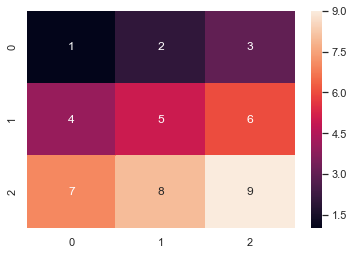
seaborn

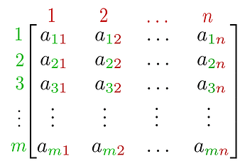
The standard convention for matrices:

Most plotly plots like your standard line plot or scatter plot are on a cartesian coordinate system where the origin, (0,0), is the bottom left. Heatmaps, however, represent a matrix where the standard convention has the origin at the top left. Practically every python scientific library that deals with matrices has the origin at the top left:

  • numpy arrays (z[0,0] corresponds to 1 in the original list z)
  • python lists
  • tensors
  • pandas
  • seaborn, matplotlib heatmaps

This has caused confusion in the past: Github issue here and a community forum post here.

Now as noted in the git issue this can be solved to fit the above matrix layout as shown below, by updating autorange to “reversed”:

Input:

import plotly.figure_factory as ff

z = [[1,2,3],
     [4,5,6],
     [7,8,9]]

fig = ff.create_annotated_heatmap(z, colorscale='Magma')
fig.update_yaxes(autorange="reversed")
fig.update_layout(
    autosize=False,
    width=500,
    height=500,
)
fig

Output:
plotly_fixed

The git issue mentions that this is still problematic because it changes the handedness of your plot and you may want to do further data comparisons, but i’m not sure I can think of a scenario where that would actually cause issues.

I wasn’t sure if this was an intentional design choice or would be an easy fix if not. Thank you.
Hi @Lando , welcome to the forum! The convention (y-axis pointing up or down) depends actually very much how you consider your data, whether they are a matrix or values on a regular grid of coordinates (with the y axis which traditionally points upwards). I come from image processing where for images the convention is the one you describe so I would tend to agree with you but other people are confused when y points downwards. I don’t think we will be changing the convention for Heatmaps since they have been around for a long time and it would be a breaking change, but we could improve the documentation in Heatmaps to mention autorange='reversed', we really should.

Also, if you don’t want to display the values as text as in the figure factory, you can use px.imshow on your data. px.imshow uses the convention of downwards y since it’s meant primarly for images (see https://plot.ly/python/imshow/). With your example it would be

import plotly.figure_factory as ff

z = [[1,2,3],
     [4,5,6],
     [7,8,9]]

px.imshow(img=z, zmax=9)
1 Like

Thank you for the quick response! I’m new to plotly and wasn’t aware that px.imshow() outputted the image with the y-axis the usual way. It’s a little odd to me though as for heatmaps having the cartesian y axis, since traditionally heatmaps are a representation of a matrix where individual values are represented as colors, whether that matrix represents an image in your case or a map or whatever else. I can totally understand not wanting to break previous code, the initial philosophy choice is just a bit unusual. As long as the autorange reversal doesn’t cause more wonky behavior I can use that.

The entire reason I ran into this was because I wanted to recreate sklearn’s plot_confusion_matrix as a plotly graph object, including text annotations and some some thin spacing between the tiles but was having some issues figuring it out.

1 Like