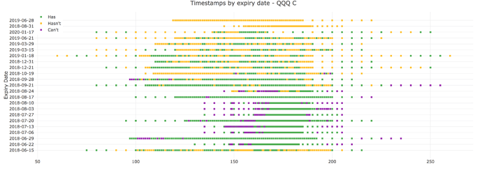
I’m visualizing a pandas data frame as a heatmap and have observed some variable and inconsistent block sizing in the heatmap to the point where it is really hard to interpret (
), whereas if I visualize the same data with a scatter plot with a square marker the points are all consistent and are easier to read (). The code is as follows:trace = [
go.Heatmap(
x=my_data.strike,
y=my_data.lastTradeDateOrContractMonth,
z=my_data.z,
colorscale=[[0, has_color], [0.5, hasnt_color], [1, cant_color]],
zauto=False,
zmax=1,
zmin=0
)
]
return {
'data': trace,
'layout': go.Layout(
title=f'Timestamps by expiry date - {symbol} {right}',
showlegend=True,
legend=go.Legend(
x=0,
y=1.0
),
margin=go.Margin(l=100, r=40, t=40, b=30),
yaxis={
"type": 'category',
"title": 'Expiry Date',
"autorange": True,
"showticklabels": True,
"automargin": True,
"tickformat": "%d-%b-%y"
},
)
}
I’d prefer to use the heatmap because the scatter plot seems to have too much whitespace, but I’d like to understand what is causing the uneven block sizes in the heatmap and if there is a way to get all of the blocks to be have same size.

