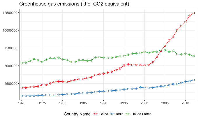
I made a plot using following code in ggplot. Here is the data source https://www.dropbox.com/s/xzauims7rqwurga/who_ghg_complete.csv?dl=0
p1 <- ghg_complete %>%
  filter(`Country Name` %in% c("United States", "China", "India")) %>%
  ggplot(aes(x = year, y = Emissions,
             group = `Country Name`, color = `Country Name`)) +
  geom_point(size = 2, shape = 21) +
  geom_line() +
  labs(title = "Greenhouse gas emissions (kt of CO2 equivalent)",
       x = NULL,
       y = NULL) +
  scale_x_discrete(breaks = seq(1970, 2012, by = 5)) +
  theme_bw() +
  theme(legend.position = "bottom") +
  scale_color_brewer(palette = "Set1")
p1
Here is the output:-
When I wrap the same plot in ggplotly
ggplotly(p1)
The plot behaves differently. The legends don’t look the same and the numbers in y-axis is clipped off.

