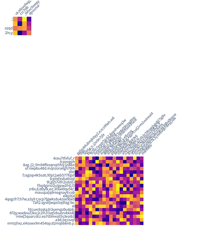
I want to create heatmaps of different numbers of rows and columns. I want the pixel size and the distances between axis labels to be the same between the heatmaps, so that the overall size of the figure grows to accomodate an increasing number of rows and columns. I have tried many option combinations while setting the figure width and height to depend on the number of rows and columns, but this creates different sized pixels so that the labels sometimes overlap and sometimes doesn’t (depending on the total image size).
You can see an example below where the labels are fine in the first and third heatmap, but overlap in the second one because the pixels are smaller. This behavior is more severe in my actual dataset but still clearly visible in this example. Also note that the labels are cutoff in the smallest heatmap although I am using automargin and there is a lot of unnecessary whitespace between the plots (this messes with my layout when trying to put these in a dash app). I also noticed that if I just set the height and not the width plots are centered and autoresized instead of left aligned for some reason, and that there is an occasional JS error thrown unless I turn off the colorbar.
There seems to be a lot of automagical size adjustements going on under the hood here, is there somehow I can turn that off and achieve the desired behavior where the pixels are of a constant size regardless of the number of rows and columns? Or am I going about this in the wrong way and there is a better approach?
import plotly.express as px
import numpy as np
import pandas as pd


np.random.seed(20934)
img = np.random.rand(200, 200)
for cut in [4, 20, 50]:
    fig = px.imshow(
        img[:cut, :cut],
        height=cut * 30,
        width=cut * 30,
        x = [''.join(np.random.choice(list('qwertyuioplkjhgfdsazxcvbnm,.;[098765432'), np.random.choice(40))) for x in range(cut)],
        y = [''.join(np.random.choice(list('qwertyuioplkjhgfdsazxcvbnm,.;[098765432'), np.random.choice(40))) for x in range(cut)],

    )
    fig.update_layout(
        coloraxis_showscale=False,
        margin=dict(t=0, b=0, l=0, r=0),
        xaxis_nticks=cut + 1,
        yaxis_nticks=cut + 1,
        xaxis_side='top',
        xaxis_tickangle=-45,
    ).update_xaxes(
        automargin=True,
    ).update_yaxes(
        automargin=True,
    )
    fig.show()
These are the screenshots from my jupyter lab (the problem is the in dash apps). You can see that the pixels are smaller and the labels are together in the middle plot.
This is a similar topic from two years ago saying manual adjustment of the height and width is requird, but even that does not seem to work reliably for me above Fixed size cell of ployly heatmap? - #4 by electronicsguy.

