Figure Friday 2025 - week 41

join the Figure Friday session on October 17, at noon Eastern Time, to showcase your creation and receive feedback from the community. Update: the Livestream Celebrating Plotly Vibe-a-Thon is taking place at noon Eastern Time this Friday.

Can you prove randomness in the winning NYC lottery numbers?

Answer this question by using Plotly on the NYC Powerball winning numbers.

Things to consider:

  • what can you improve in the app or sample figures below?
  • would you like to tell a different data story using other graphs?
  • how can you explore the data with your own Plotly Studio or Dash app?

Below is a screenshot of the app that Plotly Studio created on top of this dataset:

Line chart prompt:

Number occurrence patterns over time as a line chart with multi-select dropdown for specific numbers (1-69) and date range picker to focus on specific time periods

Participation Instructions:

  • Create - use the weekly data set to build your own Plotly visualization, Dash or Plotly Studio app.
  • Submit - post your creation to LinkedIn or X with the hashtags #FigureFriday and #plotly by midnight Thursday, your time zone. Please also submit your visualization as a new post in this thread.
  • Celebrate - join the Figure Friday sessions to showcase your creation and receive feedback from the community.

:point_right: If you prefer to collaborate with others on Discord, join the Plotly Discord channel.

Data Source:

Thank you to Data.GOV for the data.

1 Like

ok, I can see it already, @Avacsiglo21 is going to totally gamify this week’s challenge! :laughing:

3 Likes

,:joy::joy::joy::joy:may be or may be not

1 Like

Hi @adamschroeder, wondering what the Multiplier in column C means, and is it related to the randomness of the Winning Numbers in column B?

Good question, @Mike_Purtell . Here’s what I found:

  • Multiplier number: Before the main Powerball drawing, a separate number (2, 3, 4, 5, or sometimes 10) is randomly selected.
  • Multiplier effect: If you paid for the Power Play option, this number will multiply any non-jackpot prizes you win, with one special exception.
  • Special exception for Match 5: The prize for matching the first five white balls is automatically doubled from $1 million to $2 million, regardless of the Power Play number drawn.
  • 10x multiplier: The 10x multiplier is only added to the drawing when the advertised jackpot is $150 million or less.
2 Likes

Thank you @adamschroeder , very helpful response :slight_smile:

I wondered why the distribution of 1st ball values is strongly skewed toward lower numbers and is not a uniform distribution from 1 to 69 as I had expected. My first thought was something is wrong with the data, and in a sense there is. The first 5 numbers are sorted and then reported by increasing order. They are not reported in the order they are picked. What is referred to in the given distribution as 1st Ball would more accurately be labeled as Lowest Ball. First number is always the lowest of every week, last or 5th number is the highest of every week. First number has nearly zero hits above 50, and highest number has opposite behavior. To measure randomness of the first 5 numbers you have to merge the data for all 5 picks. Will look at this on my dashboard in a few days (I hope).

HI @Mike_Purtell what do you mean: “To measure randomness of the first 5 numbers you have to merge the data for all 5 picks.”

Why does the fact that the data came sorted mean that it’s less random?

Hi @adamschroeder, in my view a true random distribution is uniform, where each value has an equal probability of happening. The first number (the lowest) on its own does not have a random distribution over its 1847 values. But if you merge all of the numbers for the first 5 picks (9235 total) they will range from 1 to 69, and my guess is that the histogram will flatten out and show a high degree of randomness.

1 Like

Hi @Mike_Purtell Do you means like this one, this is the frequency of the 5 numbers

An this one for the “PowerBall”, which is from 1 to 26, but in some lottery was until 39

4 Likes

Hi @Avacsiglo21 ,

What I meant is that the very first number reported is the lowest number on 5 balls drawn at random. This skews its distribution leftward toward zero. The last number reported is the highest number of 5 balls drawn and has a distribution skewed to the right. Here is a screen shot from my dashboard in progress showing these distributions. Notice that the left side LOWEST distribution looks like the visualization given for this week’s dataset.

Let me make a cheap analogy: If you pick a random card from a deck of 52, you have an equal chance of getting any card between a low of 2 and a high card of ace. But if you draw 5 cards like in a poker, what is the probability that your lowest card is 8 or higher? That probability is about 1 in 32, making it possible but very unlikely. I would gladly give 10 to 1 odds to anyone willing to make that wager.

Notice the values on the right have a notch at around 60, and here is a fun fact to explain why: Powerball increased from 59 balls to 69 balls in October 2015. I will add at least one timeline plot and expect this change from 59 to 69 balls to be visible.

4 Likes

Hi @Avacsiglo21 , your plot showing the frequency of 5 numbers matches my expectation and shows the randomness very well. Great job. Here is a screen shot of my dashboard with all 5 numbers selected:


It is similar to your plot, but uses stacked bars.

1 Like

That card analogy really helped me understand, @Mike_Purtell . Thank you for coming up with that. And your histogram drives your point home. So what would happen if you just chose the media number in the dropdown? Would we see a bell curve?

1 Like

My first thought was what a heatmap would look like, so I wrote this prompt for Plotly Studio:
Number frequency heatmap as a heat map with controls to select number range (1-69) and toggle between raw frequency and normalized percentages


I will also attach the Plotly Cloud app later.

3 Likes

I saw this heatmap on your LinkedIn post, @Ester, and commented there as well.
It looks like the higher the number the less frequently it is drawn, suggesting it’s not random :thinking:

1 Like

One reason I found that Powerball numbers 1-59 appear more often is because the draw range was smaller before 2015.
The number set was expanded from 1-59 to 1-69 in October 2015, so the higher numbers were only available in fewer draws.

1 Like

Hello FFF Comunity my approach for this week 41 remains a phrase of the book “The Drunkard’s Walk: How Randomness Rules Our Lives” Leonard Mlodinow:

“Randomness has memory. You seem to forget that things are not just what they are, but what they have been. Chance does not have to be perfectly random to seem random.” The concept is simple: Randomness often does not feel random to us. We naturally search for patterns (like these 11 rules) because we expect true randomness to be evenly distributed. However, randomness allows for clusters, streaks, and gaps, which can sometimes make us incorrectly assume there is a mistake or a bias.

The central idea of this app is simple but challenging: The lottery is mathematically random (1 in 292 million odds), but historical data shows that certain patterns appear more frequently than others. The main question is: “Can you prove randomness in the winning numbers?” —the goal is to show how even random systems can show observable statistical biases.

Key Features and Statistical Focus

  • Historical Data Analysis: The application gathers and processes all Powerball drawing data from NYC since 2010. The system calculates averages, frequencies, and identifies patterns from this historical information.
  • The 11 Rules (Based on EDA and Research): These 11 key patterns for winning combinations emerged from Exploratory Data Analysis (EDA) and research of the historical trends (rules include balanced sum, odd/even split, no consecutive numbers, etc.).
    • Important Note: These patterns are purely statistical observations and do not increase the probability of winning. They only highlight combinations that appeared often in the past. Every new drawing is 100% independent and random.
  • Testing Interface (Interactive Interface): The interface allows testing numbers by entering user-defined or generated random combinations. Results are shown immediately with clear lottery-ball visuals.
  • Visualizing Data (Statistical Visualizations): The app includes three simple charts that show the data visually: the frequency of the main balls, the frequency of the Powerball, and the historical compliance rate of the 11 rules.
  • Grading System (Scoring System): Each combination is graded from 0 to 11 based on the number of rules it follows, Overall Compliance score: “Green Color” (8+), “Yellow Color” (5–7), or “Red Color” (<=4). This score shows how “typical” the selection is.
  • Rule Explanations (Informative Tooltips): When the cursor hovers over any rule number, a small box appears explaining its logic and historical success rate.
  • Project Goal (Educational Purpose): The aim is not to promise a jackpot, but to analyze whether a combination is “typical” or “atypical” when compared against 15 years of real lottery results.

the web app link:

some images:


Any doubt or questions more than welcome

5 Likes

Hi @adamschroeder, When you select just the median value, the distribution is indeed a bell curve. Here is a screen shot:

Also I added a timeline by winning number position, with polars dynamic group by options of week, month, year. Easy to see what happened in 2015 when it went from 59 balls to 69 balls.


I will post this dashboard to Plotly Cloud later today. Thanks as always for your helpful and insightful comments.

3 Likes

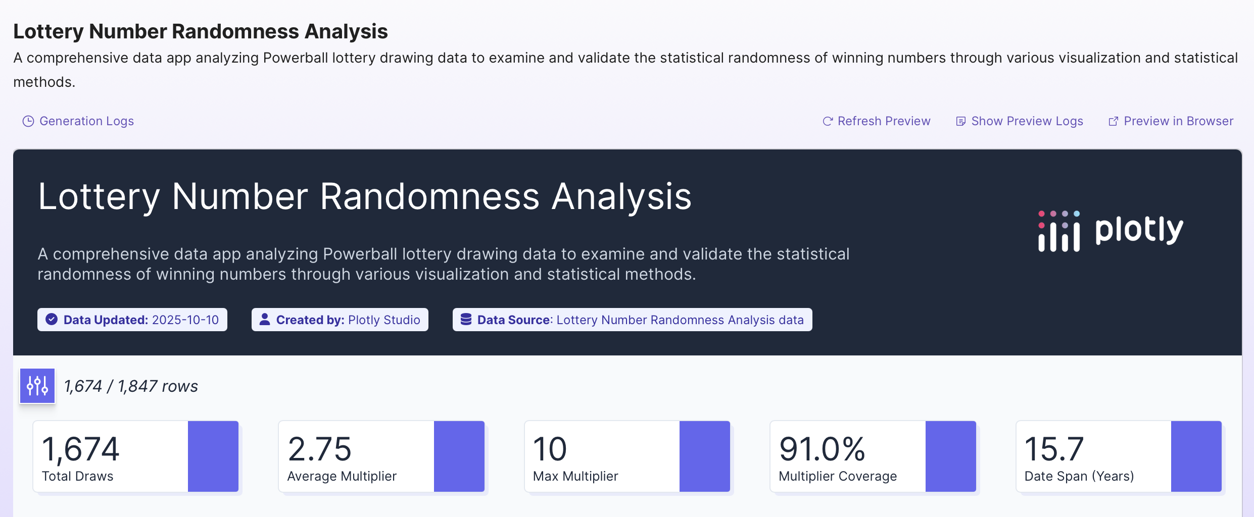
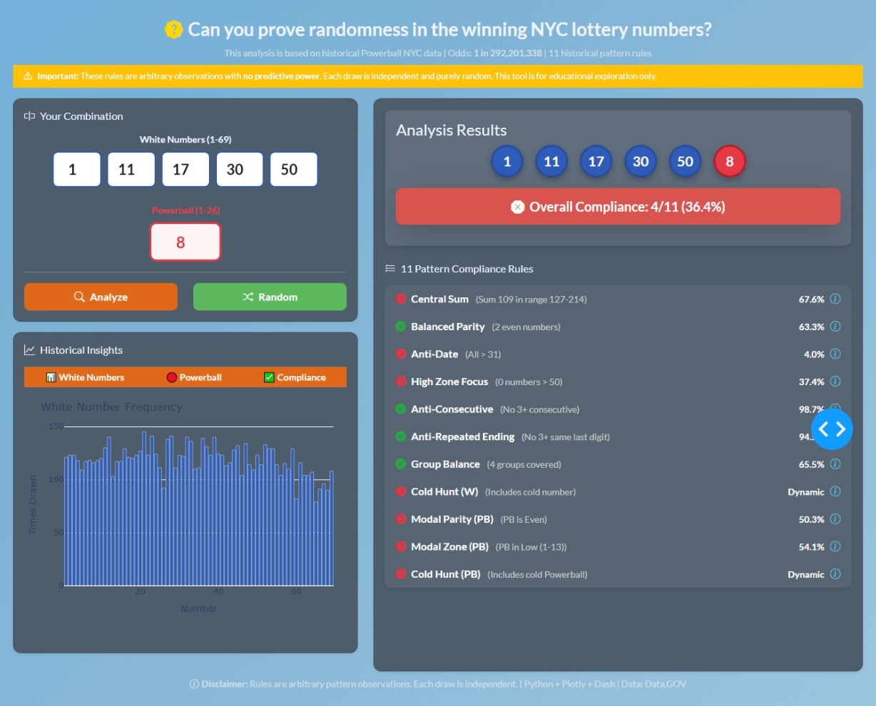
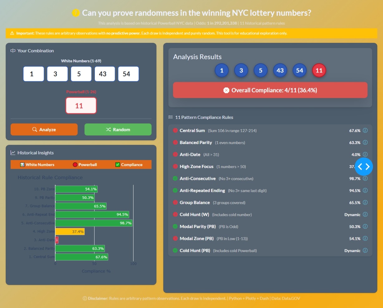
Here is a link to my dashboard for this week:

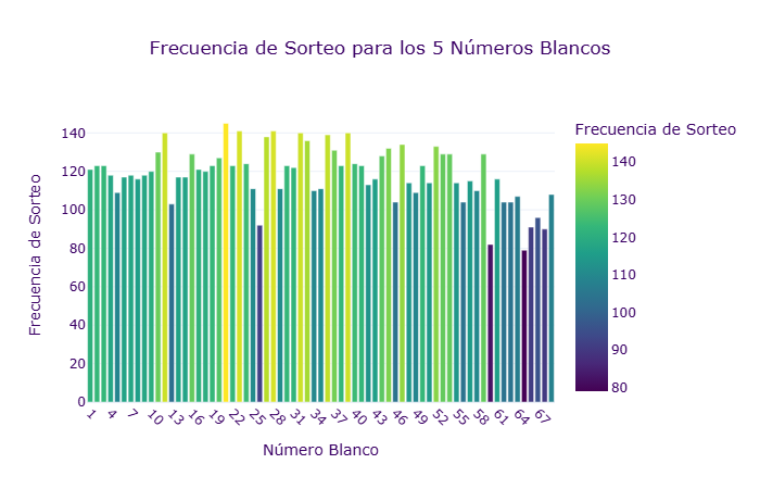
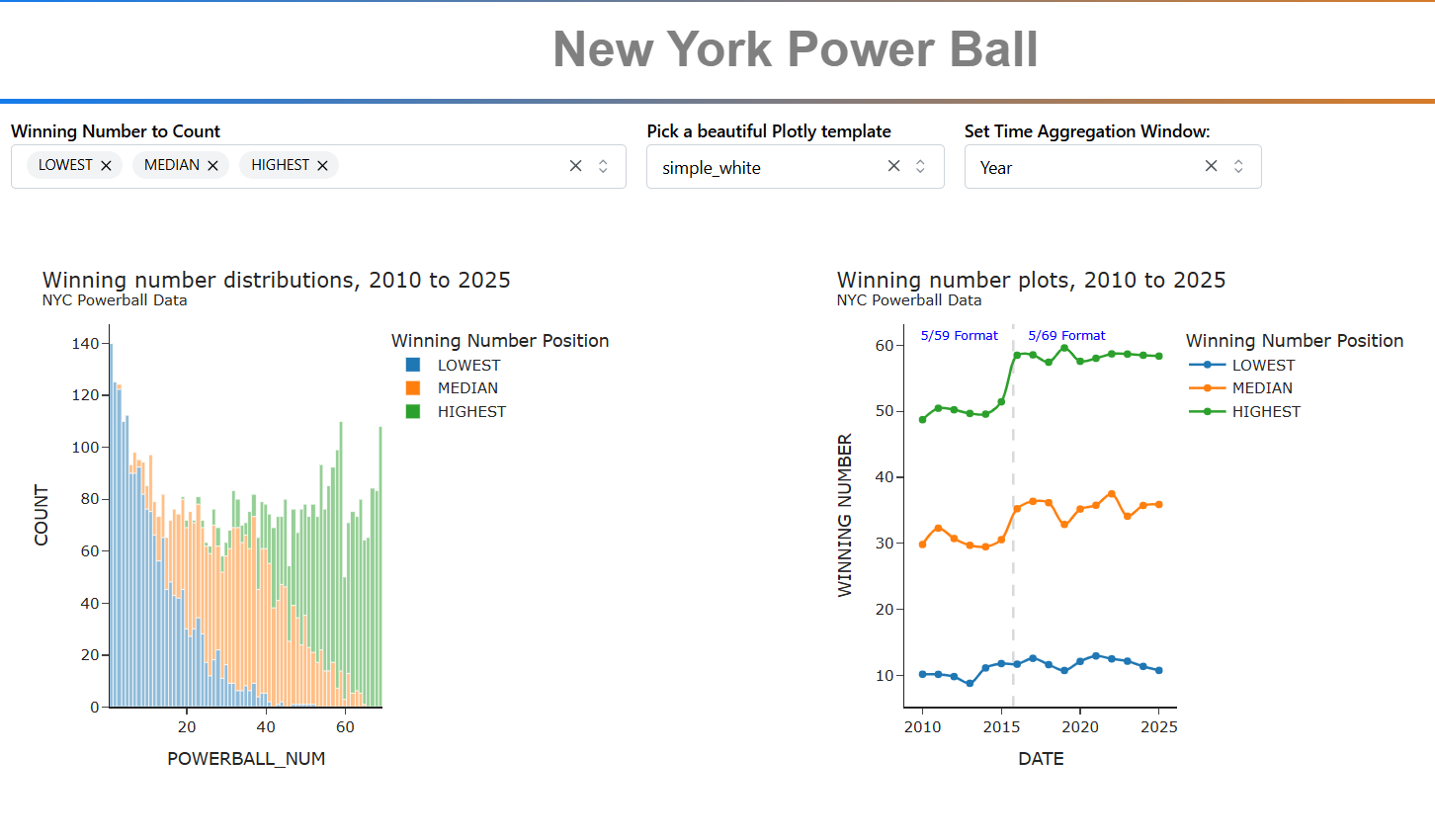
This analysis looks at the first five numbers of each Powerball drawing. The 6th ball or power ball is ignored.

The first five numbers range from 1 to 69 and are reported in ascending order. Prior to 2015, the numbers on each ball ranged from 1 to 59. The increase from 59 to 69 shows up in the timeline plot.

The range for each number is as follows:

  • First number (LOWEST): 1 to 65
  • Second number (SECOND_LOWEST): 2 to 66
  • Third number (MEDIAN): 3 to 67
  • Fourth number (SECOND HIGHEST): 4 to 68
  • Fifth number (HIGHEST): 5 to 69

This histogram on the left shows the distribution of winning number positions. The timeline plots on the right shows the winning number positions from 2010 to 20215.

The pulldown menus select the visualization template, any winning number position (LOWEST, SECOND_LOWEST, MEDIAN, SECOND_HIGHEST or HIGHEST), and the time lime plot windows which uses polars dynamic group by to consolidate by week, month, year, or None.

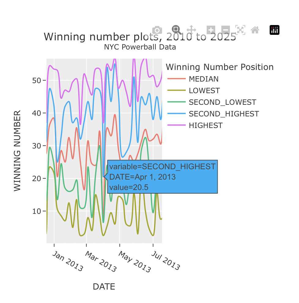
Hope you enjoy it. Here is a screenshot:

Here is the code:

import polars as pl
import os
import plotly.express as px
import dash
from dash import Dash, dcc, html, Input, Output
import dash_mantine_components as dmc
dash._dash_renderer._set_react_version('18.2.0')

#----- GLOBALS -----------------------------------------------------------------
style_horizontal_thick_line = {'border': 'none', 'height': '4px', 
    'background': 'linear-gradient(to right, #007bff, #ff7b00)', 
    'margin': '10px,', 'fontsize': 32}

style_h2 = {'text-align': 'center', 'font-size': '40px', 
            'fontFamily': 'Arial','font-weight': 'bold', 'color': 'gray'}

pick_list = ['LOWEST', 'SECOND_LOWEST', 'MEDIAN', 'SECOND_HIGHEST', 'HIGHEST']
template_list = ['ggplot2', 'seaborn', 'simple_white', 'plotly','plotly_white',
    'plotly_dark', 'presentation', 'xgridoff', 'ygridoff', 'gridon', 'none']

#----- LOAD AND CLEAN THE DATASET ----------------------------------------------
source_data = 'Lottery_Powerball_Winning_Numbers__Beginning_2010.csv'
if 'powerball.parquet' in os.listdir('.'):
    print('reading data from parquet file')
    df = pl.read_parquet('powerball.parquet')
else:
    print('reading data from csv file')
    df = (
        pl.scan_csv(source_data)
        .with_columns(
            DATE = pl.col('Draw Date').str.to_date(format='%m/%d/%Y'),
            SPLIT_NUMS = pl.col('Winning Numbers').str.split(' ')
        )
        .select(
            pl.col('DATE'),
            LOWEST = pl.col('SPLIT_NUMS')
                .list.get(0, null_on_oob=True)
                .str.strip_chars().cast(pl.UInt8),
            SECOND_LOWEST = pl.col('SPLIT_NUMS')
                .list.get(1, null_on_oob=True)
                .str.strip_chars().cast(pl.UInt8),
            MEDIAN = pl.col('SPLIT_NUMS')
                .list.get(2, null_on_oob=True)
                .str.strip_chars().cast(pl.UInt8),
            SECOND_HIGHEST = pl.col('SPLIT_NUMS')
                .list.get(3, null_on_oob=True)
                .str.strip_chars().cast(pl.UInt8),
            HIGHEST = pl.col('SPLIT_NUMS')
                .list.get(4, null_on_oob=True)
                .str.strip_chars().cast(pl.UInt8),
        )
        .collect()
        .unpivot(
            on=pick_list,
            index='DATE',
            variable_name='PICK',
            value_name='POWERBALL_NUM'
        )
        .sort('DATE', descending=False)
    )
    df.write_parquet('powerball.parquet')

#----- DASH COMPONENTS------ ---------------------------------------------------
dmc_select_data = (
    dmc.MultiSelect(
        label='Winning Number to Count',
        id='pick',
        data= pick_list,
        value=[pick_list[0], pick_list[2], pick_list[4]], # lowest, median & highest
        searchable=False,  # Enables search functionality
        clearable=True,    # Allows clearing the selection
        size='sm',
    ),
)

dmc_select_template = (
    dmc.Select(
        label='Pick a beautiful Plotly template',
        id='template',
        data= template_list,
        value=template_list[2],
        searchable=False,  # Enables search functionality
        clearable=True,    # Allows clearing the selection
        size='sm',
    ),
)

dmc_select_aggregation = (
    dmc.Select(
        label='Set Time Aggregation Window:',
        id='aggregation',
        data= ['None', 'Week', 'Month', 'Year'],
        value='Week',
        searchable=False,  # Enables search functionality
        clearable=True,    # Allows clearing the selection
        size='sm',
    ),
)

def get_histogram(df, pick, my_template):
    df_hist = df.filter(pl.col('PICK').is_in(pick))
    fig = px.histogram(
        df_hist,
        x='POWERBALL_NUM',
        color='PICK', 
        opacity=0.5,
        template=my_template,
        nbins=69
    )

    fig.update_layout(
        showlegend=True,
        title=dict(
            text=(
                'Winning number distributions, 2010 to 2025<br>' +
                '<sup>NYC Powerball Data</sup>'
            )
        ),
        yaxis_title='COUNT',
        legend_title_text='Winning Number Position',
    )
    return fig

def get_line_plot(df, pick, my_template, aggregation):
    df_line = (
        df
        .filter(pl.col('PICK').is_in(pick))
        .pivot(
            'PICK',
            index='DATE',
            values='POWERBALL_NUM'
        )
    )
    show_markers = False
    if aggregation == 'Week':
        df_line = df_line.group_by_dynamic(
            'DATE', every='1w', closed='left', period='7d').agg(pl.col(pick).mean())
    elif aggregation == 'Month':
        df_line = df_line.group_by_dynamic(
            'DATE', every='1mo', closed='left', period='1mo').agg(pl.col(pick).mean())
    elif aggregation == 'Year':
        df_line = df_line.group_by_dynamic(
            'DATE', every='1y', closed='left', period='1y').agg(pl.col(pick).mean())
        show_markers=True

    fig = px.line(
        df_line,
        x='DATE',
        y=pick,
        template=my_template,
        markers=show_markers,
        line_shape='spline',
    )

    fig.update_layout(
        showlegend=True,
        title=dict(
            text=(
                'Winning number plots, 2010 to 2025<br>' +
                '<sup>NYC Powerball Data</sup>'
            )
        ),
        yaxis_title='WINNING NUMBER',
        legend_title_text='Winning Number Position',
    )

    fig.add_vline(
        x='2015-10-04',   # powerball format changed to 5/19 from 5/59 
        line_width=2, 
        line_dash='dash', 
        line_color='gray', #'green'
    )

    fig.add_annotation(
        x='2015-01-01', y=1, xref='x', yref='paper', 
        font=dict(color='blue', size=10),
        showarrow=False,
        text='5/59 Format',
        xanchor='right'
    )

    fig.add_annotation(
        x='2016-07-01', y=1, xref='x', yref='paper', 
        font=dict(color='blue', size=10),
        showarrow=False,
        text='5/69 Format',
        xanchor='left'
    )
    return fig


# #----- DASH APPLICATION STRUCTURE---------------------------------------------
app = Dash()
server = app.server
app.layout =  dmc.MantineProvider([
    html.Hr(style=style_horizontal_thick_line),
    dmc.Text('New York Power Ball', ta='center', style=style_h2),
    html.Hr(style=style_horizontal_thick_line), 
    dmc.Grid(children = [
        dmc.GridCol(dmc_select_data, span=4, offset = 1),
        dmc.GridCol(dmc_select_template, span=2, offset = 0),
        dmc.GridCol(dmc_select_aggregation, span=2, offset = 0),
    ]),  
    dmc.Space(h=50),
    dmc.Grid(children = [
            dmc.GridCol(dcc.Graph(id='histogram'), span=4, offset=1), 
            dmc.GridCol(dcc.Graph(id='line_plot'), span=4, offset=1),           
        ]),
])
@app.callback(
    Output('histogram', 'figure'),
    Output('line_plot', 'figure'),
    Input('pick', 'value'),
    Input('template', 'value'),
    Input('aggregation', 'value')
)
def callback(pick, template, aggregation):
    if not isinstance(pick, list):  # if value is not a list, make it one
        pick = [pick]   
    histogram = get_histogram(df, pick, template)
    line_plot = get_line_plot(df, pick, template, aggregation)
    return histogram, line_plot

if __name__ == '__main__':
    app.run(debug=True)
1 Like

awesome app @Mike_Purtell . I tried zooming into a particular week in the second timeline chart. Do you know why some winning numbers are not showing as full numbers. Week of April 1 for example shows the second highest number as 20.5

1 Like