I’ve been using Plotly for a while now and it’s great! However, I’ve ran into a bit of an issue recently and I just can’t find an answer.
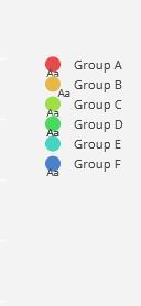
I’m plotting out multiple traces to create a bubble chart (example of one below) and to get data labels on I’ve set mode=‘markers+text’. However, now when it plots, the legend symbols show the colour dot for my bubble chart, but also show Aa underneath it. For one of the groups, I’ve set the textposition=‘bottom right’, and as you can see the legend symbol has followed suit! I want to be able to just remove the Aa below the colour marker, is this easily achieved? I know an alternative is to use annotations instead of markers+text, but I was wondering if it’s at all possible to edit these. Thanks!
trace0 = go.Scatter(
x=df[df['CustomerCategory'] == 'A']['freqprop'],
y=df[df['CustomerCategory'] == 'A']['freq'],
mode='markers+text',
name='Group A',
text=str(df[df['CustomerCategory'] == 'A']['NumberInCategory'][0]) + " | " + str(df[df['CustomerCategory'] == 'A']['AveragePerGroup'][0]) + " | " + str(df[df['CustomerCategory'] == 'A']['MedianPerGroup'][0]),
textposition='bottom',
marker=dict(
    color=colorList[0],
    size=df[df['CustomerCategory'] == 'A']['Bubble'],
)
)