In plotly express, when using a category axis (as opposed to a number) and facet columns, the first plot uses the category axis, but the remaining plots seem to revert to number. Is there a way around this?
Thanks
Hi @bruzzy welcome to the forum! Can you share here a minimal and standalone example illustrating the problem?
Thanks. I am new to plotly. Amazing tool.
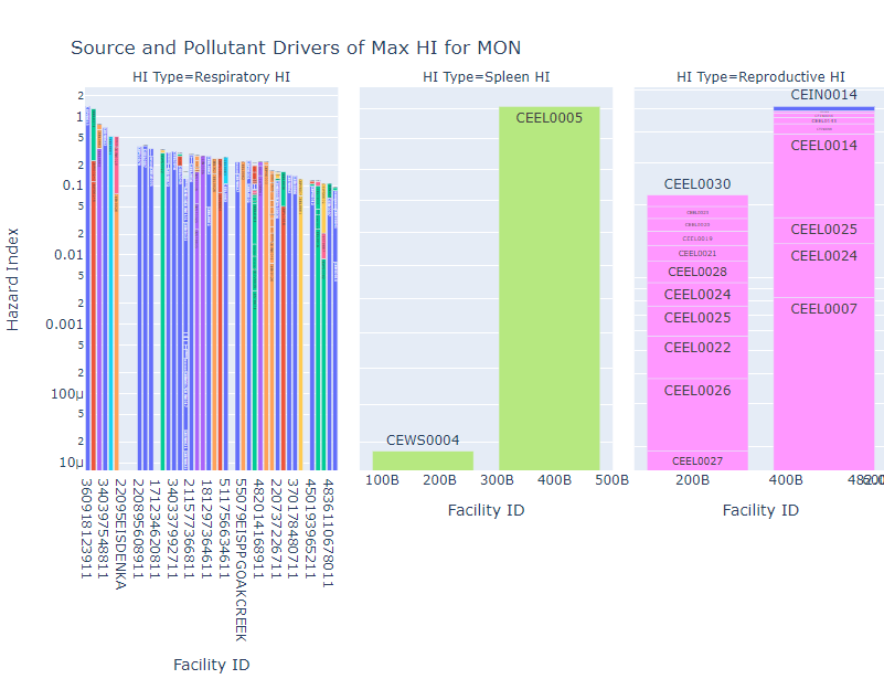
I have a df (max_HI) with cols Facility ID (str but the data can be str or num), HI Type (str), Pollutant (str), and Hazard Index (float). numTOs is the number of different HI Types.
The goal was to have facility on the x axis, Hazard Index on the y, color be Pollutant, and have facets of HI Type. The first plot does have a category x, but the others are numbers. So i was wondering how to get all plots to have a category axis.
HIDriv = px.bar(df_max_HI, x=“Facility ID”, y=“Hazard Index”, color=“Pollutant”, barmode=“relative”, log_y=True, facet_col =“HI Type”, text = ‘Source ID’, height=300*numTOs,
opacity=1)
HIDriv.update_layout(title = ‘Source and Pollutant Drivers of Max HI’ + ’ for ’ + SCname,
xaxis={‘type’:‘category’, ‘categoryorder’: ‘array’, ‘categoryarray’: df_max_HI[‘Facility ID’]})
HIDriv.update_yaxes(matches=None)