I am trying to plot a normal distribution but am getting weird results… I know I can tune the bins myself, but shouldn’t it be automatic? Thanks for any advice 
Hi @ssimontacchi yes the forced choice of bins is quite poor. You can revert to automatic bins which are much better, like
import plotly.figure_factory as ff
import numpy as np
t1 = 100 * np.random.randn(180) + 1200
fig = ff.create_distplot([t1], ['first tier'])
fig.data[0].autobinx = True
fig.show()
That said,
ff.create_distplot is deprecated since with plotly.express you can create the histogram and the rug subplot (you won’t get the kde though) as follows
import plotly.express as px
import numpy as np
t1 = 100 * np.random.randn(180) + 1200
fig = px.histogram(x=t1, marginal='rug')
fig.show()
2 Likes
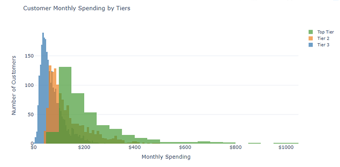
Hi, I took your advice and got the plot below with the following code:
fig = ff.create_distplot(hist_data, group_labels, show_rug = False, show_curve = False, histnorm = '')
for i in range(len(hist_data)):
    fig.data[i].autobinx = True
I like the way this looks, but the weird thing is that there are many many more Tier Three users than Top Tier, but the autobinning makes it look like there are nearly the same number.
Is there a way to set the number of bins to be the same for each distribution so the scale feels more representative?
Thanks so much for your help! 
Hi, yes you can modify all of histogram traces, for example nbinsx.
fig.update_traces(nbinsx=10, autobinx=True, selector={'type':'histogram'})
(you don’t have to write a loop you can modify directly all histogram traces with fig.update_traces)
1 Like
Thanks so much for the support!


