Sure!
import pandas as pd
import plotly.express as px
# merged_df = pd.read_excel('https://github.com/ThrallPraudmur/ThrallPraudmur/blob/main/to_plotly_community.xlsx')
merged_df = pd.read_excel('to_plotly_community.xlsx')
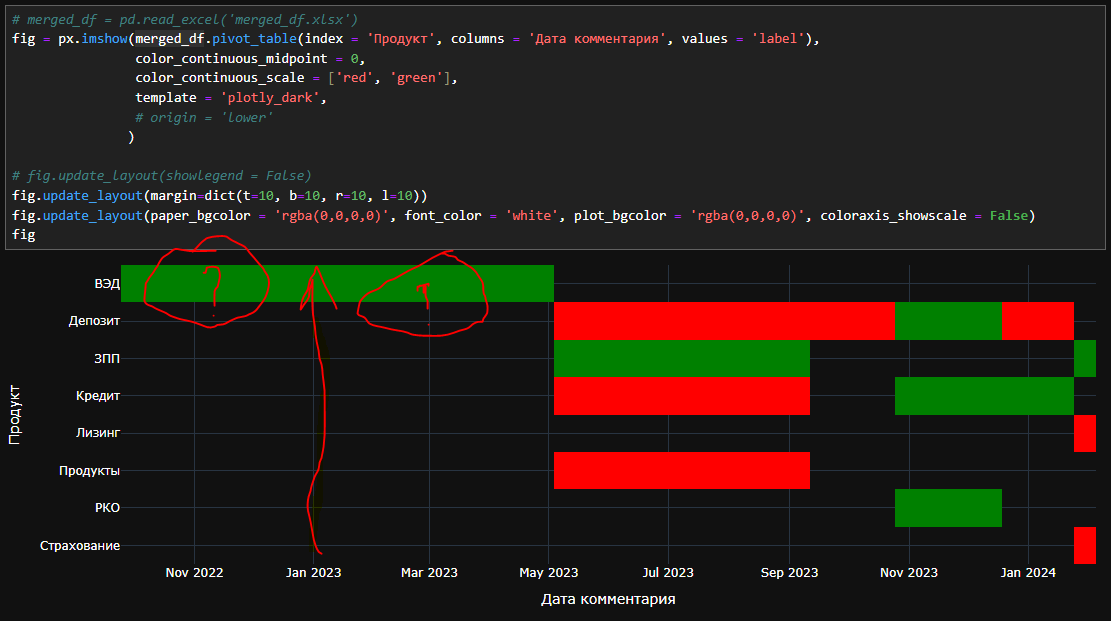
fig = px.imshow(merged_df.pivot_table(index = 'Продукт', columns = 'Дата комментария', values = 'label'),
color_continuous_midpoint = 0,
color_continuous_scale = ['red', 'green'],
template = 'plotly_dark',
# origin = 'lower'
)
# fig.update_layout(showlegend = False)
fig.update_layout(margin=dict(t=10, b=10, r=10, l=10))
fig.update_layout(paper_bgcolor = 'rgba(0,0,0,0)', font_color = 'white', plot_bgcolor = 'rgba(0,0,0,0)', coloraxis_showscale = False)
fig
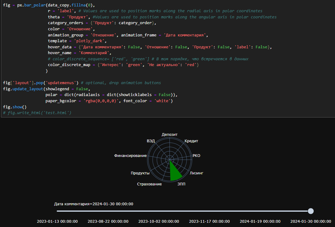
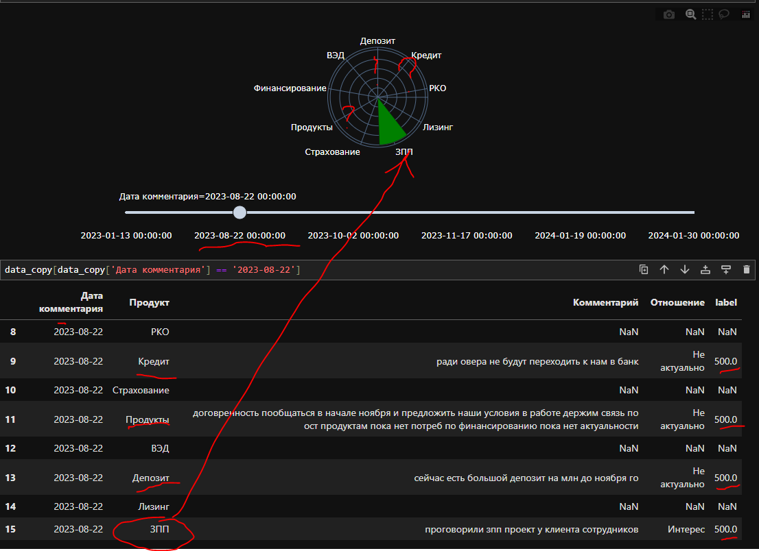
data_copy = merged_df.copy()
data_copy['Дата комментария'] = data_copy['Дата комментария'].apply(lambda x: str(x))
data_copy['label'].replace({-500: 500}, inplace = True)
category_order = ['Депозит', 'Кредит', 'РКО', 'Лизинг',
                  # 'Факторинг', 'Эквайринг',
                  'ЗПП', 'Страхование',
                  # 'ВЭД',
                  'Продукты', 'Финансирование'
                 ]

fig = px.bar_polar(data_copy.fillna(0),
                   r = 'label', # Values are used to position marks along the radial axis in polar coordinates
                   theta = 'Продукт', #Values are used to position marks along the angular axis in polar coordinates
                   category_orders = {'Продукт': category_order},
                   color = 'Отношение',
                   animation_group = 'Отношение', animation_frame = 'Дата комментария',
                   template = 'plotly_dark',
                   hover_data = {'Дата комментария': False, 'Отношение': False, 'Продукт': False, 'label': False},
                   hover_name = 'Комментарий',
                   # color_discrete_sequence= ['red', 'green'] # В том порядке, что встречается в данных
                   color_discrete_map = {'Интерес': 'green', 'Не актуально': 'red'}
                  )

fig['layout'].pop('updatemenus') # optional, drop animation buttons
fig.update_layout(showlegend = False,
                  polar = dict(radialaxis = dict(showticklabels = False)),
                  paper_bgcolor = 'rgba(0,0,0,0)', font_color = 'white')
fig.show()