Hey, I am using streamlit to show some chart of housing prices trends.
My code looks like this with df being a dataframe contain information like price, year and ‘房’.
I execute the following code on streamlit and jupyter and got different result.
def Q_df(df):
Q_df = df[df[‘房’].isin([“2”,“3”,“4”])].reset_index(drop = True)
Q_df = df.groupby([‘year’, ‘房’]).size().reset_index(name=‘count’)
Q_df[‘total’] = Q_df.groupby(‘year’)[‘count’].transform(‘sum’)
Q_df[‘portion(%)’] = Q_df[‘count’] / Q_df[‘total’] * 100
Q_df = Q_df.drop(columns=‘total’)
Q_df=Q_df.sort_values(by=[‘year’,‘房’],ascending=True)
ctgy = [str(i) for i in Q_df[‘year’].unique()]
Q_df[‘year’] = Q_df[‘year’].astype(str)
fig1 = px.bar(Q_df, x=“count”, y=“year”,color=“房”,orientation=‘h’,category_orders={“year”: ctgy})
fig2 = px.bar(Q_df, x=‘portion(%)’, y=“year”,color=“房”,orientation=‘h’,category_orders={“year”: ctgy})
return fig1,fig2,Q_df
The one I obtain with jupyter is
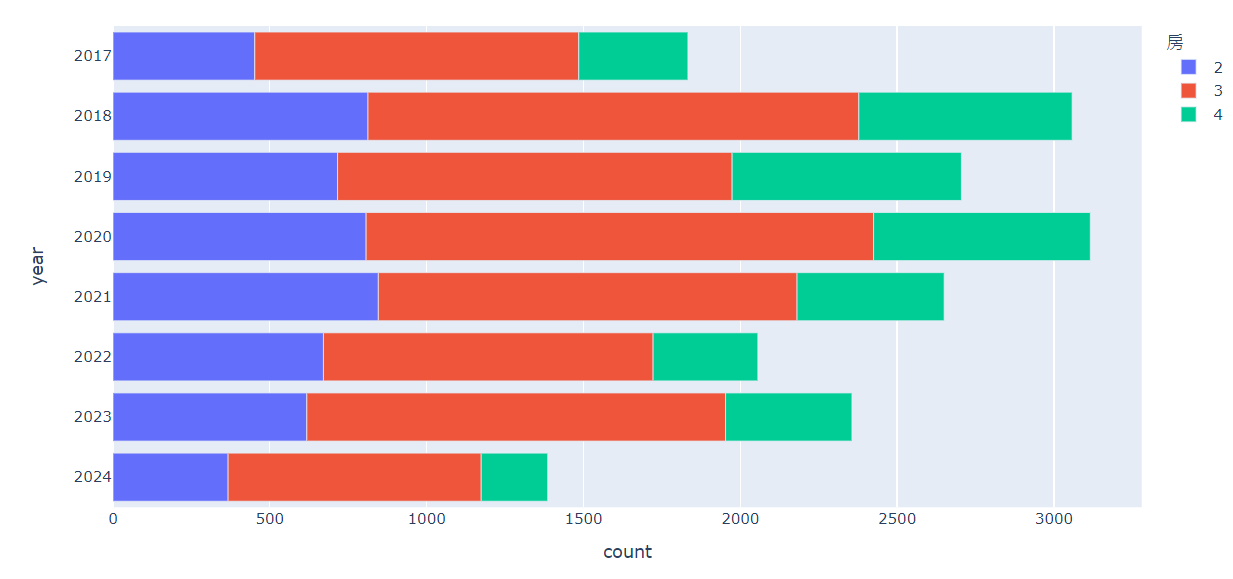
And the one I obtain from sublime text+streamlit is

why is the order of y axis different, and anyone know how to make the later one looks like the first one?