@David22
I recommend that anyone starting a new project uses AG Grid instead of DataTable. I also think it’s worth the effort to convert current projects too! The grid has so many great features right out of the box - and it’s so easy to customize. All of the examples below are using the free AG Grid community component. Even more features are available in AG Grid Enterprise.
Here are just a few examples. See the docs for more information and even more examples
Selectable Rows
Here’s a simple JavaScript function that determines whether a row is selectable. (Only rows having a year earlier than 2007 are selectable.)
dag.AgGrid(
    dashGridOptions = {'isRowSelectable': {"function": "params.data ? params.data.year < 2007 : false" }},
    # other props
)
See the full example in the Selection Checkbox section of Dash AG Grid docs.
Column Spanning
By using a function to set the column width of certain rows, you can make reports that look like this:
See complete example in the docs in the Column Spanning section. This works with Row Spanning too!
Aggregation with Custom Functions (AG Grid Enterprise)
See complete example in the Enterprise Examples
Cell Class Rules and Row Class Rules
You can now use class names with condition formatting. In this example, we use Bootstrap class names – so the background colors of the highlighted cells will match your selected Bootstrap theme.
See this example in the Cell Styling section. You can learn how to use class names with conditional formatting to set Row Styles too.
Date and Number Formatting
Dash AG Grid includes the d3-format and d3-time-format libraries - making it easy to format numbers and dates.
See more examples in the Value Formatters with d3-format section of the docs.
Date Filters
We have Included examples in the docs of how to make the date filters to work “out-of-the-box” using d3.time-format to convert string dates into date objects.

See more examples in the Filtering section of the docs.
Cell Renderer Components Examples
See these examples --and more! – in the Cell Renderer Componets docs.
Dash Mantine Components Button with icons from DashIconify
Dash Bootstrap Component Buttons with Font Awesome and Bootstrap Icons

Render figures in a dcc.Graph component

Image Component with a callback to display the full sized image in a dbc.Modal

Stock Portfolio Demo App with Dash Mantine Component Buttons, DashIconify Icons, dcc.Graph component in the grid
Dash Bootstrap Components dbc.Progress component gallery
Custom Loading and No Rows Overlay
Custom Tooltip
Custom Tooltiop

Custom datepicker component
Editing/cell editing Docs

Conditional dropdowns
See this example in the Editing/cell editing Docs
Note the different city dropdown options based on the country

1) New options for column size
If you are on alpha release 4 or 5, the only breaking change in rc1 is a name change for one prop option. Instead of columnSize=autoSizeAll, use columnSize=autoSize. This is to accommodate some cool new options for setting the columnSize:
See more info in the Column Size docs

2) New in AG Grid 29.3.2 Sticky header labels
We upgraded to the latest AG Grid release 29.3.2 which has several new features, including sticky column group labels.
See this example in the Column Groups docs.

3) Aligned Grids
You can now align two or more grids. If a user changes things like column order or width, the grids stay in sync.
See two examples in the Aligned Grids docs The second examples shows a more typical use-case where one grid has summary data.

4) Pinned rows
Just in case you missed this example, you can also pin one or more rows either on the top or bottom of the grid. This is another way to get a summary row in the grid.
See examples in the Row Pinning docs.
5) Custom Pagination
You can use the grid’s default pagination, or provide your own component to control the grid’s pagination.
See an example of how to use the dash-bootstrap-components dbc.Pagination buttons to navigate to pages in the grid in the Pagination docs.
6) Custom Number Input Component
This is a new custom component example we added to this release. The NumberInput component is a great way to ensure that only numeric data is entered into an editable grid cell. Note also that we use valueFormatter to format the number as currency with two decimal places and thousands separator.
See this example in the Cell Editor Components docs

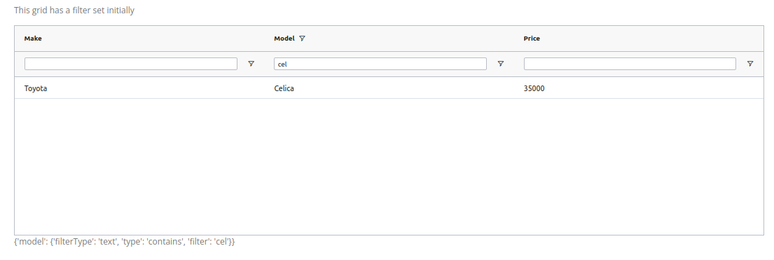
7) Filter Model
The AG Grid Filter Model is now available. Use this to set a filter for the grid. You can also access to the filters that users set in a Dash callback.
See this example in the Filter Callbacks docs
See the code for these examples in the docs:


