Dash Newbie - Heatmap Custom Color Scales Per Column

Hello, found this forum from the book “The Book Of Dash” and I’m hopeful someone can assist me on this problem.

I’ve managed to stumble through a few examples and create my own annotated heatmap, reading in data from .csv files and all, but I don’t like the built-in colorscale.

In fact, my grid at the moment for testing is 1 Row and 4 columns and I’d like to be able to have a custom color range for each of the columns. I’ve seen in the docs/examples that data gets normalized from 0 - 1, and you can specify some things doing this with a given color set, but no examples seem to fit my use-case.

They all assume a global application of the given range/settings for color over the entire heatmap, which isn’t what I’m trying to do.

(Edit: As I do more research, I can add that the data I’m working with is suited to a “continuous” color scale, and I’d like to customize each color scale by column.)

To be more specific, each column is a separate data input where a given level from one column, say 0.5, doesn’t mean the same thing in another column – so a global colorscale won’t work well.

Is there anyone willing to show me how to implement a custom color scale per column in the 1 x 4 example I’m testing with? I’m also willing to pay a bounty in BTC if you would so prefer, as I realize time/effort isn’t trivial.

I’d really appreciate it, since most examples I’ve been able to dredge up are quite convoluted to me. I thank you in advance.

HI @TallTim welcome to the forums!

I’m sure there is a way to get the chart to look like you want it to, I’m not sure you can achieve this with a heatmap, though. I understand a heatmap as a visualization of an array where the value at each array position defines the color using a common color map.

You want to use a different color map for each column- which sounds more like a scatter plot with different traces.

An example:

First the standard heatmap chart:

Code for heatmap chart
import plotly.graph_objs as go
import numpy as np
np.random.seed(42)

# size
x_size = 20
y_size = 20

# create data
arr = np.random.randint(0, 255, size=(y_size, x_size))

# create heatmap
fig = go.Figure(
    data=go.Heatmap(z=arr, colorscale='viridis'),
    layout={'height':500, 'width':500}
)
fig.show()

newplot (3)

The Scatterplot with an individual colorscale for each column:

import plotly.graph_objs as go
import plotly.express as px
import numpy as np

np.random.seed(42)
colorscales = px.colors.named_colorscales()

#size
x_size = 20
y_size = 20

# create data
arr = np.random.randint(0, 255, size=(y_size, x_size))

fig = go.Figure(
    layout={'height':500, 'width':500, 'xaxis_range': [-1, x_size]}
)

# add scatter traces
for i, colorscale in zip(range(x_size), colorscales):
    fig.add_scatter(
        x=np.ones(y_size) * i,
        y=np.arange(y_size),
        text=arr[:, i],
        mode='markers',
        marker={
            'symbol': 'square',
            'size': 14,
            'color': arr[:, i],
            'colorscale':colorscale,
        },
        showlegend=False
    )
fig.show()

newplot (4)
mrep colorscale

2 Likes

First, thanks for the reply and examples – however what I’m trying to do is definitely heatmap-oriented. I’m not interested in the other axis for data, I don’t have any time-dependent axis going on.

Here is a basic figure of what I have so far:

Its a simple 1 row 4 column heatmap, but the color scale is applied to all columns - which doesn’t work for me. For instance, the “Volatility” column ranges from 0 to 1, which is fine, but the “Fear/Greed” column would range from -1 to 1, and I’d want a specific neutral color at 0.

So, for each of the columns, they can have their own ranges, and I’d like to specify my own continuous colors for not only the max/min, but also for potentially the ‘middle’ ranges of 0 or whatever level I’d like to make it, for instance one of the columns ‘center’ would be something like 0.7

You can see that its a custom kind of setup, so while scatterplot looks nice and all, wouldn’t fit.

I don’t understand what you are trying to do. I see a row with 4 different, discrete, colors as if you changed the the variables in my second example to x_size = 4 y_size = 1

Each of the columns has a different colorscale. You could also add a different value for each of the columns via cmin and cmax for the different value ranges.

1 Like

I’m sorry, very tired. I re-read what you wrote and understand that you’re saying custom colorscales are possible using the scatterplot type chart. I had it in my head that scatterplot is dedicated to data with a time x-axis always, which wasn’t the case in your example, just to format the thing properly.

I’ll pore over your example more closely to see how to do this. I assume using this type assigning a ‘middle’ continuous color value isn’t difficult?

1 Like

Let us know if you need further assistance, I’m pretty sure there is a way to achieve what you are trying to do :wink:

1 Like

@TallTim Check out the diverging colorscales for the columns with the neutral color at 0

3 Likes

Thank you, but I recall I can’t change the built-in scales, so I’m pursuing custom ones. Great book, by the way.

1 Like

@ Glad you liked the book :smile:

Here is another option - you can use conditional formatting to color the background of cells in a grid.

See this DataTable example in the docs : Conditional Formatting | Dash for Python Documentation | Plotly

But if you are just getting started with Dash, I recommend using the new Dash AG Grid component. We’ll be adding this example to the docs shortly:


from dash import Dash, html
from dash_ag_grid import AgGrid
import pandas as pd
import colorlover


wide_data = [
    {"Firm": "Acme", "2017": 13, "2018": 5, "2019": 10, "2020": 4},
    {"Firm": "Olive", "2017": 3, "2018": 3, "2019": 13, "2020": 3},
    {"Firm": "Barnwood", "2017": 6, "2018": 7, "2019": 3, "2020": 6},
    {"Firm": "Henrietta", "2017": -3, "2018": -10, "2019": -5, "2020": -6},
]
df = pd.DataFrame(wide_data)

app = Dash(__name__)


def discrete_background_color_bins(df, n_bins=5, columns="all"):
    bounds = [i * (1.0 / n_bins) for i in range(n_bins + 1)]
    if columns == "all":
        df_numeric_columns = df.select_dtypes("number")
    else:
        df_numeric_columns = df[columns]
    df_max = df_numeric_columns.max().max()
    df_min = df_numeric_columns.min().min()
    ranges = [((df_max - df_min) * i) + df_min for i in bounds]
    styleConditions = []
    legend = []
    for i in range(1, len(bounds)):
        min_bound = ranges[i - 1]
        max_bound = ranges[i]
        if i == len(bounds) - 1:
            max_bound += 1

        backgroundColor = colorlover.scales[str(n_bins)]["seq"]["Blues"][i - 1]
        color = "white" if i > len(bounds) / 2.0 else "inherit"

        styleConditions.append(
            {
                "condition": f"params.value >= {min_bound} && params.value < {max_bound}",
                "style": {"backgroundColor": backgroundColor, "color": color},
            }
        )

        legend.append(
            html.Div(
                [
                    html.Div(
                        style={
                            "backgroundColor": backgroundColor,
                            "borderLeft": "1px rgb(50, 50, 50) solid",
                            "height": "10px",
                        }
                    ),
                    html.Small(round(min_bound, 2), style={"paddingLeft": "2px"}),
                ],
                style={"display": "inline-block", "width": "60px"},
            )
        )

    return styleConditions, html.Div(legend, style={"padding": "5px 0 5px 0"})


styleConditions, legend = discrete_background_color_bins(df, columns=["2018"])

columnDefs = [
    {"field": "Firm"},
    {"field": "2017"},
    {"field": "2018", "cellStyle": {"styleConditions": styleConditions}},
    {"field": "2019"},
    {"field": "2020"},
]


app.layout = html.Div(
    [
        legend,
        AgGrid(
            rowData=df.to_dict("records"),
            columnDefs=columnDefs,
            columnSize="responsiveSizeToFit",
            defaultColDef={"sortable": True}
        ),
    ]
)

if __name__ == "__main__":
    app.run_server(debug=True)


1 Like

Going over your example more carefully I notice you used the built-in colorscales to assign them to the columns.

I’m a total newbie, so I am struggling on how to construct my own color scale with different thresholds.

Could you possibly show me how to assign just one column a user-defined colorscale that isn’t part of the built-in ones? That would help me understand how to do this properly.

The other code makes sense when compared to how the first heatmap example is set up, so thank you for that. I just need a little more detail to get me over this hump of frustration.

Thank you in advance.

Hey @TallTim, do you really need custom colorscale? I think what you want do do is adjust the midpoint of a diverging colorscale.

Let’s take one of the built in colorscales (Portland):

fig = px.colors.diverging.swatches_continuous()
fig.show()

In the following example I’m using the scatter plot again. The values are ranging from -50 to 50 for both traces (at x=0, and x=1)

Code for figure
import plotly.graph_objs as go
import plotly.express as px
import numpy as np

colorscales = ['portland', 'portland']

#size
x_size = 2
y_size = 100

# create data
arr = np.arange(-y_size//2, y_size//2 +1)

fig = go.Figure(
    layout={'height':500, 'width':500, 'xaxis_range': [-1, x_size]}
)

# add scatter traces
for i, colorscale in zip(range(x_size), colorscales):
    fig.add_scatter(
        x=np.ones(y_size) * i,
        y=arr,
        mode='markers',
        marker={
            'symbol': 'square',
            'size': 14,
            'color': arr,
            'colorscale':colorscale,
        },
        showlegend=False
    )
fig.show()

newplot (6)

Now I want the colorscale to be skewed so that the midpoint is at a different value ( midpoint != 0). You can do so by using the cmin and cmax parameters. In this case, I want the darkest blue to start at -10 (instead of -50) and keep the red where it is (at 50)

fig.update_traces(
    marker={
        'cmin': -10, 
        'cmax': y_size//2
    },
    selector=1    # updating only trace 1
)

The result is the following (keep in mind that the actual values of arr did not change, I just changed the colorscale):

newplot (7)

Does this help?

1 Like

Thanks for detailing how the built-in scale can be manipulated, but the colors these scales use aren’t aligned with what I’m doing, which is primarily financial.

In my use-case, I need fully bright/saturated red and green, sometimes I need a neutral to either bright red or green (or another color entirely). It just seems these scales were made by academics and scientists, who don’t use bright colors except for the “warm” tones.

So it doesn’t help me – I need to be able to make a color scale that conforms to alerting on levels that can either be “hot” or “cold” with my preferred color assigned to each end of the scale.

Again, the built-in scales seem too subdued for me on the “cold” end for me to do much with, if that makes any sense.

If you can, please show me how to make a custom scale using RGB or HSV values so I can tailor it to fit. I’d really appreciate it, since most examples I have access to make my brain hurt.

Thanks in advance.

You might find this example helpful https://notebook.community/empet/Plotly-plots/Plotly-asymmetric-colorscales

2 Likes

You are a saint.

This is what I’m looking for, and there is even a Red/Green scale that looks like it will work in the examples.

Thank you!

Haha - Thanks, but I think the credit goes to whoever made this excellent example. :slight_smile:
@empet is this yours?

@AnnMarieW , @TallTim Yes this a 8 years old version of asymmetric colorscale :grinning:
Here is a much shorter one

from  matplotlib.colors import to_hex
import numpy as np
def asymmetric_cmap(cmap, vmin, vmax, ncolors=11): 
    v_max_abs=max([abs(vmin), abs(vmax)])
    arr_colors=cmap(np.linspace(vmin/(2*v_max_abs), vmax/(2*v_max_abs), ncolors)+0.5)
    return [[k/(ncolors-1), to_hex(arr_colors[k])] for k in range(ncolors)]

Explanation: The interval [-v_max_abs, v_max_abs] is mapped to [0,1] by ϕ(t) =(t+v_max_abs)/(2*v_max_abs).

Hence Φ(vmin) = (vmin+v_max_abs)/(2v_max_abs)=vmin/(2v_max_abs)+1/2
and
Φ(vmax) = (vmax+v_max_abs)/(2v_max_abs)=vmax/(2v_max_abs)+1/2

An asymmetric colorscale can be defined starting with a diverging matplotlib or cmocean colormap:

import cmocean
import plotly.graph_objects as go
Z= -1.45+2.3*np.random.rand(49)
asym_cmap=asymmetric_cmap(cmocean.cm.balance_r, Z.min(), Z.max())
fig=go.Figure(go.Heatmap(z=Z.reshape((7,7)), colorscale=asym_cmap),
              go.Layout(width=500, height=500))
fig.show()

asym-cmocean

import matplotlib.cm as cm
Z= -1.12+2.65*np.random.rand(49)

as_cmap=asymmetric_cmap(cm.RdBu, Z.min(), Z.max())
fig=go.Figure(go.Heatmap(z=Z.reshape((7,7)), colorscale=as_cmap),
              go.Layout(width=500, height=500))
fig.show()

mpl-asym

4 Likes

So much information in a single topic, nice!

Since I’m a simple guy, I like plain examples. I’m posting these bits here to help new people like me understand how to do this.

My use-case is a continuous color scale, with defined colors for minimum, midpoint and maximum values.
First I setup some public variables with the values I’m mapping from/to.

# Default min max for plotly color scale mapping
plotly_min = 0
plotly_max = 1
## Input data min/max values - 'a' is an arbitrary indicator input value
a_min = -1.0
a_max = 1.0

As you can see, plotly expects data from 0 to 1. Our input set is -1.0 to +1.0 - so we need to rescale it. Luckily I have a function that can do this easily:

## Takes number to convert, the old range min-max, the new range min-max - returns rescaled number
def rescaleRange(myNum, oldMin, oldMax):
	# Since we're remapping to plotly range, no need for arbitrary input in function arguments
	newMin = plotly_min
	newMax = plotly_max
	rescaledNum = ((newMax - newMin) * (myNum - oldMin) / (oldMax - oldMin)) + newMin
	return rescaledNum

Okay, so how do we use this function to create our color list? Python allows you to call functions inside a list, which is handy:

redBlackGreen_scale = [[rescaleRange(-1.0, a_min, a_max), 'red'], [rescaleRange(0, a_min, a_max), 'black'], [rescaleRange(1.0, a_min, a_max), 'green']]

(Note that you can use RGB definitions as well instead of named colors by substituting ‘rgb(255, 0, 0)’ for ‘red’ – you can also use hex colors by using u’#‘, such as u’#ff0000’ for red. ‘u’ simply means use unicode encoding.)

There’s probably a more elegant way to do the above, but this is a simple example so I’ll leave it to be more verbose.

Okay smartguy, so how do you use this in a figure? Well, just as a basic example it would be something like:

fig = px.imshow(myInputData, text_auto=True, aspect="auto",
	labels=dict(x="Indicator", y="Instrument", color="Level"),
	x=['Fear/Greed', 'Volatility', 'Volume', 'Truckin'],
	y=['BTCUSD '],
	color_continuous_scale=redBlackGreen_scale
	)

fig.update_coloraxes(cmin=-1.0, cmid=0, cmax=1.0) # Custom min/mid/max definitions
fig.update_xaxes(side="top")

There’s a lot here that can be changed, I’m still testing – but you see you assign your remapped color scale using ‘color_continuous_scale=’ in your figure. The min/mid/max also get defined here for your colorscale, otherwise it just assumes the default, which is automatic.

Here’s the figure output:


(Note, I haven’t done the per-column colorscales, just testing the custom scale applied to the entire heatmap for now.)

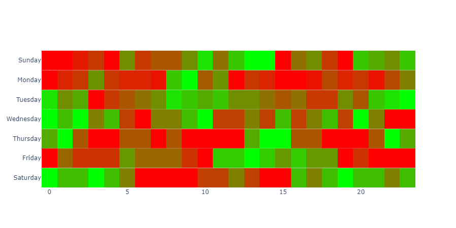
I’ve got more things to figure out, but I think I can use this heatmap example with subplots to do what I want without changing figure types:

From stack overflow - Separate Heatmap Ranges In Plotly

Pasted here for reference:

# Below uses heatmap by row and then combines the plots

from plotly.subplots import make_subplots
import plotly.graph_objects as go
import pandas as pd
import calendar

# The test.csv file contents:

"""
0,0,1,2,0,5,2,3,3,5,8,4,7,9,9,0,4,5,2,0,7,6,5,7
1,3,4,9,4,3,3,2,12,15,6,9,1,4,3,1,1,2,5,3,4,2,5,8
9,6,7,1,3,4,5,6,9,8,7,8,6,6,5,4,5,3,3,6,4,8,9,10
8,7,8,6,7,5,4,6,6,7,8,5,5,6,5,7,5,6,7,5,8,6,4,4
3,4,2,1,1,2,2,1,2,1,1,1,1,3,4,4,2,2,1,1,1,2,4,3
3,5,4,4,4,6,5,5,5,4,3,7,7,8,7,6,7,6,6,3,4,3,3,3
5,4,4,5,4,3,1,1,1,1,2,2,3,2,1,1,4,3,4,5,4,4,3,4
"""

df = pd.read_csv('test0.csv', header=None)
# initialize subplots with vertical_spacing as 0 so the rows are right next to each other
fig = make_subplots(rows=7, cols=1, vertical_spacing=0)
# shift sunday to first position
days = list(calendar.day_name)
days = days[-1:] + days[:-1]

for index, row in df.iterrows():
    row_list = row.tolist()
    sub_fig = go.Heatmap(
        x=list(range(0, 24)), # hours
        y=[days[index]], # days of the week
        z=[row_list], # data
        colorscale=[
            [0, '#FF0000'],
            [1, '#00FF00']
        ],
        showscale=False
    )
    # insert heatmap to subplot
    fig.append_trace(sub_fig, index + 1, 1)

fig.show()

And finally, the resulting figure from the above example:

Anyway, thanks to the forum members and the book “The Book Of Dash” for getting me on the right track!!

2 Likes