 What’s New
- New
ModalStackandDrawerStackcomponents - Function prop support extended across more components
- Custom rendering for calendar controls and tree nodes
- New props for
Slider,RangeSlider, and more - Based on Mantine 8.1.2
 Want to Try It Live?
This post shows screenshots only — to explore live examples with code, check out the
![]() DMC 2.1.0 Release Announcement on the docs site
DMC 2.1.0 Release Announcement on the docs site
 New
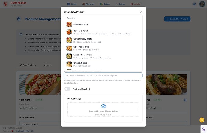
New ModalStack and DrawerStack Components
You can now stack multiple modals or drawers using ModalStack or DrawerStack. These components handle z-index layering, focus management, and Escape key behavior for you.
 Calendar
 headerControlsOrder Prop
Calendar-based components (like DatePicker) now support the headerControlsOrder prop, giving you control over the order of header buttons.
 Slider domain Prop
The Slider component now accepts a domain prop, letting you set the full allowed range independently from min/max.
↔️ RangeSlider pushOnOverlap Prop
RangeSlider now supports pushOnOverlap — so when thumbs overlap, one can push the other instead of blocking.
The default is True This example shows setting pushOnOverlap=False
 Additional Props Now Support Functions
In DMC v2.0, we introduced support for passing JavaScript functions to certain props. In v2.1, that support has expanded to cover calendar inputs, AutoComplete, and Tree components.
You can now use functions to:
- Highlight or disable specific days, months, or years in calendar pickers
- Customize how AutoComplete options are rendered or filtered
- Control the rendering of each Tree node — including layout and icons
See the Functions as Props docs for more info, including tips on using AI to help generate the JavaScript functions. Or jump to the table of supported props.
 Example: Add an indicator to a calendar day
 Example: Add styles and disable logic to calendar controls
Use getDayProps, getMonthControlProps, and getYearControlProps to highlight specific dates or disable years and months dynamically.
This example:
- Highlights every Friday the 13th
- Disables June and highlights February in the month picker
- Disables 2026 and highlights 2025 in the year picker
 Example: Custom Tree Rendering
Use the renderNode prop in the Tree component to fully control node appearance, including custom icons or layout.
 AutoComplete Improvements
Thanks to first-time contributor @ihor-lazariev, AutoComplete now supports:
renderOptionandfilteras function props- New
clearButtonPropsand a newclearableoption
 Other Notable Changes
presetsfor DatePicker: Add predefined date ranges- Popover improvements: Better dropdown positioning with dynamic content
- All components now support the
bdrsstyle prop (border radius) Tooltipnow supports theautoContrastprop for better legibility
See the full Mantine 8.1.0 changelog for more.
 Quick Start
If you’re using Dash ≥ 3.0.0, you no longer need to set the React version manually.
If you’re on DMC ≥ 1.2.0, no need to include additional stylesheets like dmc.styles.ALL.
Here’s a minimal starter app:
import dash_mantine_components as dmc
from dash import Dash

app = Dash()

app.layout = dmc.MantineProvider(
    dmc.Alert(
        "Welcome to Dash Mantine Components",
        title="Hello!",
        color="violet",
    )
)

if __name__ == "__main__":
    app.run(debug=True)
 Thank You
Huge thanks to @ihor-lazariev for the AutoComplete improvements in PR #604.
Special thanks to @alexcjohnson for helpful reviews and guidance on this project.

