Dash Blueprint Components

Hi everyone, I want to share with you the porting of a component library I have been working on recently.

The library is Blueprint by Palantir, a set of components suited for building complex data-dense interfaces for desktop applications.

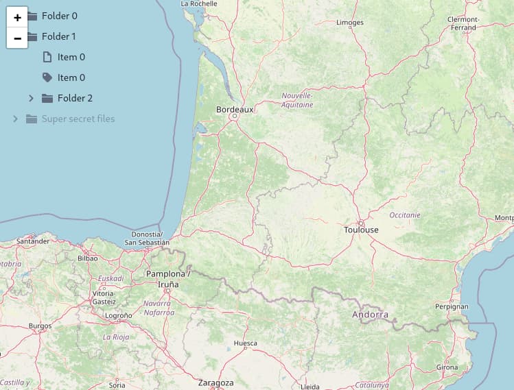
The library includes some nice components I haven’t seen in other porting, like the Tree component and the ContextMenu component.

Check out the official Blueprint documentation to have an idea of the set of components, or the documentation replica I built using Dash, available here: dash-blueprint-components. Following the idea behind Blueprint, the documention is optimized for desktop instead of mobile browsers.

This is my first open source project and the first time working with React. Until now I only used the library to create the documentation, hoping there are not too many bugs! If someone is interested in testing the library, I’m willing to mantain it and improve the code.

The library can be installed in the usual way:

pip install dash-blueprint-components

and imported as always:

from dash import Dash, html, callback, Input, Output
import dash_blueprint_components as dbpc


app = Dash(
    __name__,
)

app.layout = html.Div(
    children=[
        dbpc.Button(
            id='button',
            text='Click me!'
        ),
        html.Div(
            id='output'
        )
    ]
)

@callback(
    Output('output', 'children'),
    Input('button', 'n_clicks')
)
def click(n_clicks):
    if n_clicks is not None:
        return n_clicks

if __name__ == "__main__":
    app.run_server()
4 Likes

Hi @STEdyd666 welcome to the dash community :slightly_smiling_face:

This project looks amazing! Hard to believe this is your first open source project :star_struck:

The link to your git hub doesn’t work - is the repo private? I can’t wait to check it out!

3 Likes

The documentation looks fantastic, I attempted to build a tree component a few months back and wasn’t able to get it to work like I wanted so this really made my day when I saw that! Love when a new component library gets released to dash. Looks fantastic and its an awesome project to port over and I’m excited to see how what you build into the dash ecosystem.

Would be a great contribution for others if they could use the github of this documentation as a boilerplate to release docs for their own components. Trim it down to bare bones and give a starting point to start building up from and all. But regardless, the component within itself is an amazing contribution.

Hope to see more, first post and you are already making some fans. :star:

2 Likes

Yeah, I forgot to set it public, ops. Now it should work.

@STEdyd666 indeed … thx for the great work. Besides extra choice (and specific components like the tree and contextmenu components), is/was there specific motivation for “Dash’ifying” these components.

Also, do you know of any example of the Blueprint (react) components in use anywhere?

I’m interested in when and why people might consider these components so can steer accordingly. “complex data-sense interfaces for desktop applications” sounds right up Dash’s alley :slight_smile:

1 Like

Where have you been hiding all these years, @STEdyd666 . Such an amazing library. Thank you @STEdyd666

I’ll make sure to add it to the community components index. Did you develop this for work or as a side project?

I mainly build dashboards for scientific applications for work, and those specific components are typically present in any desktop application. I decided to convert all the library for coherence, to avoid mixing up components from different UI frameworks.

Unfortunately I don’t know any public website that uses the Blueprint react version…

I developed it as a side project, but I’ve built some apps/dashboards with Dash in the last years. The idea is to start using it for the next projects, and perhaps also converting the existing ones.

1 Like

I love this. It’s very useable and works perfectly in all of my tests.

However, I have a more general question - is there any way to prevent dbpc from changing the style of regular dash dcc and html components?

@adamschroeder - this is my general comment if I were to use multiple Community Components, the layout keeps changing. Can the namespace between components be separated?

Thanks!

hi @pfbuxton
Welcome back. We haven’t seen you in a while.

Can you please explain more. What do you mean the layout keeps changing and the namespace between components? Can you show an example?

The problem you are most likely facing is something from dbpc has the same name as another component with its styling. You can overide this with the style.css.

But this is probably an issue that would need to be addressed with @STEdyd666, getting some exact examples together would help a lot with finding where this is taking place a path for changing the components id’s and style so they dont confict. Alternatively just manually overide it by force in that style.css file i mentioned.

@PipInstallPython is right, probably there is a clash in names .

I verified the css file used by the core components, and among the others, it customizes the html, the body and p tags in this way:

@charset "UTF-8";
html{
  box-sizing:border-box;
}

*,
*::before,
*::after{
  box-sizing:inherit;
}

body{
  font-size:14px;
  font-weight:400;
  letter-spacing:0;
  line-height:1.28581;
  text-transform:none;
  color:#1c2127;
  font-family:-apple-system, "BlinkMacSystemFont", "Segoe UI", "Roboto", "Oxygen", "Ubuntu", "Cantarell", "Open Sans", "Helvetica Neue", "blueprint-icons-16", sans-serif;
}

p{
  margin-bottom:10px;
  margin-top:0;
}

is this the source of your issues @pfbuxton?

Otherwise we need some exact examples to figure out the source of the conflict.

@STEdyd666 Another improvement I could spot that could be useful is adding a style prop for the components, went into the tree to see if I could set the style directly in the component and noticed their is no way to access that functionality. Figure I might be able to do it from the assets/style.css but for a lot of components you’ll want small tweaks that a direct style prop would be beneficial.

I attempted to manually set the style through the style.css file but it isn’t working:
app.py:

import dash
import dash_leaflet as dl
from dash import html
import dash_blueprint_components as dbpc

app = dash.Dash(__name__, assets_folder='assets')

# Define the URL for the map tiles. Adjusted for the correct path for tiles or any static imagery.
url = 'https://raw.githubusercontent.com/Explv/osrs_map_tiles/master/0/{z}/{x}/{y}.png'

treecontent = [
    {
        'id': 0,
        'hasCaret': True,
        'icon': "folder-close",
        'label': 'Folder 0'
    },
    {
        'id': 1,
        'hasCaret': True,
        'icon': "folder-close",
        'label': 'Folder 1',
        'isExpanded': True,
        'childNodes': [
            {
                'id': 2,
                'icon': "document",
                'label': 'Item 0',
            },
            {
                'id': 2,
                'icon': 'tag',
                'label': 'Item 0',
            },
            {
                'id': 3,
                'hasCaret': True,
                'icon': "folder-close",
                'label': 'Folder 2',
                'childNodes': [
                    {
                        'id': 4,
                        'label': "No-Icon item"
                    },
                    {
                        'id': 5,
                        'icon': 'tag',
                        'label': 'Item 1',
                    },
                    {
                        'id': 6,
                        'hasCaret': True,
                        'icon': "folder-close",
                        'label': 'Folder 3',
                        'childNodes': [
                            {
                                'id': 7,
                                'label': "Item 0"
                            },
                            {
                                'id': 8,
                                'icon': 'tag',
                                'label': 'Item 1',
                            }
                        ]
                    }
                ]
            },
        ]
    },
    {
        'id': 9,
        'hasCaret': True,
        'icon': "folder-close",
        'label': 'Super secret files',
        'disabled': True
    }
]

# Create the map with the tile layer and an editable feature group.
app.layout = html.Div(
    [
        dbpc.Tree(
            id='tree',
            contents=treecontent,
            className='tree',
        ),
        dl.Map(center=[-79.5, -138.5], zoom=7, children=[
            dl.TileLayer(url=url),
            dl.FeatureGroup(id="feature_group", children=[
                dl.EditControl(
                    id="edit_control",
                    position="topright",
                    edit={'edit': True, 'remove': True},
                    draw={
                        "polyline": False,
                        "polygon": False,
                        "circle": False,
                        "rectangle": False,
                        "marker": False,
                        "circlemarker": False,
                    }
                )
            ]),
            dl.ImageOverlay(opacity=1, url="/assets/img_2.png", bounds=[[-80, -140], [-79.5, -134]], id='image_overlay'),
        ], id='osrs_map', style={'width': '100%', 'height': '95vh'}),
    ]
)

if __name__ == '__main__':
    app.run_server(debug=True,
                      port='4011')

style.css:

.tree {
    'position': 'absolute' !important;
    'top': '10px' !important;
    'left': '10px' !important;
    'width': '200px' !important;
    'height': '200px' !important;
}

Hi @STEdyd666, Yes I believe that changes like this are what I am referring to. @PipInstallPython, I’m sure you are correct if I specify everything explicitly in a custom *.css file then this would not be an issue.

My point was that it would be better if blueprint, bootstrap, and others only modify their components, i.e. dbc.Button, and dbpc.Button, and don’t change dcc.Button.

Here is an minimal example with 4 different cases, in each you can see that the layout / styling is slightly different.


1. Dash only

from dash import Dash, dcc, html

app = Dash()
app.layout = html.Div([
    dcc.Input(id='dcc input', type='text', value='dash dcc input'),
    html.Button(id='submit-button-state', children='dash html Button'),
])

if __name__ == '__main__':
    app.run(debug=True)


2. dash_blueprint_components

from dash import Dash, dcc, html
import dash_blueprint_components as dbpc

app = Dash()
app.layout = html.Div([
    dcc.Input(id='dcc input', type='text', value='dash dcc input'),
    html.Button(id='submit-button-state', children='dash html Button'),
])

if __name__ == '__main__':
    app.run(debug=True)


3. dash_bootstrap_components

from dash import Dash, dcc, html
import dash_bootstrap_components as dbc

app = Dash(external_stylesheets=[dbc.themes.BOOTSTRAP])
app.layout = html.Div([
    dcc.Input(id='dcc input', type='text', value='dash dcc input'),
    html.Button(id='submit-button-state', children='dash html Button'),
])

if __name__ == '__main__':
    app.run(debug=True)


4. dash_bootstrap_components and dash_blueprint_components

from dash import Dash, dcc, html
import dash_blueprint_components as dbpc
import dash_bootstrap_components as dbc

app = Dash(external_stylesheets=[dbc.themes.BOOTSTRAP])
app.layout = html.Div([
    dcc.Input(id='dcc input', type='text', value='dash dcc input'),
    html.Button(id='submit-button-state', children='dash html Button'),
])

if __name__ == '__main__':
    app.run(debug=True)

Thanks,
Peter

@PipInstallPython That is an improvement I can insert in the next release.

However, your example with style.css file works if you remove the single quotation marks around the dictionary keys:

.tree {
    position: absolute;
    top: 10px;
    left: 10px;
    width: 200px;
    height: 200px;
    z-index: 1000;
}

You need also to specify the z-index to ensure that the tree component is rendered above the map.

The second approach is to wrap the Tree component in a div, and set the style as you wish.

2 Likes

woops, :sweat_smile: was so used to the format of setting dash style from the component I formatted my style.css wrong lol Thanks for the response and insight! Your awesome.

@STEdyd666 this library looks very awesome. I am building an app that is supposed to be more of a desktop app using the Dash Mantine Components library. Your library seems a very nice tool to play around with.

I saw you have an interactive card element, I was looking for that:O.

Any idea how your library cooperates with the Mantine library? It would be nice to be able to use components from both libraries while sticking to one style and not having interfering styles.

Hi Tobs, I don’t think there is a way to use different UI libraries without having interfering styles…

I haven’t tried using it with Mantine, but as @pfbuxton showed in his reply , I would expect some minor changes in the style.

I will try it soon, let’s see what happens:p

@STEdyd666 I have been playing around a little bit with the library.

I want to second the suggestion of PipInstallPython, i do miss the style property to pass down css properties from the python interface. It would be a great addition to allow that, especially for developers not well-versed in the art of css.

Secondly, I noticed that if I change the text property of an InputGroup via callback, it doesn’t update the visual value in the app. Let’s say the input field contains the text This is input text. Then I have a button to clear the input field. The callback returns the empty string "" to Output("my_InputContainer", "text"), then in the browser the input field will still show the text This is input text. However, behind the scenes the text property is properly set. If you would use that property in another callback, you would get the empty string as expected. So, changing the value in the input field updates the text property, however changing the text property doesn’t update the value of the input field. I took a look at the js-code of the component, but couldn’t really understand why that happened.

Thirdly, it would be nice to have code snippets in the docs for each component. Now I go to the source code to check the actual code, but being able to copy it from the docs website would be nice!

Lastly, I saw some small mistakes in the documentation of some properties. What is the source of the documentation that is added in the auto-generated Python files? I might do some pull requests.