Hello,
I am newcomer to plotly.
I am looking methods to customize tooltip using Python API.
But I could not proper documents and examples.
I hope get any information about it
Thank you in advance
Hello,
I am newcomer to plotly.
I am looking methods to customize tooltip using Python API.
But I could not proper documents and examples.
I hope get any information about it
Thank you in advance
@robustor Hi, I looking for the same thing, Did you find somenthing ?
Hi @vitorsc
By default, Plotly displays on hover the variable values in each trace type. For example, it displays the coordinates x, y in a Scatter plot, x, y, z in a Scatter3d one, x,y, z in a Heatmap, etc. If you prefer to change this default behaviour, you can set the key hoverinfo, in the trace definition:
hoverinfo ='x'  # to display  only the x value
hoverinfo ='x+y' #
To suppress displaying any tooltip, set:
hoverinfo = 'none'
You can also display on hover over a point, some text;
hoverinfo = 'text' # or
hoverinfo ='x+y+text'
Ex:
trace = go.Scatter (x = [1, 2, 3, 4, 5],
                            y = [1.2, 3.5, 2.34, 5.16, 0.5],
                            mode='markers+lines',
                             text = '(x, y)-coords',
                             hoverinfo = 'x+y+text',
                            marker =dict(size=4, color ='red'),
                            line = dict(width = 0.5, color ='red')
)
fig = go.Figure(data=[trace], layout=dict(width=700, height 500, hovermode='closest'))
See also this basic tutorial https://plot.ly/python/hover-text-and-formatting/.
Please check for each trace definition, the Plotly docs, https://plot.ly/python/reference, selecting from the left menu, the trace type or the layout attribute you are interested in.
Read also and run the tutorials posted here https://plot.ly/python/, to get acquainted with plotly plots.
@empet thanks a lot, Can I change the position of “%”, wanted to put on side “20.43” and would like to change the dot by comma is possible?

@vitorsc23 To display a float number with comma instead of decimal point, convert it to a string, and call the method replace for that string:
import plotly.graph_objs as go


categ = ['A', 'B', 'C']
y1 = [20.3, 14.15, 23.6]
y2 = [12.78, 10.12, 29.32]

text1 = [f"{str(v).replace('.', ',')}%"  for v in y1]
print(text1)
text2 = [f"{str(v).replace('.', ',')}%"  for v in y2]
print(text2)
fig = go.Figure(data=[
    go.Bar(name='I', x=categ, y=y1, text=text1, hoverinfo ='text'),
    go.Bar(name='II', x=categ, y=y2, text=text2, hoverinfo ='text')
])

fig.update_layout(width=500, height=300, barmode='stack', hovermode='x')
fig.show()
@empet thank you, I’m starting now if you left ask tree last things. It’s possibile on pie char when the chart calculate the dot in percentage number for comma. I would like to replace even remove the “M” (axis X) in the bar char and remove the “k” (axis y ).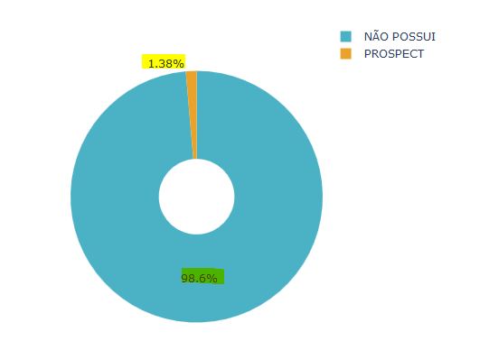

![]()
@vitorsc23 1) To display floats (sector percents) with comma in a pie chart, set the layout attribute:
separators=’,’:
import plotly.graph_objects as go

labels = ['Oxygen','Hydrogen','Carbon_Dioxide','Nitrogen']
values = [4500, 2500, 1053, 500]

fig = go.Figure(data=[go.Pie(labels=labels, values=values)])
fig.layout.update(separators=',')
fig.show()
tickformat = 'd'.
Example:
y  = [1000000+k*20000 for k in range(6)]
fig=go.Figure([go.Bar(x=[1,2,3,4,5,6], y=y)])
fig.show()
update yaxis:
fig.update_layout(yaxis_tickformat ='d')
fig.show()
@empet Thanks , Somethings call my attention
1 - when I change the ticklabels for ‘%’ on the y axis, automatically add “00” to the y axis but the max value I got is “100”
AFTER:
.
2 - In the pie char I want to in the hoverinfo shows like that “NÃO POSSUI:121587” and " POSSUI:1697" but I when I put on text It shows like in the pic(2)
When I put Label + values on the hoverinfo stay in way

When I put text on hoverinfo, But When I do this I have two problems
1 - Only show for the “Não Possui” and for the part of the other value not (pic2)
2 - See the text marked in yellow, I don’t want to show it on there, just the percentage.

sorry for bothering you. And tanks again.
@vitorsc23 It’s difficult to understand what is the issue in each case.
For your item 1 I think that this example could help:
import plotly.plotly as py
import plotly.graph_objs as go

x = [1, 2, 3, 4, 5, 6, 7, 8, 9, 10, 11, 12]
y = [0.18, 0.38, 0.56, 0.46, 0.59, 0.4, 0.78, 0.77, 0.74, 0.42, 0.45, 0.39]

trace0 = go.Scatter(
    x = x,
    y = y
)

data = [trace0]

layout = go.Layout(
    yaxis = go.layout.YAxis(
        tickformat = '%'
    )
)

fig = go.Figure(
    data = data,
    layout = layout
)
fig.show()
How did you define the layout to get the image labeled “BEFORE”?
2 - Code :
import plotly
import plotly.graph_objects as go
cores = [‘rgb(75, 178, 197)’, ‘rgb(234, 162, 40)’]
labels = [naopossui, prospect]
values = [121587, 1697]
fig = go.Figure(data=[go.Pie(labels=labels, values=values, marker_colors=cores, hoverinfo=“label+value”),
], layout={
‘margin’: {‘l’: 0, ‘r’: 0, ‘t’: 0, ‘b’: 0},
})
fig.layout.update(separators=’,’)
fig.show()
@empet Try this one
import plotly.graph_objs as go
x = [1, 2, 3, 4, 5, 6, 7, 8, 9, 10, 11, 12, 15]
y = [10, 16, 20, 100, 0, 97, 55, 77, 74, 42, 5, 39, 100]
trace0 = go.Scatter(
x=x,
y=y
)
data = [trace0]
layout = go.Layout(
yaxis=go.layout.YAxis(
tickformat=’%’
)
)
fig = go.Figure(
data=data,
layout=layout
)
fig.show()
@vitorsc23 I defined hovertext (or text) to be displayed as you required:
cores = ['rgb(75, 178, 197)', 'rgb(234, 162, 40)']
labels = ['naopossui', 'prospect']
values = [121587, 1697]
tooltips = [f"{lab}: {val}"  for lab, val in zip(labels, values)]
fig = go.Figure(data=[go.Pie(labels=labels, values=values, marker_colors=cores, hovertext=tooltips, hoverinfo="text"),
])
fig.layout.update(separators=',')
For the your issue with ‘%’ take y = np.array([10, 16, 20, 100, 0, 97, 55, 77, 74, 42, 5, 39, 100])/100
because only data betwwen 0 and 1 are displayed corectly when setting tickformat ='%'.
@empet Thank you very much 
@empet Hi again, I’m trying to create a table like this one: 
But what I got 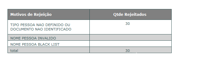 .
.
It is possible to add an equal sort button from the previous figure and it is also possible to leave the borders and lines in the same way ?


